Please add the following features to the Editor in Kendo UI for Angular 2+:
- Table Wizard
- Split cell row
- Split cell column
- Merge cell row
- Merge cell column
Note: These features exist i the Kendo UI for ASP.NET MVC version of the editor.
Currently, the pageSizes option of the available Grid's PagerSettings only allows passing a boolean or a number array as possible values. Thus, at the moment, the Grid component allows displaying an "All" option in the pager by implementing a kendoPagerTemplate:
It would be great if an "All" page size option could be set directly through the settings of the pageable property by having the ability to pass a PageSizeItem array to the pageSizes option, similarly to how its done in the standalone Pager component:
Currently, it is not possible to define a static pane in the Splitter with a fixed size that does not change when interacting with the surrounding panes, unless it is configured as non-resizable. In turn, configuring a pane as non-resizable affects the resizing ability of the surrounding panes as well, which means that they also become non-resizable.
It would be great if the Splitter could provide the ability to configure a static pane with a fixed size that is not affected by other functionalities like resizing, and in turn, have the possibility to resize the surrounding panes of a non-resizable pane.
Hi,
Recently I have implemented the date range component like described here: https://www.telerik.com/kendo-angular-ui/components/dateinputs/daterange/popup. The component normaly works as following:
- A user selects the start or end datepicker and the calendar will open.
- The start of the range now needs to be selected.
- Then the end of the range needs to be selected.
- If a user would now select another date then this will be set as the start of the range.
- ....
But what a few users have issues with is the following scenario:
- User selects the start of the range.
- User selects the end of the range.
- User wants to change the end of the range so they select the same start of the range again and now select a new end range.
- As a result the start of the range is changed instead of the end of the range, because the click on the same start of the range didn't do anything.
The same issue also occurs with the MultiViewCalendar. I didn't add a runnable project because the same issue also occurs in the documentation which I linked above.
We are using @progress/kendo-angular-dateinputs": "17.0.1"
It looks like this line in the performRangeSelection method in the MultiViewCalendarComponent causes this behaviour:
const emitValueChange = (this.activeRangeEnd === 'start' && this.value?.start?.getTime() !== date?.getTime()) ||
            (this.activeRangeEnd === 'end' && this.value?.end?.getTime() !== date?.getTime());
Thanks,
Joren
Hi,
It will be a good component enhancement if selection and multi selection was introduced to the ListBox component. Like Kendo UI for React and jQuery:
https://www.telerik.com/kendo-react-ui/components/listbox/selection/
https://docs.telerik.com/kendo-ui/api/javascript/ui/listbox/configuration/selectable
Thank you for your consideration.
It would be great if we could add footnotes in the Kendo editor, similar to how TinyMCE handles them, or a simpler version like the example found here: https://prosemirror.net/examples/footnote/
Hi, Team!
I would like to request a functionality that allows users to navigate the slots inside the Scheduler (not just the events) using specific keyboard shortcuts.
Hi, Team!
I would like to request the addition of a functionality that would allow me to programmatically determine whether the cells for the weekends will be rendered inside the Gantt component!
This feature seems to exist in Kendo UI for jQuery: https://docs.telerik.com/kendo-ui/api/javascript/ui/gantt/configuration/showworkdays
When the values of the min and max properties of a Splitter pane contain both percentage and pixel values, there are cases when the values contradict with each other in different screen sizes.
For example, if a Splitter pane's min is set to 100px and the max property is set to 20%, in certain screen sizes, the maximum 20% space that the Splitter should occupy may be smaller than 100px.
It will be great if the Splitter can be enhanced with the ability to define which property should take priority over the other in order to handle such scenarios.
It will be a good addition to the component if a placeholder option is provided for the filter input.
Current workaround - https://stackblitz.com/edit/angular-vcm2tlxf
The Grid provides column spanning by default, but the change is applied to all rows:
https://www.telerik.com/kendo-angular-ui/components/grid/columns/spanned
A good addition to the Grid would be to provide conditional columns spanning where some rows are normal while others - have spanned columns such as:

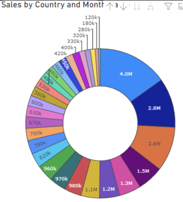
Provide support for dynamic label positions for the Donut chart.
Some labels to be displayed inside the Donut, and other (which couldn't fit) to be outside, similar to:
Hi Team,
Currently, when loading large PDF files with numerous pages, there seems to be a delay in the search and zoom functionalities.
I would like to be able to load the pages of the PDF one at a time and handle the pageChange in order to load the next page.
Currently, it is not possible to enter a date that falls exactly on a Daylight Saving time.
Check the following example where it is not possible to enter 3 for the hours' section (it is also not possible to select 3 from the TimePicker popup):
https://stackblitz.com/edit/angular-nstdolh5-xfiws9nr
That behavior is expected as there is no such time in the Bulgarian time zone. Daylight saving time begins on 30 March 2025 03:00 when the time is moved 1 hour forward.
The demonstrated undesired behavior for the specific date will be reproducible only if the example is opened in the specified time zone. But the same behavior is valid for any other date that falls on Daylight Saving time in other time zones.
We should decide on what the expected behavior is for such cases. For example not allowing entering the value, displaying an error, auto-switching to the real hour (4 AM), etc.
Kendo's Angular components that have optional inputs are not built correctly.
For example on the `kendo-avatar`component the input `imageSrc` is defined like this:
@Input() imageSrc: string;however, since it is an optional input it should be defined like this:
 @Input() imageSrc?: string;
// or
 @Input() imageSrc: string | undefined;