In the Hierarchical drawer, there should be a way to programmatically collapse or expand the drawer items.
Being able to manually trigger the `isItemExpanded` check would be helpful in this. The conditions that make an item expanded could be changed and then the check triggered. For example, if the callback is:
isItemExpanded: DrawerItemExpandedFn = (item): boolean => {
    return this.expandedIndices.indexOf(item.id) >= 0;
}It would be helpful if drawer items had a simple "title" property to add tooltips. It would be easier to recognize actions in mini mode.
I know that it's possible to achieve this by adding a template for each item, a tooltip property would just make things a lot easier.
Hi,
It will be nice to have an option for the Drawer to expand on top of the content without applying a grey overlay.
Currently, it can be done by using the overlay mode and removing the `k-overlay` class:
https://stackblitz.com/edit/angular-chk7uw?file=src%2Fapp%2Fapp.component.ts
Hi,
Please provide similar functionality to Material's BreakpointObserver:
https://material.angular.io/cdk/layout/api#BreakpointObserver
that will allow changing the default options of the Drawer automatically based on the screen size.
Thank you
Provide a how-to example or a support option that allows using both a left and a right Drawer at the same time.
Thanks
Dear team,
in one of our projects, we use the Hierarchical Drawer with icons, as shown in https://www.telerik.com/kendo-angular-ui/components/layout/drawer/hierarchical-drawer/.
This Drawer is collapsible, and I am aware that there is the possibilty to create a Mini view by using:
[mini]="true"
[miniWidth]="80"
as shown here: https://www.telerik.com/kendo-angular-ui/components/layout/drawer/hierarchical-drawer/#toc-using-hierarchical-data.
What our customer has requested, is a collapsing behavior, which - in the mini-view - leaves only the icons of the menu entry, just like in the "normal" drawer (https://www.telerik.com/kendo-angular-ui/components/layout/drawer/), but with hierarchical data.
Are there currently any plans to support such a behavior?
Thanks in advance,
Felix
Please provide an option for the Drawer so that the developer can configure whether the item content is destroyed and recreated when collapsing/expanding the collapsible section of the component or not.
Currently all inner items content is destroyed when the Drawer is collapsed, and recreated again on expand. This imposes additional overhead when using Kendo UI for jQuery components inside the Drawer item templates, as they need to be destroyed on collapse and reinitialized on expand.
Further scenarios in which having such an option, is using forms or other components that need state persistence within the Drawer items templates.
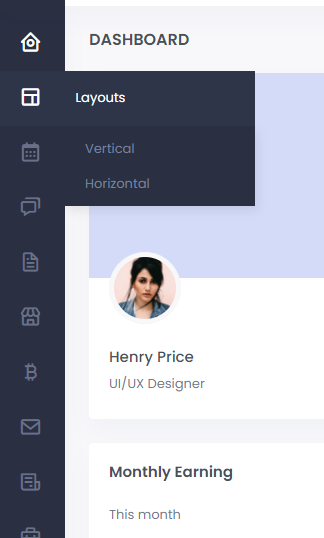
When the Drawer component is in "mini" view, please add an option that enables the following behavior:
- When a drawer item is hovered, a popup appears to the side of the item icon, containing the full item text.
Here is a page where the menu does have the described behavior: http://skote-v-light.codeigniter.themesbrand.com/
And here is a screenshot for quick preview of the idea:
Before we started using kendo ui, we implemented this slidemenu. - https://www.primefaces.org/primeng/#/slidemenu
So far I haven't been able to find anything comparable within kendo ui, but the closest thing is https://www.telerik.com/kendo-angular-ui/components/layout/drawer/how-to/hierarchical-drawer/
The drawers could slide between options, instead of expanding out into the page.
Martin, on your team, managed to put together https://stackblitz.com/edit/angular-ckjeuc?file=app%2Fapp.component.ts which is awfully close to accomplishing what we're aiming for, but is lacking the smooth animations between menu layers that we'd like. Ticket ID: 1448501

