Hello,
In the documentation it says that sticky columns are not available while using virtual columns. It is really important for us to virtualize columns, when there's a lot of them in the grid, but also being able to use a sticky column at the same time.
Can you please consider implementing sticky columns while virtual columns are also enabled?
Best regards,
Boris
Hi,
It will be a nice feature to have the ability to customize the drag hint of the built-in row reordering similar to the hintTemplate.
Currently the Grid checkbox column selection does not allow for selecting a range of rows via shift-click.
As this seems to be a behavior that users expect, based on a similar experience with popular applications like for example Outlook and Gmail, we can consider introducing this behavior in the Grid too.
For example:
When we click on a check box and Shift+click on another checkbox all the rows in between these rows should be checked. Ex: click on 2nd row and shift click on 8th row, all the rows in between 2nd and 8th should be selected.
Please provide support for spanned columns with multi-column headers combining the already existing features:
https://www.telerik.com/kendo-angular-ui-develop/components/grid/columns/spanned/
https://www.telerik.com/kendo-angular-ui-develop/components/grid/columns/headers/
Could we have a turnkey solution which allows to disable a row selection which takes care of disabling only the relevant selection checkboxes and handle properly the "Select all" checkbox state (in header).
With CheckboxColumnComponent field which allows providing dataItem field name or predicate function.
<kendo-grid-checkbox-column showSelectAll="true" disableSelection="isDisabled">
</kendo-grid-checkbox-column><kendo-grid-checkbox-column showSelectAll="true" [disableSelection]="isDisabledPredicateFunction">
</kendo-grid-checkbox-column>OR
If you don't want to add more selection concerns into CheckboxColumnComponent this field could be specified in your SelectableSettings as well:
public selectableSettngs: SelectableSettings = {
    enabled: true,
    checkboxOnly: false,
    mode: 'multiple',
    cell: false,
    drag: false,
    rowEnabled: mySelectableRowPredicateFunction
}
rowEnabled field could something like this:
export declare type RowEnabledSelectionFn = (context: RowArgs) => boolean | boolean;

export interface SelectableSettings {
    //...
    /**
     * Determines if row selection is allowed.
     *
     * @default true
     */
    rowEnabled?: RowEnabledSelectionFn;
}
Thank you
Hello,
The list view component provides a loader template. This is easier to work with than the mechanisms provided for the grid component. For the sake of consistency of approach, I would like to request that a grid loader template directive be provided for the grid component, similar to the one available for the list view that is seen here: https://www.telerik.com/kendo-angular-ui/components/listview/api/LoaderTemplateDirective/
Thank you,
David
Please provide a built - in rows reordering functionality that isn't based on the public HTML drag and drop api. Also please allow to customize the content of the drag hint. Something similar to the drag and drop feature of the TreeView.
thank you
Could you please assist me with gaining understanding of implementation of the drag and drop Angular feature together with your grid?
I need to implement the following scenarios:
1. D'n'd between 2 Kendo grids in different components
2. D'n'd between Kendo grid and custom list in separate component
3. D'n'd in scope of the same Grid.
Lets say I have Angular of the 8th version and the latest version of Kendo Angular Grid.
It would be very cool if you can update your documentation with the corresponding page.
If that doesn't make sense from your perspective I would appreciate if you could provide me detailed instruction for all the above scenarios implementations.
Thank you in advance.
Hi Team,
Requesting a feature to grid rows merge like the below example,
| Col1 | Col2 | Col3 | Col4 | Col5 | Col6 |
| Row1 | Row1 | Row1 | Row1 | Row1 | Merge1 |
| Row2 | Row2 | Row2 | Row2 | Row2 | |
| Row3 | Row3 | Row3 | Row3 | Row3 | Merge2 |
| Row4 | Row4 | Row4 | Row4 | Row4 | |
| Row5 | Row5 | Row5 | Row5 | Row5 | |
| Row6 | Row6 | Row6 | Row6 | Row6 | Merge3 |
| Row7 | Row7 | Row7 | Row7 | Row7 | |
| Row8 | Row8 | Row8 | Row8 | Row8 | Merge4 |
| Row9 | Row9 | Row9 | Row9 | Row9 |
Thanks!
Hello,
As I explained in this post, I would like to set max-width on certain columns of a grid to force them to not becoming bigger than a certain size if there is a remaining width in the parent container. However, I do need to distribute the remaining width across other columns if they don't have max-width.
For example in this project https://stackblitz.com/edit/max-width-request?embed=1&file=app/app.component.ts, I want the first column which shows the ID of products would never be bigger than 15. I'm advised to leave one of the columns without setting width, so that column will occupy the remaining width and as a result the width of columns with width will be respected as max-width. However, that is not good because in big screens you will end up with a very big column while other columns are still suffering from lack of space.
Thanks,
Mojtaba
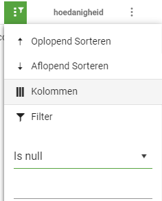
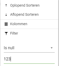
When using KendoUI for Angular 2+, the filter value is still enabled and accepts input when "Is null" or "Is empty" is selected.
Since those selections do not require a parameter, I'd prefer the filter value to be default disabled.
Current behavior
The grid component already has the functionality to resize and reorder columns by the user, but is missing functionality for saving an restoring columns configuration, so that changes done by the user are lost after a page change.
There is the Persist the State article in the "How to section" in the documentation, but the described solution is only applicable when adding grid columns by using *ngFor. When defining columns in the markup, due to extensive usage of templates (kendoGridColumnMenuTemplate, kendoGridFilterMenuTemplate, kendoGridCellTemplate, ..), there is no reasonable solution available.
Expected behavior
Provide methods, similar to the jQuery grid, to save and restore columns configuration. This should at least include the column's order, width and sort.
PS: This is not a duplicate of the feature request Add persistent state for grid (and other components). The latter one has been marked as "Completed" but does not include the needed functionality.
It would be nice to have support for horizontal virtual scrolling for the Grid in cases of large number of columns. Just like the current feature for vertical scrolling, in which you can update the visible rows through a pageChange() event handler.
Currently in the Grid, the GroupHeaderTemplate can create just one cell. I'd prefer to have option to have columns in the group header like it is implemented in the jQuery Grid. Check it here https://demos.telerik.com/kendo-ui/grid/aggregates
This option will be handy for displaying aggregates in a group header.