

Provide a how-to example or a support option that allows using both a left and a right Drawer at the same time.
Thanks

When the Drawer component is in "mini" view, please add an option that enables the following behavior:
- When a drawer item is hovered, a popup appears to the side of the item icon, containing the full item text.
Here is a page where the menu does have the described behavior: http://skote-v-light.codeigniter.themesbrand.com/
And here is a screenshot for quick preview of the idea:
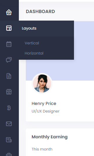
It would be helpful if drawer items had a simple "title" property to add tooltips. It would be easier to recognize actions in mini mode.
I know that it's possible to achieve this by adding a template for each item, a tooltip property would just make things a lot easier.
In the Hierarchical drawer, there should be a way to programmatically collapse or expand the drawer items.
Being able to manually trigger the `isItemExpanded` check would be helpful in this. The conditions that make an item expanded could be changed and then the check triggered. For example, if the callback is:
isItemExpanded: DrawerItemExpandedFn = (item): boolean => {
    return this.expandedIndices.indexOf(item.id) >= 0;
  }