If the value "-1" is passed in as one of the values in pageSizes input for the PagerPageSizesComponent, that option should be shown as "All" and should show all rows available for the grid.
I find myself reusing similar/identical code in order to implement filtering, sorting and virtual paging. In almost all cases, I am simply applying the filters, sort and determining the records to select based on the page as shown in the API.

This code should be inbuilt into the kendo grid. If filterable is true, kendo should implement the filter change event and apply filters automatically; the users should not be forced to define what happens on filter change for every grid instance. Similarly, if sortable is true, the kendo grid should automatically implement default sort functionality.

The same would also be useful for virutal scrolling. If scrollable is set to 'virtual', then the view to be shown in the grid should be automatically calculated on page change.
Hello,
In the documentation it says that sticky columns are not available while using virtual columns. It is really important for us to virtualize columns, when there's a lot of them in the grid, but also being able to use a sticky column at the same time.
Can you please consider implementing sticky columns while virtual columns are also enabled?
Best regards,
Boris
Angular 2 - type script
I've created a Plunker: http://plnkr.co/edit/WoqkaDZpq8hU24m0eKcv?p=preview

Show the detail template of Row 1 in Beverages, then collapse the Beverages group. the Detail for Chai does not go away with the rest of the table.
When mouse hover over a specific row, a tooltip to show more information should be shown
At current, if one wants to, (for example), highlight the entirety of a row, the natural choice would be to associate a background color with that row.  However, currently, this is not possible.  The closest we can come is to conditionally associate a given color with a div that happens to live in that cell, e.g.:

<kendo-grid [data]="gridData" [height]="410">
            <kendo-grid-column field="ProductID" title="ID" width="40">
            </kendo-grid-column>
            <kendo-grid-column field="ProductName" title="Name" width="250">
            </kendo-grid-column>
            <kendo-grid-column field="Category.CategoryName" title="Category">
            </kendo-grid-column>
            <kendo-grid-column field="UnitPrice" title="Price" width="80">
              <ng-template kendoGridCellTemplate let-dataItem let-rowIndex="rowIndex">
               <div [class.myClass2]="dataItem.UnitPrice >= 20">{{dataItem.UnitPrice}}</div>
              </ng-template>
            </kendo-grid-column>
            <kendo-grid-column field="UnitsInStock" title="In stock" width="80">
            </kendo-grid-column>
            <kendo-grid-column field="Discontinued" title="Discontinued" width="120">
                <ng-template kendoGridCellTemplate let-dataItem>
                    <input type="checkbox" [checked]="dataItem.Discontinued" disabled/>
                </ng-template>
            </kendo-grid-column>
        </kendo-grid>

(where the class.myClass2 is defined as follows):

styles: [`
    .k-grid td {
      position: relative;
    }
      .myClass2 {
        background-color: rgba(255, 0, 0, 0.5);
        color: white;
        padding: 8px 12px;
        position: absolute;
        top: 0;
        left: 0;
        right: 0;
        bottom: 0;
        display: flex;
        align-items: center;
      }
    `]

But this doesn't reliably highlight a predictable amount of the cell, especially across browsers.

Thanks for your consideration,
  Jeff
Need to have Parent --> Child hierarchical records to be displayed in Grid..
It should support up to 'n' level , it means a parent can have any number of child records. can this be done using current Master Detail grids?.

 Parent 1
   --- Child 1
        -- Grand Child 1
            -- Grand Child 1
        -- Grand Child 2


Thanks in advance.
when expanding a group, inside the expand event (function) we do have access to the groupIndex.

but groupIndex is not available inside the groupHeader(Footer)Template itself.

we need that groupIndex, so we can get the parent items (groups) to the group that is expanded.
When resizing grid columns so the last column does not reach the right border of the grid (sum of columns width < current grid width), loading stored state (or changing column width property in any way) does not restore the columns width proportionaly to use the full width of the grid.
Note: in this case, the default columns width sum and stored state columns width sum are always inferior to the grid width in order to use proportionality and adapt to every screen size.
In our implementation, we made a "Reset columns view" (working exactly as the loading store data), but if the user play arround with the columns as described above), the reset is broken.
Reproduce steps:
Using the persisting state exemple available in the doc: https://stackblitz.com/edit/angular-3jdmzy?file=app%2Fapp.component.ts
- Click "Save current state"
- Resize grid columns so the last column does not reach the right border of the grid

- Click "Load saved state", the columns are resized proportionaly of the saved state but on the base of previous columns width sum instead of the full grid width.

When a Grid cell is focused, and after this, the data is filtered so that the data contains fewer items than the index of the row the last focused cell was in, the Grid table area does not receive focus when tabbed into.
Please check the example:
https://stackblitz.com/edit/angular-xqswy5-zqeqkb?file=app/app.component.ts
Could we have a turnkey solution which allows to disable a row selection which takes care of disabling only the relevant selection checkboxes and handle properly the "Select all" checkbox state (in header).
With CheckboxColumnComponent field which allows providing dataItem field name or predicate function.
<kendo-grid-checkbox-column showSelectAll="true" disableSelection="isDisabled">
</kendo-grid-checkbox-column><kendo-grid-checkbox-column showSelectAll="true" [disableSelection]="isDisabledPredicateFunction">
</kendo-grid-checkbox-column>OR
If you don't want to add more selection concerns into CheckboxColumnComponent this field could be specified in your SelectableSettings as well:
public selectableSettngs: SelectableSettings = {
    enabled: true,
    checkboxOnly: false,
    mode: 'multiple',
    cell: false,
    drag: false,
    rowEnabled: mySelectableRowPredicateFunction
}
rowEnabled field could something like this:
export declare type RowEnabledSelectionFn = (context: RowArgs) => boolean | boolean;

export interface SelectableSettings {
    //...
    /**
     * Determines if row selection is allowed.
     *
     * @default true
     */
    rowEnabled?: RowEnabledSelectionFn;
}
Thank you
Use IE11:
1. Try to use the grids column menu for filtering
2. Click the column icon => popdown menu opens
3. Click the filter oder column icon inside the menu => nothing happens
I can't even open up your docs using IE11, it just loads forever:
https://www.telerik.com/kendo-angular-ui/components/grid/columns/menu/
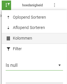
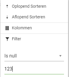
When using KendoUI for Angular 2+, the filter value is still enabled and accepts input when "Is null" or "Is empty" is selected.
Since those selections do not require a parameter, I'd prefer the filter value to be default disabled.
When using the Grid control inside an Angular component which is shown in a dialog (via MatDialog), the component is not properly destroyed after closing the dialog. The same problem doesn't occur when the component instead contains, say, a TreeView.
The problem occurs in Angular 8 and 9, in the Chrome browser. I've created an Angular 8 demo here: https://stackblitz.com/edit/angular-thr9j1 and an Angular 9 demo here: https://stackblitz.com/edit/angular-ksfrqy
Run the demo, press the "Open dialog" button a number of times, then take a heap snapshot in the Chrome dev console (be sure to first select the proper Javascript VM instance, containing "angular-thr9j1" or "angular-ksfrqy"). The component shown in the dialog is called "MemoryLeakDialogComponent", so use that as a filter. You'll see that for every time you opened the dialog there's now an instance of the component on the heap.
The MemoryLeakDialogComponent contains just an empty kendo-grid tag with no attributes. If you edit its dialog template to instead contain a kendo-treeview component, everything is properly destroyed and garbage collected, which leads me to suspect a memory leak in the Grid component.
Hi,
It seems there is an issue with the material theme and nested grids. When you have master-detail nested grids, the entire last nested grid gets applied with the same styling as the bottom rows of all the other nested grid.
The styling in my browser is showing up as
- border-bottom-width: 0;
Which causes the rows in the last grid to not appear.
I have attached an image where I have changed the styling to 5px and red so you can see that it is being incorrectly styled. You can see that even the other rows in in the last grid are getting styled along with the last row style.
I am running the latest version of Kendo.
Cheers,
Clint