Hi,
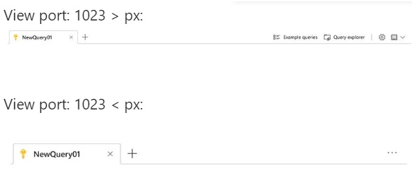
Today the tollbar can be responsive - in this case it moves the items according the space in the screen.
We want to be able to hide the tools manually.
In our case, we want to move the tools to poup from specific screen width:
We'd appricate this feature!
Thanks,
Michal.
Currently there is no straight-forward way to add HTML attributes to the Button elements within the ToolBar tools, barring a direct DOM manipulation after the components are rendered.
Please expose a public API for setting the desired set of HTML attributes.
Please add the "overflow" property (like available in the jQuery counterpart) to the ToolBarToolComponent to determine whether the tool is initially pushed to the toolbar's overflow.
Hi,
I want to define some of the items in the toolbar to have overflow = "always", so they'll always be inside the 3 dots menu.
I found a way to do it in JQuery here, but didn't find a way to do it in Angular.
How can I reach this result?
Thanks,
Hi Kendo Team,
It will be a good addition if the ToolBar button controls allow nesting child components or directive to apply custom icon to the buttons. Similar to the button component where it is available as an option.
Currently the developer would need to create a custom control to achieve that withing the ToolBar component:
https://stackblitz.com/edit/angular-qfzm2q-f6fppa?file=src%2Fapp%2Fcustom-tool.component.ts
    <button kendoButton>
        <fa-icon [icon]="['fab', 'github']"></fa-icon>
        Browse
    </button>
Improving the button controls would allow the developer to directily define the icon inside the ToolBar button control like the following:
    <kendo-toolbar-button>
        <fa-icon icon="calendar" size="lg"></fa-icon>
    </kendo-toolbar-button>
Also this can be concidered for the other component packages that Kendo UI for Angular offers.
Thank you for the concideration.
Provide an item template directive for the ToolBarSplitButton and the ToolBarDropDownButton that allows the customization of their items, similar to the ones available for the default SplitButton and DropDownButton components:
Currently, the only way to use this item template is by implementing the default buttons as custom tools in the Toolbar.


