

When Toolbar component is configured to
- Have spacer between two elements: Angular ToolBar Control Types - Kendo UI for Angular
- AND it uses `overflow=menu` strategy: Angular ToolBar Responsive ToolBar - Kendo UI for Angular
- AND when there is sufficient space, so the Toolbar is NOT overflowing. In other words, the visibility of the overflow button is set to hidden.
THEN the elements are not properly aligned with the right edge of the Toolbar component. This is because the overflow button still occupies the space as is the bahviour of the `visibility` style: visibility CSS property - CSS | MDN
- The visibility CSS property shows or hides an element without changing the layout of a document.
Minimal reproducible example:
import { Component } from '@angular/core';
import { KENDO_TOOLBAR } from '@progress/kendo-angular-toolbar';
import { FormsModule } from '@angular/forms';
import { KENDO_INPUTS } from '@progress/kendo-angular-inputs';
import { KENDO_LABELS } from '@progress/kendo-angular-label';

@Component({
  selector: 'my-app',
  imports: [FormsModule, KENDO_TOOLBAR, KENDO_INPUTS, KENDO_LABELS],
  template: `
    <kendo-label [for]="width" text="Set toolbar width"></kendo-label>
    <kendo-slider
      #width
      [(ngModel)]="toolbarWidth"
      style="width: 100%; display: block;"
      [showButtons]="false"
      [min]="0"
      [max]="100"
      [largeStep]="1"
      tickPlacement="none"
    ></kendo-slider>

    <kendo-toolbar overflow="menu" [style.width.%]="toolbarWidth">
      <kendo-toolbar-button text="My Kendo Angular Toolbar Button A" />

      <kendo-toolbar-spacer></kendo-toolbar-spacer>

      <kendo-toolbar-button text="My Kendo Angular Toolbar Button B" />
    </kendo-toolbar>
  `,
})
export class AppComponent {
  toolbarWidth = 100;
}
Expected behaviour: The overflow button does not occupy that space in the scenario described above.
- EITHER has `display: none` OR it is completely removed from the DOM when there is sufficient space.
Currently there is no straight-forward way to add HTML attributes to the Button elements within the ToolBar tools, barring a direct DOM manipulation after the components are rendered.
Please expose a public API for setting the desired set of HTML attributes.

Please add the "overflow" property (like available in the jQuery counterpart) to the ToolBarToolComponent to determine whether the tool is initially pushed to the toolbar's overflow.
Hi,
Today the tollbar can be responsive - in this case it moves the items according the space in the screen.
We want to be able to hide the tools manually.
In our case, we want to move the tools to poup from specific screen width:
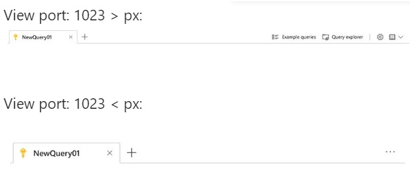
We'd appricate this feature!
Thanks,
Michal.