add native support for displaying the series stack label.
as for today doing so is a work around using the labels property of seriesDefaults.
Please add a Gantt and Resourcechart component.

See anychart
Please take a look at this following example: https://stackblitz.com/edit/grouped-bar-chart-missing-values?file=app/app.component.ts
Problem:
The 2nd and 3rd series don't have data for 1/16/2020, but the chart still creates placeholders for where they would have been if there was data for those points.
If there are many missing values in the middle of the group, the outermost values appear as if they belong to the adjacent groups (they are visually closer).
Desired behaviour:
I would like the option to omit the blank space created for each missing value. The end result should be that missing values don't generate gaps and all the existing values cluster directly adjacent to each other. Clarifying example below.
I understand that this is not a bug and that it can be useful to have the placeholders for missing data, but would like to have the ability to not have them take up space. Over multiple dates and with 10-15+ series the chart can start looking very confusing with which date the bar actually belongs to.
This is somewhat related "missingValues", but differs in that instead of replacing a missing value with something (even a gap), here we want the component to behave as if it never existed.
The behaviour could be optional and toggle-able through a property binding, e.g. [hideMissingValues]="true".
I have the following data:

Price   Downloads
59      10
62      15
69      30
70      10
75      25
78      30

I want to present the data in a chart in such a way that the Price are grouped together and the Downloads have their medians.

So it would be:
< 59:   10
61-70:  (Median of 62, 69 and 70 above)
71-80:  (Median of 75 and 78 above)

X-axis would be the Price then Downloads on Y-axis.

I can create the median but I just want to be able to group the X-axis.
Please provide kendo Gantt chart supporting for angular 5
Currently missing values can be either interpolated (with the same dash type), zero or gap. It would be nice to provide the opportunity to configure the dash type for the missing (interpolated) values and have for example a solid line for the existing values, and dashes for the interpolated portion.
Request to allow control of SVG dimensions from exportSVG options
Ideal behavior:
export class AppComponent {
this should produce a 600x300 svg. ChartComponent.prototype.exportSVG does not pass options into ChartComponent.prototype.exportVisual in the kendo-angular-charts library. I request that it pass these options in to allow for SVG dimension specification. I have modified the code manually and it behaves as expected.
Hi Telerik,
Is there way to have more configuration options on chart series DashTypes? For example, we'd like to use just dash (no dot), but with the capability of configuring how long the solid/white parts are. Currently, we are limited to 2 options: dash and longDash. We'd like to have more, e.g.,
1, _________ ____________ _____________
2, ______ _______ _______ _______ _______
3, ___ ___ ___ ___ ___ ___ ___ ___ ___
4, __ __ __ __ __ __ __ __ __ __ __ __
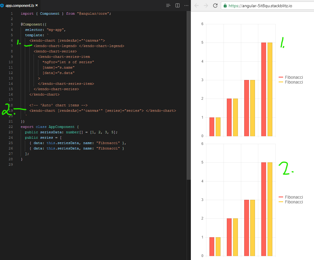
Expected: Clicking on an item in the legend is supposed to toggle it's visibility.
Using kendo-angular-charts 5.1.0, if you add a series input, this does not happen. A full, minimal reproduction of this issue is available At the StackBlitz link below. The top chart has no issues (hides series upon clicking) while the bottom does.
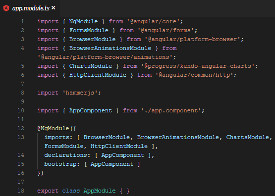
https://stackblitz.com/edit/angular-5it8qu?file=app%2Fapp.module.ts
Screenshots of above repro:
It appears that there is a line deep in the codebase that says:
const seriesComponent = this.seriesComponents.get(index);
if( !seriesComponent ){ return; }
seriesComponent.toggleVisibility();
And the seriesComponents array is empty when you use the [series] binding.
We even went so far as to bind to the legend click event and toggle the visibility myself, but it is 100% ignored.
It was something like:
public onLegendClick(event: LegendClickEvent){
  event.series.visibility = !event.series.visibility;
  event.source.refresh();
  event.source.changeDetector.markForCheck();
}
Calling refresh did redraw the chart, but it was still visible/enabled. Even though digging into it with ng.getComponent on the kendo-chart, and looking at the series, it clearly showed series[0].visible to be false.
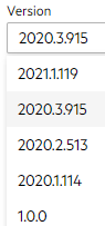
I had to make an assumption on version for this ticket since the dropdown on the bug report doesn't list 5.1.0. I wouldn't mind tips on understanding how to match up your marketing version name with your npm version. I spent 20 minutes looking around for that, but your versioning doc and release history don't seem to have anything about the actual version numbers used by package management.
Describe the bug
The <kendo-chart-series-item> component is missing settings for median and mean elements rendered by Box Plot series.
These are the two lines within each box (dashed line is mean):
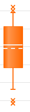
Expected behavior
These series elements should be customizable and should accept an object containing color, width, dashType and opacity.
Hi,
I'd it would be great if Kendo offered a way to build 2D density plot, even myabe somthing similar to a seaborn https://python-graph-gallery.com/82-marginal-plot-with-seaborn/
Hi,
We really like the Kendo for Angular suite. We were trying to see if the kendo-stockchart could fit our needs with some customization. But this might be difficult to achieve.
We are looking for rendering multiple items within a horizontal timeline.
Unfortunately, we didn't find a good component yet that provides what we are looking for.
Here an example of the kind of functionalities we are interested in.
http://www.simile-widgets.org/timeline/
Is there any plan to provide such component in the near future? or perhaps there is a way we can customize the Kendo chart to do a similar.
Thanks.
-Patrick