Please take a look at this following example: https://stackblitz.com/edit/grouped-bar-chart-missing-values?file=app/app.component.ts
Problem:
The 2nd and 3rd series don't have data for 1/16/2020, but the chart still creates placeholders for where they would have been if there was data for those points.
If there are many missing values in the middle of the group, the outermost values appear as if they belong to the adjacent groups (they are visually closer).
Desired behaviour:
I would like the option to omit the blank space created for each missing value. The end result should be that missing values don't generate gaps and all the existing values cluster directly adjacent to each other. Clarifying example below.
I understand that this is not a bug and that it can be useful to have the placeholders for missing data, but would like to have the ability to not have them take up space. Over multiple dates and with 10-15+ series the chart can start looking very confusing with which date the bar actually belongs to.
This is somewhat related "missingValues", but differs in that instead of replacing a missing value with something (even a gap), here we want the component to behave as if it never existed.
The behaviour could be optional and toggle-able through a property binding, e.g. [hideMissingValues]="true".
Hi Telerik,
Is there way to have more configuration options on chart series DashTypes? For example, we'd like to use just dash (no dot), but with the capability of configuring how long the solid/white parts are. Currently, we are limited to 2 options: dash and longDash. We'd like to have more, e.g.,
1, _________ ____________ _____________
2, ______ _______ _______ _______ _______
3, ___ ___ ___ ___ ___ ___ ___ ___ ___
4, __ __ __ __ __ __ __ __ __ __ __ __
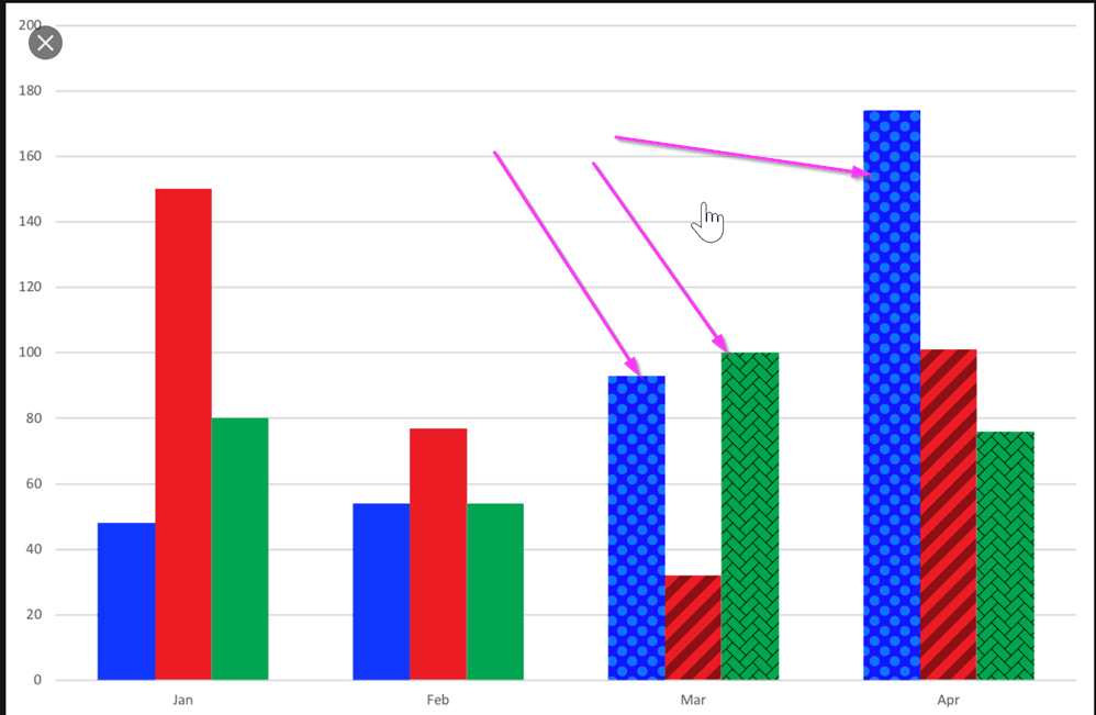
I would like to be able to use a texture, a pattern, or an image as the background of a Kendo chart.
One use-case where this would come handy is a stacked bar chart where all segments of the bar have the same color. A way to visually separate them could be via different textures.
See image below for an example reference:
Hi,
We really like the Kendo for Angular suite. We were trying to see if the kendo-stockchart could fit our needs with some customization. But this might be difficult to achieve.
We are looking for rendering multiple items within a horizontal timeline.
Unfortunately, we didn't find a good component yet that provides what we are looking for.
Here an example of the kind of functionalities we are interested in.
http://www.simile-widgets.org/timeline/
Is there any plan to provide such component in the near future? or perhaps there is a way we can customize the Kendo chart to do a similar.
Thanks.
-Patrick