Hi,
I have prepared a forked stackblitz example for a navigator selection with a shared tooltip:
https://stackblitz.com/edit/angular-h1j1hq-kmmqfg?file=src%2Fapp%2Fapp.component.ts
(I also included a screenshot)
There seems to be now way to have a shared tooltip in this scenario that makes sense, clearly no one needs the duplicated items in the tooltip that origins from the navigator selection pane.
So I would propose a flag for a pane to configure if a pane is included in the shared tooltip.
Or alternatively on the series item level a flag that allows for enable / disable or visible / invisible regarding the shared tool tip.
I think there are other cases where this might come handy to have a shared tooltip for several serieses only over one pane, or exclude specific panes and or serieses.
I tried to make the tooltip invisible, on the series level of the navigator pane but something like:
[tooltip]="{ visible: false }"
inside the navigator series seems to be only applicable to the current series tooltips but not the shared ones.
It will be a good addition to the Title element if the underlined text option is added.
Currently, it can be added to the font property, but it will break the background property:
https://stackblitz.com/edit/angular-j1wzef?file=src%2Fapp%2Fapp.component.ts
I would like to modify the crosshair tooltip to display the interpolated y value for the given x position of the crosshair (see data below the chart)
https://stackblitz.com/edit/angular-sdmdrbjt-5yunmeo2
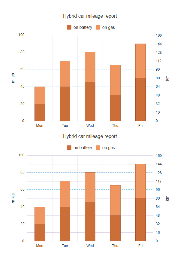
Currently, in Kendo UI for Angular Charts, when using multiple axes of the same orientation (e.g., two Y axes), only the major grid lines of the first axis are displayed. The grid lines of the second axis (Y2) are ignored, even if enabled in the configuration. This limits the readability of multi-axis charts, as it is not possible to visually distinguish the graduations of each axis.
Add an option (for example, showGridLinesOnAllAxes: true) that would allow displaying major grid lines on all axes, not just the primary one.
The Kendo team suggests using plot bands to simulate the grid lines of the second axis, but this solution is less convenient and requires manual configuration.
Below is a screenshot of what it might look like; the first graph shows what is currently possible, and the second shows what would be possible if this feature were added.
Description
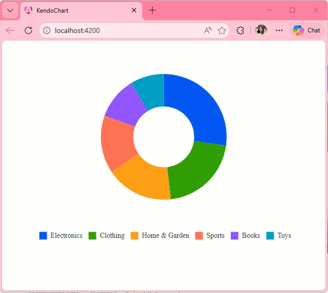
When you move the cursor to a new series item, the tooltip position does not move until you leave the chart area and re-enter. It changes the content based on where the cursor is pointing, but does not change the position.
Steps To Reproduce
- Create a new Angular application
- Add the Kendo UI Chart and paste the following code in the app.component.ts file:
import { Component } from '@angular/core';
import {KENDO_CHARTS} from "@progress/kendo-angular-charts";

@Component({
  selector: 'app-root',
  imports: [KENDO_CHARTS],
  template: `
    <kendo-chart>
      <kendo-chart-legend position="bottom"></kendo-chart-legend>
      <kendo-chart-series>
        <kendo-chart-series-item
          type="donut"
          [data]="data"
          field="value"
          categoryField="category"
          colorField="color"
          [holeSize]="60"
          [tooltip]="{
            visible: true,
            format: '{0:C0}'
          }"
          [highlight]="{ visible: true }"
        >
        </kendo-chart-series-item>
      </kendo-chart-series>
    </kendo-chart>
`,
})
export class App {
  public data = [
    { category: "Electronics", value: 245000, color: "#0058e9" },
    { category: "Clothing", value: 189000, color: "#37b400" },
    { category: "Home & Garden", value: 156000, color: "#f59c1a" },
    { category: "Sports", value: 134000, color: "#ff6358" },
    { category: "Books", value: 98000, color: "#8c43ff" },
    { category: "Toys", value: 78000, color: "#00acc1" },
  ];
}
- Run the application
Screenshots or video

Actual Behavior
The Tooltip position only changes when you leave and reenter the Chart area. It does not change when you move the cursor from one series item to other, it updates the content displayed in the Tooltip though.
Expected Behavior
The Tooltip position should move with the cursor as seen in the screen recording below:
Request to allow control of SVG dimensions from exportSVG options
Ideal behavior:
export class AppComponent {
this should produce a 600x300 svg. ChartComponent.prototype.exportSVG does not pass options into ChartComponent.prototype.exportVisual in the kendo-angular-charts library. I request that it pass these options in to allow for SVG dimension specification. I have modified the code manually and it behaves as expected.
Enabling Shift-key zooming in the stockChart produces an exception when the user Zooms.
I was told by T. Tsonev that this feature is not supported in the stockChart.
Here is a example:
https://stackblitz.com/edit/angular-gmoekv-rwu28c?file=app/app.component.ts
When the chart is configured to use the selection zoom. One must press the Shift-Key and select an area inside the chart to zoom.
I the chart shows tooltips, in most cases the tooltip pops up under the cursor and it is not possible to select an area.
The tooltip shoud be disabled, when the shift-key (or the configured key) is pressed inside the chart area.
Hi,
I'd it would be great if Kendo offered a way to build 2D density plot, even myabe somthing similar to a seaborn https://python-graph-gallery.com/82-marginal-plot-with-seaborn/
Please see the attached screenshot.
On the leftmost side, the donut chart on the top has dark blue color (Oil). And i am using the same color for the bubble chart below. But the color on the bubble is not showing dark blue but lighter one. Interestingly if i mouse over on the bubble. the color turns dark blue. how can we make it show the right color(dark blue)? and only show lighter blue when mouse over?
this is my template in case you need it.
<kendo-chart (seriesClick)="onSeriesClick($event) " style="height:800px">
<kendo-chart-series>
<kendo-chart-title text="Efficent Hedging: M-risk by Commodity ({{position}} Portfolio)" [font]="font"></kendo-chart-title>
<kendo-chart-series-item [labels]="{ visible: true, content: 'test', color: 'white', background:'none'}" [color]="barColor" type="bubble" [data]="data" xField="x" yField="y" sizeField="y" categoryField="category">
<kendo-chart-series-item-tooltip>
<ng-template let-value="value" let-category="category" let-dataItem="dataItem" style="white-space: pre-line">
<div style="white-space: pre-line">{{tooltip(dataItem )}} </div>
</ng-template>
</kendo-chart-series-item-tooltip>
</kendo-chart-series-item>
<kendo-chart-x-axis title="xx">
<kendo-chart-x-axis-item [title]="{ text: 'Liquidity Premium (cost in cents to hedge 1$ of M-risk) ', font: font }" [labels]="{ format: '{0:N0}' }">
<kendo-chart-x-axis-item-labels format="{0:N0}" [skip]="1" rotation="auto">
</kendo-chart-x-axis-item-labels>
</kendo-chart-x-axis-item>
</kendo-chart-x-axis>
<kendo-chart-y-axis title="yy">
<kendo-chart-y-axis-item [title]="{ text: 'M-risk ($MM) ', font:font }" [labels]="{ format: '{0:N0}' }">
</kendo-chart-y-axis-item>
</kendo-chart-y-axis>
<kendo-chart-legend [visible]="true">
</kendo-chart-legend>
</kendo-chart-series>
</kendo-chart>
Describe the bug
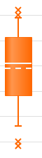
The <kendo-chart-series-item> component is missing settings for median and mean elements rendered by Box Plot series.
These are the two lines within each box (dashed line is mean):
Expected behavior
These series elements should be customizable and should accept an object containing color, width, dashType and opacity.
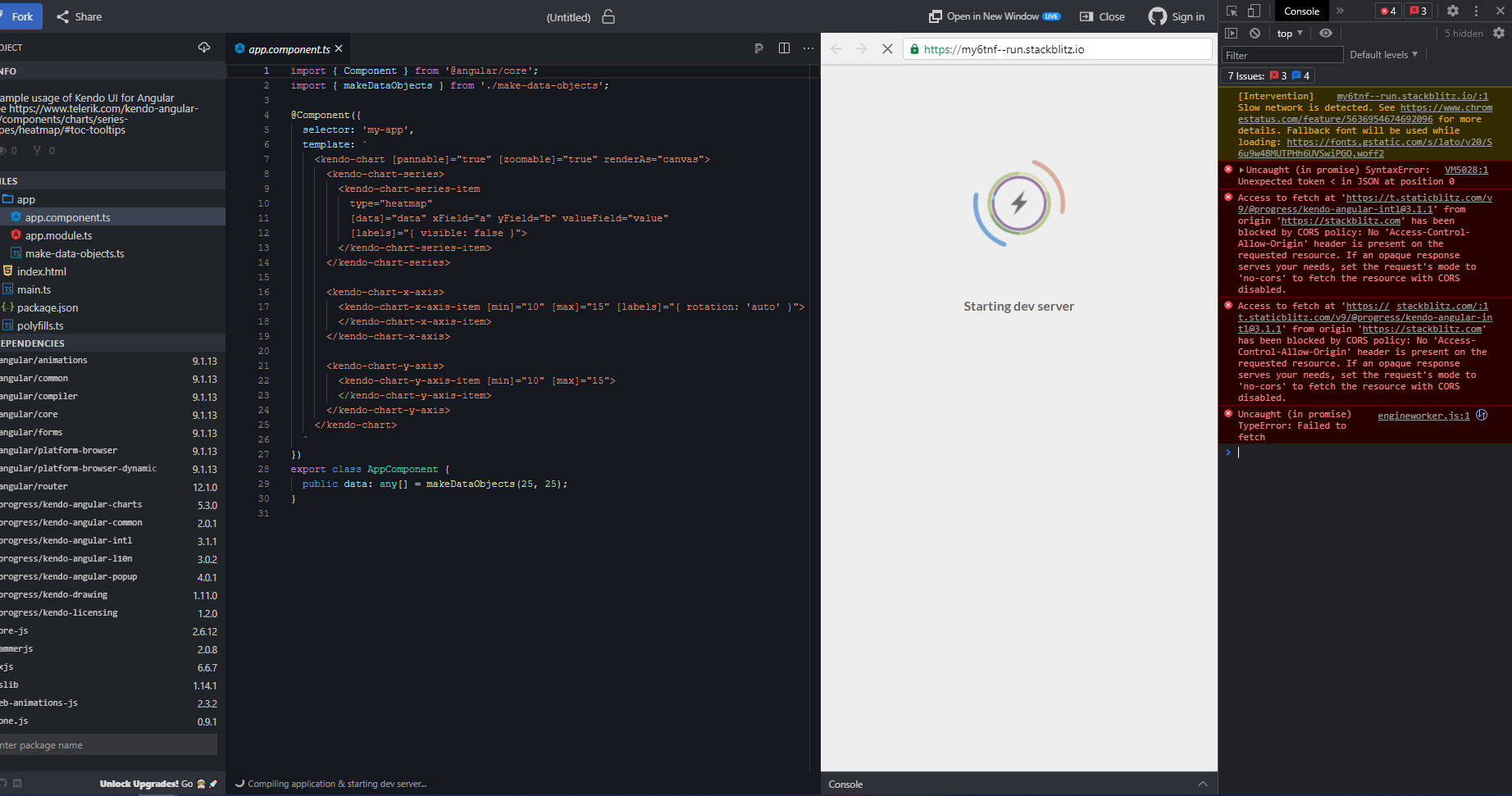
Hi,
This documentation Stackblitz demo is broken (see screenshot below for details).
Hi Team
I was using Kendo UI for Angular to render a Sankey chart.
I checked with the technical support and currently there is no way to adjust the width of link lines in Sankey Chart API for Angular.
In many cases because of data , the link lines appear too big for the whole canvas and does not look good, leading me to use another chart types or alternate libraries.
Request you to please look into this and provide a way as soon as possible.
Thanks
Mohit