Severity: Sev2 (High)
Test Environment: OS: Windows 11 22H2
OS Build: 23620.1000
Pre-Requisite: Set browser zoom level to 400% and display resolution: 1280x1024 (or) In dev Tools set the resolution to 320*256.
Repro steps:
1.Open URL: http://www.telerik.com/kendo-ui in edge browser.
2.Navigate to 'Kendo UI for Angular ' tab item and invoke it.
3.Navigate to the Angular chart control and invoke it.
4.In left navigation pane click Scatter control under 'series types'.
5.Navigate to 'Scatter Plot Chart'.
6.Verify whether X-axis is getting overlapped while resizing the page upto 400% of zoom or not.
Actual Result:
X-axis is getting overlapped while resizing the page upto 400% of zoom.
Expected Result:
X-axis should not get overlapped when browser zoom level set to 400%.
Hi,
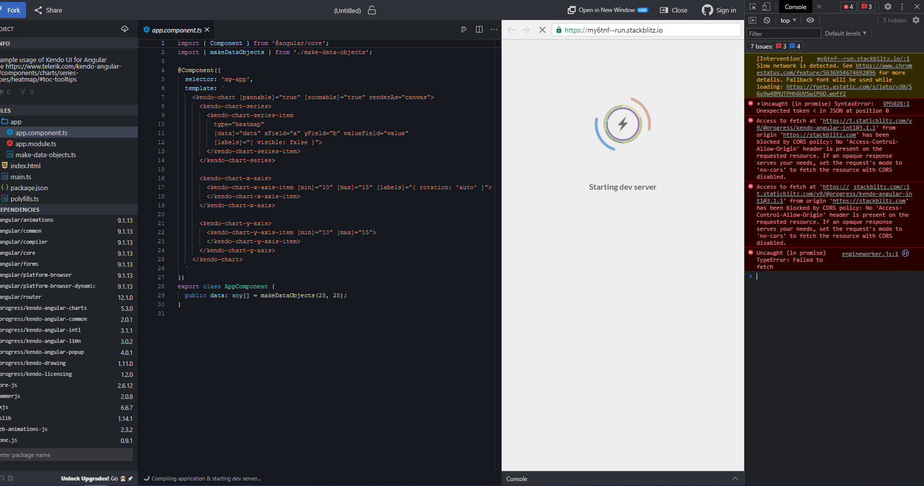
This documentation Stackblitz demo is broken (see screenshot below for details).
Hi,
Please provide an ability to set the axis range in the drag/zoom events.
Thanks
Expected: Clicking on an item in the legend is supposed to toggle it's visibility.
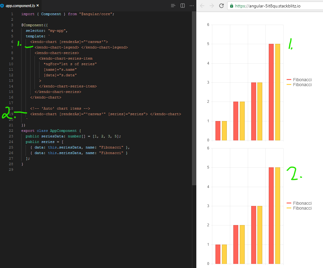
Using kendo-angular-charts 5.1.0, if you add a series input, this does not happen. A full, minimal reproduction of this issue is available At the StackBlitz link below. The top chart has no issues (hides series upon clicking) while the bottom does.
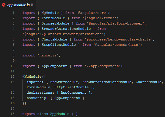
https://stackblitz.com/edit/angular-5it8qu?file=app%2Fapp.module.ts
Screenshots of above repro:
It appears that there is a line deep in the codebase that says:
const seriesComponent = this.seriesComponents.get(index);
if( !seriesComponent ){ return; }
seriesComponent.toggleVisibility();
And the seriesComponents array is empty when you use the [series] binding.
We even went so far as to bind to the legend click event and toggle the visibility myself, but it is 100% ignored.
It was something like:
public onLegendClick(event: LegendClickEvent){
  event.series.visibility = !event.series.visibility;
  event.source.refresh();
  event.source.changeDetector.markForCheck();
}
Calling refresh did redraw the chart, but it was still visible/enabled. Even though digging into it with ng.getComponent on the kendo-chart, and looking at the series, it clearly showed series[0].visible to be false.
I had to make an assumption on version for this ticket since the dropdown on the bug report doesn't list 5.1.0. I wouldn't mind tips on understanding how to match up your marketing version name with your npm version. I spent 20 minutes looking around for that, but your versioning doc and release history don't seem to have anything about the actual version numbers used by package management.
I want to align the Chart Plot Area on the left side (similar to the position property of the Legend component).
Currently, the same can be achieved only with the Drawing API in render event handler. Here is an example:
https://stackblitz.com/edit/angular-ucwo6p
Providing a built-in position option for alignment of the Plot Area will be an easier and intuitive appraoch.
Thanks.
Please provide the Charts selection functionality for vertical category axis as well.
thank you
It would be great if your pan and zoom had sliders to more easily navigate a long duration chart.
See these couple examples: https://www.amcharts.com/demos/line-chart-with-range-slider/ https://www.amcharts.com/demos/zoomable-value-axis/
Please see the attached screenshot.
On the leftmost side, the donut chart on the top has dark blue color (Oil). And i am using the same color for the bubble chart below. But the color on the bubble is not showing dark blue but lighter one. Interestingly if i mouse over on the bubble. the color turns dark blue. how can we make it show the right color(dark blue)? and only show lighter blue when mouse over?
this is my template in case you need it.
<kendo-chart (seriesClick)="onSeriesClick($event) " style="height:800px">
<kendo-chart-series>
<kendo-chart-title text="Efficent Hedging: M-risk by Commodity ({{position}} Portfolio)" [font]="font"></kendo-chart-title>
<kendo-chart-series-item [labels]="{ visible: true, content: 'test', color: 'white', background:'none'}" [color]="barColor" type="bubble" [data]="data" xField="x" yField="y" sizeField="y" categoryField="category">
<kendo-chart-series-item-tooltip>
<ng-template let-value="value" let-category="category" let-dataItem="dataItem" style="white-space: pre-line">
<div style="white-space: pre-line">{{tooltip(dataItem )}} </div>
</ng-template>
</kendo-chart-series-item-tooltip>
</kendo-chart-series-item>
<kendo-chart-x-axis title="xx">
<kendo-chart-x-axis-item [title]="{ text: 'Liquidity Premium (cost in cents to hedge 1$ of M-risk) ', font: font }" [labels]="{ format: '{0:N0}' }">
<kendo-chart-x-axis-item-labels format="{0:N0}" [skip]="1" rotation="auto">
</kendo-chart-x-axis-item-labels>
</kendo-chart-x-axis-item>
</kendo-chart-x-axis>
<kendo-chart-y-axis title="yy">
<kendo-chart-y-axis-item [title]="{ text: 'M-risk ($MM) ', font:font }" [labels]="{ format: '{0:N0}' }">
</kendo-chart-y-axis-item>
</kendo-chart-y-axis>
<kendo-chart-legend [visible]="true">
</kendo-chart-legend>
</kendo-chart-series>
</kendo-chart>
Please provide a global Charts font property that allows to set the font for all Chart elements.
Thank you.
Hi,
I'd it would be great if Kendo offered a way to build 2D density plot, even myabe somthing similar to a seaborn https://python-graph-gallery.com/82-marginal-plot-with-seaborn/
When the chart is configured to use the selection zoom. One must press the Shift-Key and select an area inside the chart to zoom.
I the chart shows tooltips, in most cases the tooltip pops up under the cursor and it is not possible to select an area.
The tooltip shoud be disabled, when the shift-key (or the configured key) is pressed inside the chart area.
Enabling Shift-key zooming in the stockChart produces an exception when the user Zooms.
I was told by T. Tsonev that this feature is not supported in the stockChart.
Here is a example:
https://stackblitz.com/edit/angular-gmoekv-rwu28c?file=app/app.component.ts
We have a case with a chart with values: Date-Value that only applies to working days.
Non of the current options of missingValues ("gap" | "interpolate" | "zero") suits us. Interpolate is the closest option but it pretends to have 2 additional points (Sat & Sun) between Friday and Monday while we prefer just to connect directly Friday and Monday so both label and chart-line shape showns that 4 weeks (28 days) data based chart is based on 20 points and not 28 points (20 real points and 8 interpolated points).
Can this be achived currently? If not can you extend missingValues with additonal option (eg. "ignore") to do as explained above?
Thanks,
Tomasz
Can you implement a new chart like the below reported?
It's a bubble chart without considering the xaxis


https://bl.ocks.org/alokkshukla/3d6be4be0ef9f6977ec6718b2916d168
Charts that use one or more value axis should expose the means to specify which values on that axis are labeled, instead of basing the labels on the min value of the axis and the major unit.

Ex, using the Angular syntax:

<kendo-chart-value-axis-item
  min="0"
  max="10"
  [labelsAt]="[2.5, 4, 7]"
>

yielding an axis like

----------|------|------------|------------
          2.5     4             7
Organisation Chart Like Web form. kindly provide this control very helpful
Provide the animation once select or deselect the legend the visible line in chart should rerender with animation
I have the following data:

Price   Downloads
59      10
62      15
69      30
70      10
75      25
78      30

I want to present the data in a chart in such a way that the Price are grouped together and the Downloads have their medians.

So it would be:
< 59:   10
61-70:  (Median of 62, 69 and 70 above)
71-80:  (Median of 75 and 78 above)

X-axis would be the Price then Downloads on Y-axis.

I can create the median but I just want to be able to group the X-axis.


