Please repeat the following steps to reproduce this critical accessibility issue:
- Go to https://www.telerik.com/kendo-angular-ui/components/editor#angular-editor-example
- In the Angular Editor Example. click in the editor and type one letter to enable the "Undo" toolbar button
- Navigate to toolbar via Shift+Tab key
- Use the left or right arrow key to navigate to "Undo" button
- Use Enter to trigger the "Undo" button which should then re-focus the editor and disable the "Undo" button
- Immediately press Shift+Tab key to navigate back to the toolbar with the "Undo" button disabled
Expected behaviour: The disabled "Undo" button is focused so that toolbar navigation with left or right arrow keys is enabled.
Experienced behaviour: The toolbar is permanently unfocusable with keyboard navigation and the element (theme selector) before the toolbar is focused. It is no longer possible to navigate to any buttons in the toolbar with Tab or Shift+Tab at this point. This happens with any toolbar button that becomes disabled after triggering such as the "outdent" button.
NOTE: The expected behaviour actually works in the jQuery Editor (https://demos.telerik.com/kendo-ui/editor/all-tools), so the Angular Editor should be fixed to match.
Hi,
When the first day of the week is changed dynamically through a custom IntlService, the Calendar weekday headers are updated, but the date cells are not repositioned. (The first day is changed as described in your guide: https://www.telerik.com/kendo-angular-ui/components/knowledge-base/calendar-first-day )
Reproduction (forked from your example): https://stackblitz.com/edit/angular-tqvypgwg
Click on "Set first day to Monday ": the weekday headers are updated to start with Monday, but the date cells remain in their previous positions.
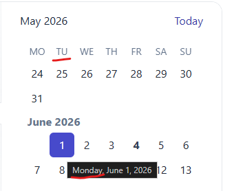
Best regards,
Michael
When the user wants to select a date, the filter closes up and the user is not able to select any date from the calendar.
The issue is happening on tablet device in portrait mode and we found out that it's happening on your documentation too. To reproduce the issue, please go to the "Angular Grid Filter Menu" in your documentation:
https://www.telerik.com/kendo-angular-ui/components/grid/filtering/filter-menu/
Please open the dev tools and set the browser on any tablet portrait size or use Galaxy Tab S4.
In your first example (Angular Grid Filter Menu), please click on the "Date" filter in the grid. When the popup opens up, please click on the calendar icon
of the date input field.
When the calendar shows up, try to select any date. You'll see that the filter closes up and the user is not able to select any date. Demo video attached for reference.
Please fix this bug as we support Samsung Galaxy tablet devices and we're using this feature in our project.
You're docs say
Open the example in a new window to evaluate it with Axe Core or other accessibility tools. for the Kendo angular grid
When i do that i see the attached error, which is the same issue i get in our product when running playwright axe
That suggests to me that it is not WCAG 2.2 compliant
Ensure elements with an ARIA role that require child roles contain them
more informationElement Location:
.demo-frame.loaded.demo-module--wrap--718a6 > .demo-module--demoWrap--d1437 > .demo-module--explorerWrap--4bf1f.flex-grow-1 > .demo-module--demoBody--97eee > iframe #k-fbe44131-4768-4755-93c3-e321b714780e<div role="grid" kendodragtargetcontainer="" kendodroptargetcontainer="" mode="manual" class="k-grid-aria-root" id="k-fbe44131-4768-4755-93c3-e321b714780e" aria-label="Data table" aria-rowcount="62" aria-colcount="5">To solve this problem, you need to fix the following:
Element has children which are not allowed: div[tabindex]
Related Node
In firefox, open the Kendo Radio Button documentation and slowly resize the window (https://www.telerik.com/kendo-angular-ui/components/inputs/radiobutton)
The radio button will kind of jiggle around and occasionally the white dot in the radio button will become off-center.

This also seems to happen in response to some material bouncy (cubic-bezier) animation transitions.
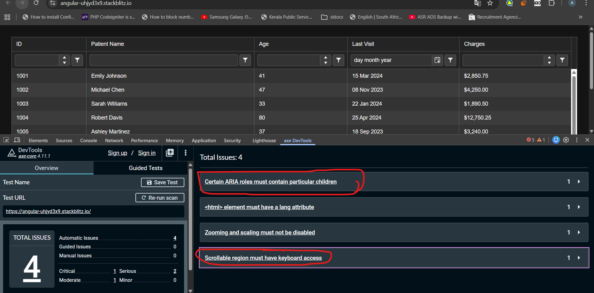
I have tested kendo grid accessibility with AXE Dev tool. Found following errors that seems difficult to fix.
1)Certain ARIA roles must contain particular children
2)Scrollable region must have keyboard access
Any suggestion to fix these above-mentioned issues could be very helpful. Noticed these issues even exist in kendo grid demos published in kendo documentation. Check the link below
stack blitz link : https://stackblitz.com/edit/angular-uhjyd3x9?file=src%2Findex.html
When a tooltip of a dialog is shown and the dialog is closed, the tooltip is still present and is moved into the top left corner.
We use e.g. `kendo-dialog-titlebar` and the close button has a tooltip.
Hi,
if I use both the features locked columns and sticky rows, the sticky rows do not stick in the locked columns.
For me it would be logical if they would stick there too (now the UI looks inconsistent):
Reproduction (forked from your example): https://stackblitz.com/edit/angular-wak7v99i
Can you please take a look at it?
Best regards,
Michael
Hi,
if I change the [placeholder] input on a kendo-editor, the changes are not reflected.
Reproduction (forked from your example): https://stackblitz.com/edit/angular-uqbchubd
Can you please take a look at it?
Best regards,
Michael
The DrawerAnimation interface isn't exposed in the index file.
DrawerItem, DrawerMode, and DrawerPosition are all exported but DrawerAnimation is missing.
Hi ,
I want the kendoGridFocussable to apply the FocusableDirective on an anchor tag. This should allow the user to reach the anchor element using only the arrow keys without pressing Enter. (Example : Please, check out the following StackBlitz demo: https://stackblitz.com/edit/angular-rqqzam)
Regards,
Uzma
The directive `kendoGridColumnChooserTool` does not work correctly when having columns which are grouped. See this example: https://stackblitz.com/edit/angular-r9duqpcn?file=src%2Fapp%2Fapp.component.ts
- It shows that 0 items are selected ("0 Selected items") - This is incorrect because all columns are selected by default. In the example above, I would expect it shows that 4 items are selected.
- When unselecting an item in the list (popup), it does not actually hide any column.
- When using directive `kendoGridToolbarTemplate` with `kendo-grid-column-chooser` component, it works as expected. I would expect that `kendoGridColumnChooserTool` directive would work (behave) exactly the same way.
import { Component } from '@angular/core';
import { FormsModule } from '@angular/forms';
import {
  KENDO_GRID,
  KENDO_GRID_EXCEL_EXPORT,
  KENDO_GRID_PDF_EXPORT,
} from '@progress/kendo-angular-grid';
import { KENDO_TOOLBAR } from '@progress/kendo-angular-toolbar';
import { KENDO_LABELS } from '@progress/kendo-angular-label';
import { KENDO_INPUTS } from '@progress/kendo-angular-inputs';
import { KENDO_BUTTONS } from '@progress/kendo-angular-buttons';
import { Product } from './model';
import { products } from './products';

@Component({
  selector: 'my-app',
  standalone: true,
  imports: [
    FormsModule,
    KENDO_GRID_EXCEL_EXPORT,
    KENDO_GRID_PDF_EXPORT,
    KENDO_GRID,
    KENDO_BUTTONS,
    KENDO_TOOLBAR,
    KENDO_LABELS,
    KENDO_INPUTS,
  ],
  template: `
    <kendo-grid
      [kendoGridBinding]="products"
      [pageSize]="5"
      [pageable]="true"
      [sortable]="{ mode: 'multiple' }"
      [style.width.%]="gridWidth"
    >
      <ng-template kendoGridToolbarTemplate position="bottom">
        <kendo-grid-column-chooser></kendo-grid-column-chooser>
      </ng-template>

      <kendo-toolbar overflow="scroll">
        <kendo-toolbar-button kendoGridColumnChooserTool></kendo-toolbar-button>
      </kendo-toolbar>

      <kendo-grid-column-group title="TestA">
      <kendo-grid-column
        field="ProductName"
        title="Product Name"
      ></kendo-grid-column>
      </kendo-grid-column-group>

      <kendo-grid-column-group title="TestB">
      <kendo-grid-column
        field="UnitPrice"
        filter="numeric"
        title="Price"
      ></kendo-grid-column>
      <kendo-grid-column
        field="Discontinued"
        filter="boolean"
        title="Discontinued"
      ></kendo-grid-column>
      <kendo-grid-column
        field="UnitsInStock"
        filter="numeric"
        title="Units In Stock"
      ></kendo-grid-column>
      </kendo-grid-column-group>
    </kendo-grid>
  `,
  styles: [
    `
      .example-info {
        background: rgba(83, 146, 228, 0.1);
        border-radius: 2px;
        margin: 10px auto 10px auto;
        padding: 15px;
        border-left: 4px solid #5392e4;
        font-size: 14px;
      }
    `,
  ],
})
export class AppComponent {
  public gridWidth: number = 100;
  public products: Product[] = products;
}
momentjs is a widely used date library which makes handling dates much more comfortable, and all Date components should support it
Add functionality to the Java Spring Boot sample application to support server-side data operations, such as sorting, filtering, and pagination. Currently, the demo uses the process method to do the operations on the client.
https://github.com/telerik/kendo-angular/tree/master/examples-standalone/kendoangular-java-integration
In the Kendo ComboBox, the selection part is not working with shadow dom.
1. Reproduction:
Please look at the below links,
With ShadowDOM:
https://stackblitz.com/edit/angular-evkasb?file=app%2Fapp.component.ts
Without ShadowDOM:
An example is provided in the below link under 'ENABLING SUGGESTION' section
https://www.telerik.com/kendo-angular-ui/components/dropdowns/combobox/suggestions/
Expected Result:
When user type 'C', the first word starts with C in the list 'Croatia' is suggested and 'roatia' is selected. But as soon as I type 'y' next to 'c', the combo box is suggesting 'Cyprus' and 'prus' should be selected
Actual Result:
As soon as I type the first word starts with C in the list is 'Croatia' is populated in the Combobox and 'roatia' is NOT selected. So the user cannot type ‘y’ in this case. But the user wants to select ‘CYPRUS’ but 'Croatia' is filled as the input and Cyprus is not suggested.
I have attached the video for the difference between with/without shadow dom.
Also, If you need any additional information, I have created a support ticket:
Hello Support,
There is a feature request for this, but I see this as a bug. The Agenda view in the scheduler is advertised to work perfectly on mobile, but I would expect to see the event column one way or another. Now you can only see timeslots, which is not that useful. Can you fix it by making the event column available, maybe as part of the time as text or some other solution.
Ran this on StackBlitz
import { Component } from '@angular/core';
import {
  LegendLabelsContentArgs,
  SeriesClickEvent,
} from '@progress/kendo-angular-charts';
import { IntlService } from '@progress/kendo-angular-intl';

@Component({
  selector: 'my-app',
  template: `
    <kendo-chart
      (plotAreaClick)="onClick($event)"
      [transitions]="false"
      title="World Population by Broad Age Groups"
    >
      <kendo-chart-legend position="bottom"></kendo-chart-legend>
      <kendo-chart-series>
        <kendo-chart-series-item
          type="donut"
          [data]="pieData"
          field="value"
          categoryField="category"
          explodeField="exploded"
          [labels]="{ visible: true, content: labelContent }"
        >
        </kendo-chart-series-item>
      </kendo-chart-series>
    </kendo-chart>
  `,
})
export class AppComponent {
  public pieData: Array<{
    category: string;
    value: number;
    exploded: boolean;
  }> = [
    { category: '0-14', value: 0.2545, exploded: false },
    { category: '15-24', value: 0.1552, exploded: false },
    { category: '25-54', value: 0.4059, exploded: false },
    { category: '55-64', value: 0.0911, exploded: false },
    { category: '65+', value: 0.0933, exploded: false },
  ];

  constructor(private intl: IntlService) {
    this.labelContent = this.labelContent.bind(this);
  }

  public labelContent(args: LegendLabelsContentArgs): string {
    return `${args.dataItem.category} years old: ${this.intl.formatNumber(
      args.dataItem.value,
      'p2'
    )}`;
  }

  public onClick(event: any): void {
    console.log('Click');
  }
}
When the event is seriesClick, it works as expected, and if I change the type to bar, it works as expected, but when it's as shown as above, the onClick event isn't triggered.
As I have donuts/pies that might not have data in it, I needed to use plotAreaClick (which I have done for the bar charts)
Thanks,