- Hit enter link https://angular-kendo-dropdown-list.stackblitz.io/
- Tab to 'Run project' button and press ENTER to activate it.
- Tab to the “Select gender:” dropdown.
- Run fastpass in Accessibility insights for web extension
Ensures elements with an ARIA role that require child roles contain them
Fix ONE of the following:
Required ARIA children role not present: group, option
Element has no aria-busy="true" attribute
User Impact:
When adding a filter to a grid, there is no way to define "case insensitivity" for the oData filter query.
There is a property in the Data Query library (toLower) but it seems only to work for the value and not accessible from grid.
This Feature Request is to have the ability to do case insensitive queries via the query string and not in the API.
Built-in editors lack the option to set accessible labels. This can be worked around by declaring an editor template.
A built-in setting for the label would be nice to have. The column title can be used as a default.
Reproduce the bug with
import { Component } from "@angular/core";

@Component({
  selector: "my-app",
  template: `
    <button (click)="show = !show">Show/hide</button>
    <ng-container *ngIf="show">
      <div class="example-config">
        Selected value is: {{ value | kendoDate: "MM/dd/yyyy" }}
      </div>
      <div class="example-wrapper" style="min-height: 400px">
        <p>Select a date:</p>
        <kendo-datepicker
          [(value)]="value"
          fillMode="outline"
        ></kendo-datepicker>
        <p>
          (use Alt+↓ to open the calendar, ← and → to navigate, ↑ to increment
          and ↓ to decrement the value)
        </p>
      </div>
    </ng-container>
  `,
  styles: [
    `
      kendo-datepicker {
        width: 170px;
      }
    `
  ]
})
export class AppComponent {
  public show = false;
  public value: Date = new Date(2000, 2, 10);
}
error displayed:
"TypeError: Cannot read properties of undefined (reading 'nativeElement')
at set fillMode [as fillMode] (progress-kendo-angular-dateinputs.mjs:9186:53)
at Object.ngOnChangesSetInp"
in file
node_modules/@progress/kendo-angular-dateinputs/fesm2020/progress-kendo-angular-dateinputs.mjs
at
 /**
     * Sets the fillMode of the component.
     *
     * The possible values are:
     * * `solid` (Default)
     * * `flat`
     * * `outline`
     * * `none`
     *
     */
    set fillMode(fillMode) {
        this.renderer.removeClass(this.wrapper.nativeElement, getFillModeClass('input', this.fillMode));
        this.renderer.removeClass(this.toggleButton.nativeElement, getFillModeClass('button', this.fillMode));
        this.renderer.removeClass(this.toggleButton.nativeElement, `k-button-${this.fillMode}-base`);
        const newFillMode = fillMode ? fillMode : DEFAULT_FILL_MODE;
        if (newFillMode !== 'none') {
            this.renderer.addClass(this.toggleButton.nativeElement, getFillModeClass('button', newFillMode));
            this.renderer.addClass(this.toggleButton.nativeElement, `k-button-${newFillMode}-base`);
            this.renderer.addClass(this.wrapper.nativeElement, getFillModeClass('input', newFillMode));
        }
It works when the code changes in
import { AfterViewInit, Component } from "@angular/core";

@Component({
  selector: "my-app",
  template: `
    <button (click)="show = !show">Show/hide</button>
    <ng-container *ngIf="show">
      <div class="example-config">
        Selected value is: {{ value | kendoDate: "MM/dd/yyyy" }}
      </div>
      <div class="example-wrapper" style="min-height: 400px">
        <p>Select a date:</p>
        <kendo-datepicker
          [(value)]="value"
          [fillMode]="fillMode"
        ></kendo-datepicker>
        <p>
          (use Alt+↓ to open the calendar, ← and → to navigate, ↑ to increment
          and ↓ to decrement the value)
        </p>
      </div>
    </ng-container>
  `,
  styles: [
    `
      kendo-datepicker {
        width: 170px;
      }
    `
  ]
})
export class AppComponent implements AfterViewInit {
  public show = false;
  public value: Date = new Date(2000, 2, 10);

  public fillMode = "solid";

  ngAfterViewInit() {
    Promise.resolve().then(() => (this.fillMode = "outline"));
  }
}
It only appears in DateInputs Components, other Inputs work well
Hi, Team!
Currently, I am using the Column Menu functionality of the Grid component and would like to be able to set a default value/placeholder of the input fields in the Filter section.
Hi,
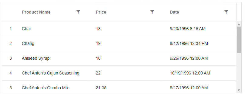
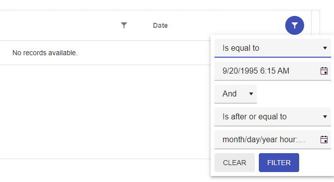
Filter operator 'equalTo' doesn't work properly with columns that has DateTime format. I set 'format' property on column, so filter will have the same format, but after providing exact same day and time the result is "no records ".
Here is a reproduction in Stackblitz based on one of the examples from https://www.telerik.com/kendo-angular-ui/components/grid/filtering/filter-menu/.
Description
We are using RecurrenceEditor :
<kendo-recurrence-editor [formControl]="formGroup.get('recurrency')">
</kendo-recurrence-editor>
Repro Steps
Context : Date = 2023-03-06
- Double click on the 2023-03-09
- The editor is open :
- We choose the repeat rule Monthly :
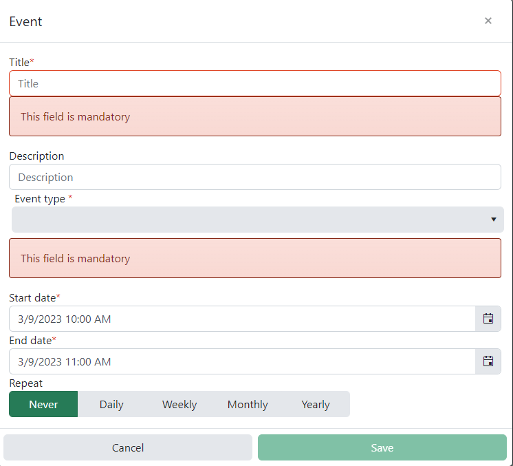
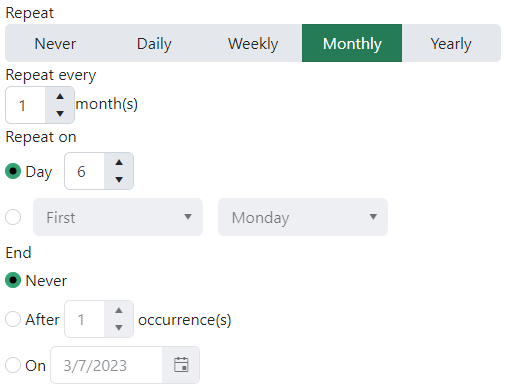
We can see the context of RecurrenceEditor is 2023-03-06 instead of 2023-03-09.
Expected Result
When we create an event on different date of today, the RecurrencyEditor context should the creation date.
- The input "Day" default value should be 9
- The input "On" default value should be 2023-03-10
- First Monday => First Thuesday
Same problem with other repeat rule (Daily, Weekly and Yearly)
https://stackblitz.com/edit/angular-botsaf?file=src/app/app.component.ts
The internal element has a calculated width - but it only grows in value if slider width changes (responsive or even in CSS with media queries etc).
It permanently stays at the largest size.
Currently the Treelist uses the `k-grid-md` class by default and does not provide a way to change this.
Since the Treelist uses looks and feels just like the Grid component and it uses the same classes, it should (imo) provide the same options for sizing as the Grid component.
I need an Angular control works pretty much like Kendo-JQuery Autocomplete control or Telerik Asp.Net Auto Complete text box.
I understand that Kendo-Angular currently have an "auto complete" control based on a dropdown. However, it is missing some core features I am looking for:
1. It needs to accept multiple inputs.
2. It needs to eliminate unmatched results based on user input.
3. It needs to call a server side API to get the available items dynamically after input changes.
The current Kendo-Angular AutoComplete MIGHT have the 3rd point since I have not yet to try with all the events, but I am pretty sure that the first 2 points are not there. If they do exist, please provide demo or documentation link.
Thank you.
Convert YAML file to JSON, so they can be used to translate the built-in messages in the components to desired locale.
For example: It would be convenient to use this YAML file if it was available in JSON to translate the messages to German instead of creating my own custom message service.
Providing the developers with the options to configure various widths for different columns, as well as min-width, based on the supported features of the CSS Grid Layout, will be a nice enhancement enabling richer customization opportunities.
Current behavior
ToolbarComponent, DropDownButton and SplitButton utilize the PopupSettings of type:
interface PopupSettings {
    animate?: boolean;
    appendTo?: 'root' | 'component' | ViewContainerRef;
    popupClass?: string;
    anchorAlign?: Align;
    popupAlign?: Align;
    width?: number | string;
    height?: number | string;
}
For the overflow popup, they all work fine, but for the buttons:
- popupAlign
- anchorAlign
- height
- width
properties don't work.
https://stackblitz.com/edit/angular-jqhp2d?file=app/app.component.ts
Currently, the DropDownButton and SplitButton popup alignment can be changed, by using the align property of the Buttons PopupSettings type
https://stackblitz.com/edit/angular-jqhp2d-smtyhp?file=app/app.component.ts
Expected behavior
Create separate PopupSettings interface for the DropDownButton and SplitButton components to:
isolate the width and height options
to unify the PopupSettings of the Toolbar SplitBtn and DropDownBtn with the updated Buttons PopupSettings:
interface PopupSettings {
animate?: boolean;
appendTo?: 'root' | 'component' | ViewContainerRef;
popupClass?: string;
anchorAlign?: Align;
popupAlign?: Align;
width?: number | string;
height?: number | string;
}
Due to recent changes to kendoButton directive behaving like a component, this directive is no longer compatible.
This was important for buttons used in grid editing to extend the themes and styles of the kendoButton.
Now this however leads to
ERROR Error: NG0300: Multiple components match node with tagname button: ButtonComponent and AddCommandDirective. Find more at https://angular.io/errors/NG0300
In dialog, if we close it giving `false` as a result i.e.
```
this.dialog.close(false)
```
Actual return is empty object.
Additional thing is result itself in `DialogRef` is force-typed as `DialogResult` despite that actual `dialogRef.close()` allows us to return any value.In such case I'd understand mapping to empty object (probably some truthy-based if which maps to empty object) but then close method should also force-type taken argument. So can we return any value or not?
Ideally it should return `undefined` in case of no result value is provided (also mapped to empty object) and return `false` if we return `false`
Hi,
This feature request considers the Kendo Angular UI Grid component.
We use the builtin drag & drop columns reordering functionallity. When we try to drag a column to the edge of the visible part of the grid with a horizontal scroll the scroll does not adjust automatically so we cann't drag to column to a place outside of the horizontal visible area.
It would be nice if you could enable automatic horizontal Grid scroll when a grid column is reordered and dragged to the edge the visible column area.
Thanks,
Shai
The alternating grid rows got k-table-row-alt
.k-table-row-alt
.k-table-alt-row