When trying to use autocomplete, it falls short of what I would like to have. I presumed this to be on feature parity with MudBlazor offerings.
What I used before with mudautocomplete: label, value, style, reset value on empty text, coerce text, to string func, search func, required, required error, value changed, virtualize, max items. The way I use autocomplete box, is that user searches against a list of hundreds of thousands of elements, component querys against method, get's filtered reply that is displayed. When chosen, it binds the guid value, not the string. User also cannot submit their own option, only one from provided list.
Telerik autocomplete box does not provide those features, what other workarounds are there besides running with Mudblazor for time being?
The inputs now have DebounceDelay property but it will be useful to also have such functionality for other components that incorporate inputs - AutoComplete, for example.
I am loading data from the server based on the input that the user does. As it is not possible to predict how long the server takes to answer, it would be useful to only change the value after the user stops editing for about certain milliseconds.
I'm using the autocomplete control to bind a comlex model to it.
Binding a complex model is currently supported by the autocomplete control:
https://docs.telerik.com/blazor-ui/components/autocomplete/data-bind#bind-to-a-model
When selecting an item from this list, it is necessary to retreive the selected item.
It seems to me that at the moment the .ToString Method is called on the selected item.
That results in displaying type information at the UI and providing the type information when the "MyOnChangeHandler" function ist called ( 02.jpg, 03.jpg).
And because the OnChange event handler needs to implement a function with an object as a parameter ( 03.jpg ) I'm wondering how the selected item can retreived.
Instead ob providing a .ToString() - information when binding to a complex type you need to provide the selected item.
And by the way, when selecting an item the ItemTemplate ( 04.jpg ) seems to be ignored when displaying this selected item.
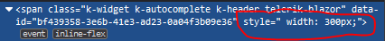
Please remove the hardcoded width and make default width 100% as in the other components.
---
ADMIN EDIT
I updated the title to be more generic - it should be about removing the inline width rule, and whether there will be a default value and what units it will use will be up to a more detailed research.
---
I want to implement throttle in the AutoComplete, for example. Basically when user types, I want to throttle for 1 second and after that whatever text is typed I want that to be searched.
===
Admin edit: Here is a KB article, which describes how to achieve this:
Debounce filter requests and apply minimum search string length
When using AutoComplete on Mobile devices, the onscreen keyboard pops up, and will mask the drop down list from the AutoComplete component. Yes, the Height of the dropdown list is controllable (px, em, etc.), but this is problematic with varying display sizes. For example, I was able to show a list of 6 lines on my phone, but when I demoed the App to the Chief Development Officer, his phone was older, smaller, and when the keyboard popped up, only 4 lines were visible! So embarrassing.
What I want to propose is to extend the AutoComplete component with a new Control called PopUpLines, where the MAX number of lines that can be displayed is set. In my example, I would set this value to 4 to make sure it works on the CDO's phone. However, the AutoComplete control would need to know what the screen size is, calculate how big a line is, and how many lines can be displayed without the on-screen keyboard masking the list. It would then display from 1 to PopULines worth of lines in the drop down box. This would insure that a on-screen keyboard never masks the AutoComplete list, destroying UI functionality.
When typing in the AutoComplete component, it defaults to the last visible line in the drop down list, if the item is greater than the window size. On mobile devices, this has a negative effect that the on-screen keyboard will mask the typed in entry if the list is too long. If the height of the dropdown list is accurate, it is not masked, but it is still at the bottom of the list. If you type a query into Google, the highlight item as at the top of the list, not the bottom.
1) I propose to change the default functionality of AutoComplete to display the closest match at the top of the dropdown box, not at the bottom.
2) I propose to add a new new control DefaultDisplayPosition=[First|Middle|Last] to give developers control over the UI experience.
To be clearer, you have a list that of X items. The AutoComplete window can display Y items. X can be >, < or = to Y. If X[selected] is < Y, it will be highlighted anywhere between Y[First] through Y[Last]. However, if it is >= Y[Last], then the highlighted selection is always the last item in the dropdown display. There should be an option to set the highlighted item to Y[First], Y[Middle], or Y[Last], maybe even Y[N] (not so sure about that). Again with all kinds of different mobile screen sizes, with the current default being Y[last], it can easily be hidden by the on screen keyboard.