In <TelerikTimePicker>, how can I enable format in the dropdown for minutes in two digits like 01, 02, 03, 04? Currently, I found these formats for Blazor Timepicker - https://demos.telerik.com/blazor-ui/timepicker/formats. All formats are showing single-digit minutes like 1, 2, 3, and 4.
I want to set the format in the dropdown for minutes to be two digits. Same as here https://demos.telerik.com/aspnet-mvc/timepicker/component-type.
By design, when the TimePicker (and other date/time pickers) is bound to a non-nullable value, pressing the clear button clears the input only and sets the component in invalid state. In this case, ValueChanged and OnChange events do not fire and the component keeps its old value until a new valid value is entered.
I want to catch when the user presses the clear button. Instead of clearing the input, I want to reset the value to 00:00:00, so the component is still in a valid state.
===
ADMIN EDIT
===
For the time being, you can disable the built-in clear button. Instead, add a custom button/span, use CSS to position it inside the picker's input and handle its onclick event: https://blazorrepl.telerik.com/QTabvxPz46eLPVvJ00.
This request can potentially be related to providing an option to also detect when the user clears the value via the keyboard.
The request applies to all pickers (DateInput, DatePicker, DateRangePicker, DateTimePicker).
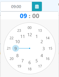
I would like a clockpicker something like screenshot below.
It´s easy and fast to use
The "SET" button is not visible when we open it and we are on the middle of the page: the button appears outside of the bottom of the page. So I have to close it, put the field to the top of the page, then open it again.
---
ADMIN EDIT
Some workaround, especially if most of your user base is on the same small form factor, is to use a bit of CSS to change the position of the dropdown to stick to the top of the viewport - this could potentially make it fit into screens as small as about 350x400px.
CSS
    /*you can tweak the media query to target only the resolutions you want*/
    @media(max-width: 500px) {
        .top-aligned {
            position: fixed;
            top: 0;
            left: 50%;
            transform: translate(-50%, 0%);
            /* you can also try translate(-50%, 50%) for a centered effect which may be better suited for laptop/tablet size */
        }
    }
Component
Selected time: @selectedTime
<br />

<TelerikDateTimePicker Min="@Min" Max="@Max" @bind-Value="@selectedTime"
                       Format="dd MMM yyyy HH:mm:ss" Width="250px"
                       PopupClass="top-aligned">
</TelerikDateTimePicker>

@code {

    private DateTime? selectedTime = DateTime.Now;
    public DateTime Min = new DateTime(1990, 1, 1, 8, 15, 0);
    public DateTime Max = new DateTime(2025, 1, 1, 19, 30, 45);
}
---
Hello,
For the most part, I think Telerik has the best library of Blazor controls and my team is happy with it. That said, the Time Picker control in particular falls short in terms of look/feel/user experience to some other libraries. In doing research for a project, most apps are using a clock-based standard. This results in less clicks and is more familiar and intuitive (especially on mobile). We would like to see a clock-based version of the time picker or an option to use this. Material also has a way to combine this with the date picker (to handle date time fields).
Is this (by chance) already in the works? I've included some examples below.
Material example: https://material-ui-pickers.dev/demo/timepicker
MudBlazor example: https://mudblazor.com/components/timepicker#basic-usage
Thanks!
- Joe