I need to be able to allow our users to tab into the dropdownlist control and open it with enter (similar to standard HTML select).
Here is also a sample from the W3 documentation to compare against: DropDownList keyboard support.
Currently, if I set a zoom level to the body/html different than 1 the DropDownList's popup is not positioned correctly.
Please provide support for proper rendering on different zoom/scale levels.
===
ADMIN EDIT
===
The request applies to all components that incorporate popup elements - for example, ComboBox, MultiSelect, DatePicker, TimePicker and more.
Hello,
i am trying to add a Clear Button inside the DropDownList-Component.
I tried to follow the instructions provided here: How do I add a Clear button to a DropDownList? in UI for Blazor | Telerik Forums respectiveley here: Telerik REPL for Blazor - The best place to play, experiment, share & learn using Blazor.
But unfortunateley, the button is never inside the component. It's always next to it or under the component.
In your example provided above, the button is inside the component.
I would love to have any solution for this one. A clear button is needed quite often.
I also have attached our custom component, where we use the Telerik DropDownList Component.
Thank you
When using the DropDownList component with less than seven items, there is extra whitespace:
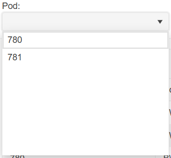
In terms of user experience, this extra whitespace is clutter as it takes up visual space yet serves no viable purpose to the user. Clutter gives an unfinished appearance and should be removed if possible.
You can remove the extra whitespace by specifying Height and MaxHeight in the DropDownListSettings render fragment:
<TelerikDropDownList Data="@_dropDownData" @bind-Value="@_selectedPod">
    <DropDownListSettings>
        <DropDownListPopupSettings Height="auto" MaxHeight="200px"/>
    </DropDownListSettings>
</TelerikDropDownList>
However, having to specify DropDownListSettings for every DropDownList component that has fewer than seven items is laborious and verbose. I would like there to be no extra whitespace in DropDownList components by default without having to specify DropDownListSettings.
Hello,
would it be possible to add "OnFocus" event to DropDownList as there is already "OnBlur" event?
Thanks
Hi,
We are using the DropDownList component as an inline editor in the grid, for managing a product hierarchy. Previously we were using the DropDownList with grouping enabled, without virtualization, but due to volume of data we now need to use virtualization.
This does not work with grouping at the moment.
At the bottom of this page it is mentioned that 'Virtual scrolling with grouping will be supported in a future version.'.
Any timeline on this feature?
KR,
Lennert
_close_crop.png)
Currently, a TextField value of empty string will produce a blank item in the dropdown.
On the other hand, a null TextField value will produce the fully qualified class name.
Here are possible workarounds: https://blazorrepl.telerik.com/myOlFpFb1465jW8E07
I am reaching out to suggest an enhancement to the existing filtering feature in the Telerik Blazor dropdown component. Currently, the filtering capability is quite useful, but it would be even more powerful if there was an event trigger during the filtering process. This event would allow developers to execute custom logic while a user is typing in the dropdown field. The ability to respond in real-time as the input changes would significantly enrich the interactivity and functionality of the dropdown, enabling more dynamic and user-tailored experiences. Implementing this feature could greatly enhance the flexibility and utility of the dropdown component. Thank you for considering this enhancement, and I eagerly anticipate its potential integration in future updates.
Kind regards,
Suryateja KONDLA
At the moment, typing with the keyboard focuses the first item that starts with the last letter you pressed. To focus the next one you should either use Down Arrow, or type the same letter again.
I would like it to behave like the regular <select> or like a combo box with filtering - typing characters quickly should highlight the item that begins with all those characters, instead of using only the first letter.
===
Admit edit: some keywords for better findability: DropDownList keyboard search filter accessibility
The DropDownList component is too basic to be used in complex environments. In the real world, no one is binding DropDownLists to List<string>, they are binding to complex datatypes, and the ability to do so has been present in MVC apps for a long time.
Given the following code, it is possible to bind to a List<object>, and two-way bind to the object that was selected.
	<select @onchange="@OnChangedAsync">
		<option></option>
		@if (DataSource != null)
		{
			@foreach (var item in DataSource)
			{
				<option @key="item" value="@optionValueFunc(item)" selected="@(item.Equals(SelectedItem))">@optionTextFunc(item)</option>
			}
		}
</select> #region Private Members
private Func<TSource, object> optionTextFunc;
private Func<TSource, object> optionValueFunc;
private TSource selectedItem = default(TSource);
#endregion
#region Public Parameters
/// <summary>
/// A List of objects to bind against.
/// </summary>
[Parameter]
public IList<TSource> DataSource { get; set; } = new List<TSource>();
/// <summary>
/// A lambda expression referencing the property containing the text to display to the end user. Example: @(c => c.DisplayName)
/// </summary>
[Parameter]
public Expression<Func<TSource, object>> OptionText { get; set; }
/// <summary>
/// A lambda expression referencing the property containing the value for this object, usually an identifier. Example: @(c => c.Id)
/// </summary>
[Parameter]
public Expression<Func<TSource, object>> OptionValue { get; set; }
/// <summary>
/// The item from the <see cref="DataSource" /> that has been selected.
/// </summary>
[Parameter]
public TSource SelectedItem { get; set; }
/// <summary>
/// The callback event required for two-way binding.
/// </summary>
[Parameter]
public EventCallback<TSource> SelectedItemChanged { get; set; }
#endregion
private async Task OnChangedAsync(ChangeEventArgs changeEventArgs)
{
await UpdateSelection(DataSource.FirstOrDefault(c => optionValueFunc(c).ToString() == changeEventArgs.Value.ToString()));
}
private async Task UpdateSelection(TSource item)
{
selectedItem = item;
await SelectedItemChanged.InvokeAsync(selectedItem);
}
protected override async Task OnInitializedAsync()
{
if (optionTextFunc == null && OptionText != null)
{
optionTextFunc = OptionText.Compile();
}
if (optionValueFunc == null && OptionText != null)
{
optionValueFunc = OptionValue.Compile();
}
await Task.CompletedTask;
}Would really appreciate it if you would consider adding this to the next release.
Hi,
Is it possible to implement search/look-ahead in the current version of the DropDown component? If not, will you be adding this feature soon?
Thank you.
Ben
Right now when a DropDownList has PopupHeight="Auto" the popup gets the height necesaary to display its items properly.
But when there are many items the popup also displays all items without a vertical scrollbar (maybe over the entire page and beyond), which is not good.
My suggestion would be to add a property for specifyig a "MaxPopupHeight" to limit the growth of the popup.
Also if "PopupHeight" is not specified it should take "Auto" as the default value instead of a static height in px, instead give the new "MaxPopupHeight" a limiting default value.
***Admin Edit***
Released in 3.0.0 through PopupSettings tag: https://docs.telerik.com/blazor-ui/upgrade/breaking-changes/3-0-0#popup-settings
***Admin Edit***
This will allow the dropdown to be large enough to fit a reasonable number of items without a scrollbar. Alternatively, you could limit it through a pixel value you can set, or through the MaxPopupHeight property if it gets implemented: https://feedback.telerik.com/blazor/1412653-maxpopupheight.
Hello everyone,
We have opened this Feature Request to gather your insights on the addition of disabled items for the DropDownList.
===
UPDATE: The associated built-in feature is the OnItemRender event, which can help style specific items without a template. Then, use the ValueChanged event to prevent selection of disabled items with the keyboard.
<TelerikDropDownList Data="@Products"
                     DefaultText="Select Product..."
                     OnItemRender="@OnDropDownListItemRender"
                     TextField="@nameof(Product.Name)"
                     ValueField="@nameof(Product.Id)"
                     Value="@SelectedProductId"
                     ValueChanged="@( (int? newValue) => SelectedProductChanged(newValue) )"
                     Width="200px">
</TelerikDropDownList>

@code {
    private List<Product> Products { get; set; } = new();

    private TelerikDropDownList<Product, int?>? DropDownListRef { get; set; }

    private int? SelectedProductId { get; set; }

    private void OnDropDownListItemRender(DropDownListItemRenderEventArgs<Product> args)
    {
        // args.Item is null for the DefaultText item
        if (args.Item != null && !args.Item.Active)
        {
            args.Class = "k-disabled";
        }
    }

    private void SelectedProductChanged(int? newValue)
    {
        var newProduct = Products.FirstOrDefault(x => x.Id == newValue);

        if (newProduct?.Active == true || !newValue.HasValue)
        {
            // select only active items or DefaultText
            SelectedProductId = newValue;
        }
        else
        {
            // skip disabled items during keyboard navigation
            var oldProductIndex = Products.FindIndex(x => x.Id == SelectedProductId);
            var newProductIndex = Products.FindIndex(x => x.Id == newValue);

            if (newProductIndex > oldProductIndex)
            {
                // skip forward
                SelectedProductId = Products[++newProductIndex].Id;
            }
            else
            {
                // skip backward
                SelectedProductId = Products[--newProductIndex].Id;
            }
        }
    }

    protected override void OnInitialized()
    {
        for (int i = 1; i <= 7; i++)
        {
            var active = i % 3 != 0;

            Products.Add(new Product()
            {
                Id = i,
                Name = (active ? "" : "Disabled ") + "Product " + i,
                Active = active
            });
        }

        base.OnInitialized();
    }

    public class Product
    {
        public int Id { get; set; }
        public string Name { get; set; } = string.Empty;
        public bool Active { get; set; }
    }
}
===
The example below shows the legacy approach to style items as disabled with DropDownList ItemTemplate and prevent clicks with @onclick. Again, use the ValueChanged event to skip disabled items during keyboard navigation.
<TelerikDropDownList Data="@Products"
                     TItem="@Product"
                     TValue="@(int?)"
                     Value="@SelectedProductId"
                     ValueField="@nameof(Product.Id)"
                     TextField="@nameof(Product.Name)"
                     DefaultText="Select Product..."
                     ValueChanged="@( (int? newValue) => SelectedProductChanged(newValue) )"
                     Width="200px">
    <DropDownListSettings>
        <DropDownListPopupSettings Class="disabled-items" />
    </DropDownListSettings>
    <ItemTemplate>
        @{ var p = context as Product; }
        <div class="item-div @( !p.Active ? "disabled" : "" )"
             @onclick:preventDefault="@(!p.Active)"
             @onclick:stopPropagation="@(!p.Active)">
            @p.Name
        </div>
    </ItemTemplate>
</TelerikDropDownList>

<style>
    /* remove default item padding to prevent selection outside the template div */
    .disabled-items .k-list-item {
        padding: 0;
    }
    /* add back inner padding */
    .disabled-items .item-div {
        padding: 4px 8px;
    }
    /* style disabled items */
    .disabled-items .disabled {
        cursor: not-allowed;
        width: 100%;
        color: #ccc;
    }
</style>

@code {
    private List<Product> Products { get; set; }

    private int? SelectedProductId { get; set; }

    private async Task SelectedProductChanged(int? newValue)
    {
        var newProduct = Products.FirstOrDefault(x => x.Id == newValue);

        if (newProduct?.Active == true || !newValue.HasValue)
        {
            // select only active items or DefaultText
            SelectedProductId = newValue;
        }
        else
        {
            // skip disabled items during keyboard navigation
            var oldProductIndex = Products.FindIndex(x => x.Id == SelectedProductId);
            var newProductIndex = Products.FindIndex(x => x.Id == newValue);

            if (newProductIndex > oldProductIndex)
            {
                // skip forward
                SelectedProductId = Products[++newProductIndex].Id;
            }
            else
            {
                // skip backward
                SelectedProductId = Products[--newProductIndex].Id;
            }
        }
    }

    protected override void OnInitialized()
    {
        Products = new List<Product>();

        for (int i = 1; i <= 7; i++)
        {
            var active = i % 3 != 0;

            Products.Add(new Product()
            {
                Id = i,
                Name = (active ? "" : "Disabled ") + "Product " + i,
                Active = active
            });
        }

        base.OnInitialized();
    }

    public class Product
    {
        public int Id { get; set; }
        public string Name { get; set; }
        public bool Active { get; set; }
    }
}
Is it possible to drop dropDownList from outside, for example after its data has been changed, without clicking on it ?
ADMIN EDIT:
This feature is also applicable to ComboBox, AutoComplete, Multiselect, Date and Time Pickers components.