Hi,
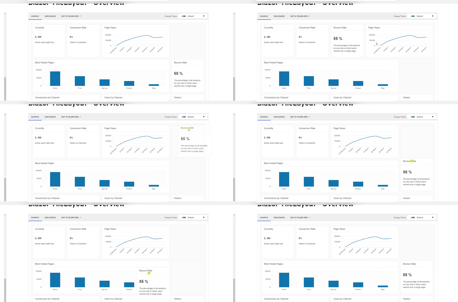
We would like to request a feature wherein we can drag the tile on empty spaces and triggers the reordering of tiles. To make it some kind of docking feature on the TileLayout.
So far the workaround we see to put the tiles on those empty spaces is when you drag the tile in between tiles (between conversion rate and page views tiles) and if you drag it again on the same row it will reorder fine. Another one is to drag the tile on another tile (drag into most viewed pages tile) it will reorder the dragged tile on that empty space beside the existing tile.
https://demos.telerik.com/blazor-ui/tilelayout/overview
Here's a sample of what we did:
Hey all, I just tried the big upgrade (VS 2020, .Net 6). During it, I moved from Telerik UI for Blazor 2.30. I've invested a lot of time into using this component and it came out as a non-starter in this release. After digging for a couple hours, I just kept it simple (see code).
Any time you put an @ inside a TileLayoutItem, it breaks - just freezes everything. So I can't tell you where it is coming from, but I can tell you it doesn't work. To reproduce, see the following code, but basically use "@someObject" as the value of an attribute of TileLayoutItem or inside Content/HeaderTemplate.
My use case is more complicated and I'm waiting for a mid-December pre-release (see ticket 1543513), but here's a way to reproduce (I hope)
Example:
<TelerikTileLayout Reorderable="true"
                   Resizable="true"
                   >
    <TileLayoutItems>
        @foreach (string name in Names)
        {
            <TileLayoutItem Class="builder">
                <Content>@name</Content>
            </TileLayoutItem>
        }
    </TileLayoutItems>
</TelerikTileLayout>

@code {
	public List<string> Names { get; set; } = new List<string> { "Sara", "Dan", "Frank", "Deuce" };
}While your existing TileLayout seems to be striving for this it doesn't seem to function as intuitively, or perhaps it is supposed to but has bugs? Ideally I'd like to have a layout component that mimics what I see in the Azure portal, however I realize from other feedback tickets you're not going to do that. The ability to have gaps really makes the user experience better. I understand things have to be 'touching' (eg I can't just place something off into the bottom right corner of the screen by itself) but being able to do something like you see in the attached gridstack_basic_demo_img1.jpg would be great.
It seems easy to get into an odd state using the TileLayout, even creating gaps where I don't want them and I'm unable to fix it. For example in telerik_tilelayout_img1.jpg you see your demo page, I have the "Bounce Rate" box with a gap above it and for whatever reason I can't even bring it UP to fill the gap (dragging it up the red arrow path and dropping it gets rejected and the box floats back to where it is in the img).
I really want to use your TileLayout but I think using it as-is would really frustrate my userbase. Do you have plans to improve it's functionality and overall user experience?
Thanks for your consideration

