Pager control (standalone or embeded in grid) does not support appearence customization of containing controls like the textbox for page selection or the page size dropdown list. When the whole application uses for example outline fill mode, it seems strange and odd to have the grid's pager or standalone pager always in solid mode.
It would be nice to have options to customize the appearence of the containing textbox and dropdown list controls.
We have grids with the pager enabled. Some grids are within an EditForm.
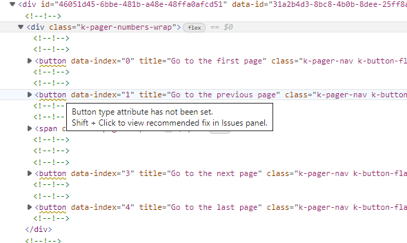
The pager <button> elements do not have a "type" attribute, so clicking them causes the form to be submitted. They should be type="button" and not submit the form.
We do not use a GridPagerTemplate.
If you use the pager whether in the grid, or on its own and the total number of rows in the underlying data source exactly matches the selected page size, the drop down will be displayed as blank. This will only occur when there is no null "All" option in the list of page sizes. By the looks of it, I would guess that there is code to select "All" whenever the total matches the selected page size option, but it selects nothing when the "All" option isn't in the list. The functionality should select the page size that was selected by the user, not try to reset itself to All if the number of rows equals the page size. The following repl shows the bug:
https://blazorrepl.telerik.com/mxOIEBPW09nKgO9A35
When you run the repl, change the page size to 5, and then back to 10. You will see that the dropdown selects a blank item. It should stay with 10.
Hi.
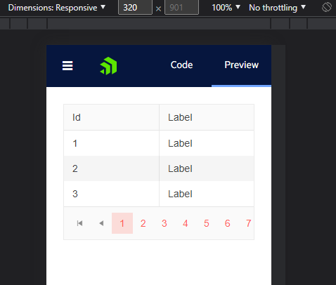
When you have a TelerikGrid, with on OnRead event making an async call, the pager that comes with TelerikGrid doesn't show the mobile view when on a narrower device.
I created a blazor repl here: https://blazorrepl.telerik.com/mxOPbEuZ29PQRAQk02
If you view the repl in browser, open dev tools and toggle the device toolbar, and set your viewport width to something around 320px. If it loads into the preview right away, after having been first rendered on normal screensize, then the pager will adapt. To see the bug, go to the code tab, then the preview tab to have it do its initial render on mobile width. You will see something like this:
This is an issue live currently on my own websites, which had been reported to me by customers. I believe this only occurs when using the Grid's OnRead, and making an asynchronous call within it (which I represented in the repl with a Task.Delay)
I'm using as early as 3.5.0 in production, but can repro this on latest, 3.7.0.
I've made a simple blazor repl demo here: https://blazorrepl.telerik.com/mmlYatun39gTFEgO21
As you can see, TotalCount is 10, and the current PageSize is also 10. When these values match, the value in the "items per page" dropdown isn't present. Select any other value, and it will be present (for 5, 20, 40). Come back to 10, and again, the value disappears.
I am using the following list of page sizes for the Pager:
private static readonly List<int?> _pageSizeSelectorItems = new (){ 5, 10, 11, 12, 13, 14, 15, 16, 17, 18, 19, 20, 21, 22, 23, 24, 25, 26, 27, 28, 29, 30, 40, 50, 60, 70, 80, 90, 100 };The dropdown is not appearing into the correct direction and overflows the screen.

---
ADMIN EDIT
---
A possible workaround for the time being is to set some max height to the inner element of the PageSizes dropdown. You can achieve that with CSS. Thus, when the list is longer, the popup will keep that max height and a scrollbar will appear. For example: https://blazorrepl.telerik.com/mcEiYSFO39g6rfSE36.An important point to take into consideration is that this approach will target other popup elements on the page (if any) as they have the same classes. For, example, if you have a DropDownList component, it will also have max height that you have set with the custom CSS styles. If you want to override that, you can configure the popup settings of the corresponding DropDownList component.
The purpose of this request is to be able to choose the keyboard navigation flow of the pager component:
- arrow keys (current)
- tab navigation (disabling the arrow keys navigation but including all elements within the pager in the tab sequence)
The configuration should be available in the pager and the components that integrate it.
We have encountered the following accessibility issue with the navigation buttons of the Pager:
Snippet:
<a data-index="0" aria-label="Go to the first page" title="Go to the first page" class="k-link k-pager-nav k-state-disabled k-pager-first" aria-disabled="true" tabindex="-1"><span class="k-icon k-i-arrow-end-left" role="presentation"></span></a>How to fix - Fix the following:
ARIA attribute cannot be used, add a role attribute or use a different element: aria-label
An accessibility issue is found on pager lists when scanned by Lighthouse in Chrome.
Tables and lists These are opportunities to improve the experience of reading tabular or list data using assistive technology, like a screen reader.
List items (<li>) are not contained within <ul> or <ol> parent elements.
Screen readers require list items (`<li>`) to be contained within a parent `<ul>` or `<ol>` to be announced properly.


