I would like to request a simple update to the Grid component.
When a column width is too small - the column header text is cut-off or is unreadable.
For example:
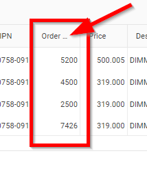
It would be nice that on mouse hover, the full title would be rendered. Currently to achieve this, I have to implement a custom <HeaderTemplate> for every grid column and add a span myself:
<GridColumn Field="@nameof(SalesOrderLineItem.Quantity)">
    <HeaderTemplate>
        <span title="Order Quantity">Order Quantity</span>
    </HeaderTemplate>
</GridColumn>
Can you update the GridColumn component and add a title attribute to the column <th> element so the browser can show the fill title should the user hover over it?
Hi,
I'm testing the grid on mobile and I've noticed that the pager can end up being cut off the edge of the screen. The app is designed to not allow scrolling in the HTML window but it does allowing scrolling in the grid (and navbar). This works, but the pager is cutting off. Is there any way it can be made more responsive or made to wrap in a relatively neat way without breaking the control?
See attached image.
Thanks,
Nick
I would like the grid and treelist to honor the DisplayFormatAttribute.NullDisplayText Property so I don't have to use cell templates to change what null values render.
----
ADMIN EDIT
The Excel export seems to honor it, so it can be used as a workaround.
Reproducible with the workaround commented out:
<TelerikButton OnClick="@CurrentPage">Current Page</TelerikButton>
<TelerikButton OnClick="@AllPages">All Pages</TelerikButton>

<TelerikGrid Data="@GridData"
             @ref="@GridRef"
             Pageable="true"
             Sortable="true"
             Resizable="true"
             Reorderable="true"
             FilterMode="@GridFilterMode.FilterRow"
             Groupable="true">


    <GridExport>
        <GridExcelExport FileName="telerik-grid-export" AllPages="@ExportAllPages" />
    </GridExport>

    <GridColumns>
        <GridColumn Field="@nameof(SampleData.ProductId)" Title="ID" Width="100px" />
        <GridColumn Field="@nameof(SampleData.ProductName)" Title="Product Name" Width="300px" />
        <GridColumn Field="@nameof(SampleData.UnitsInStock)" Title="In stock" Width="100px" />
        <GridColumn Field="@nameof(SampleData.Price)" Title="Unit Price" Width="200px" />
        <GridColumn Field="@nameof(SampleData.Discontinued)" Title="Discontinued" Width="100px" />
        <GridColumn Field="@nameof(SampleData.FirstReleaseDate)" Title="Release Date" Width="300px" />
    </GridColumns>
</TelerikGrid>

@code {
    async Task AllPages()
    {
        ExportAllPages = true;

        await Task.Delay(20); // allow the component to rerender with the new parameter

        await GridRef.SaveAsCsvFileAsync();

        //await GridRef.SaveAsExcelFileAsync(); // this works
    }

    async Task CurrentPage()
    {
        ExportAllPages = false;

        await Task.Delay(20); // allow the component to rerender with the new parameter

        await GridRef.SaveAsCsvFileAsync();

        //await GridRef.SaveAsExcelFileAsync(); // this works
    }


    private TelerikGrid<SampleData> GridRef { get; set; }


    List<SampleData> GridData { get; set; }
    bool ExportAllPages { get; set; }

    protected override void OnInitialized()
    {
        GridData = Enumerable.Range(1, 100).Select(x => new SampleData
        {
            ProductId = x,
            ProductName = $"Product {x}",
            UnitsInStock = x * 2,
            Price = 3.14159m * x,
            Discontinued = x % 4 == 0,
            FirstReleaseDate = DateTime.Now.AddDays(-x)
        }).ToList();
    }

    public class SampleData
    {
        public int ProductId { get; set; }
        public string ProductName { get; set; }
        public int UnitsInStock { get; set; }
        public decimal Price { get; set; }
        public bool Discontinued { get; set; }
        public DateTime FirstReleaseDate { get; set; }
    }
}
This isn't a bug per say, but with the latest Telerik Blazor update, the GridCommandEventArgs Field and Value properties are now deprecated. When updating a specific cell in a grid using InCell edit mode, how am I able to know which specific field and value are updated when the OnUpdate event gets called? Before the latest update, I had the following code:
protected override void OnGridRowUpdate(GridCommandEventArgs args)
{
validationMessage = ValidateField(args.Field, args.Value);
}
I realize I have the updated values using args.Item, but I don't want to have to validate the entire row every time I update a cell. Is there still a way to know what cell I updated, or is that information no more?
Thank you,
Steve
Please add a property to the grid that lets me specify a debounce time for filtering. This way I can (for example) set the debounce time to 500(ms), and then only have the grid filter (which is slow) when the user stops typing (it current takes about 300ms per keypress anyway).
---
ADMIN EDIT
We are reopening this feature request because it can make sense for the FilterRow filter mode as an out-of-the-box feature, even if it can be achieved right now with a bit of application code (example).
---
 - copy.png)
I would like to set increase the searchbox width with a parameter.
---
ADMIN EDIT
Here is a CSS workaround:
<style>
    .custom-searchbox-width .k-grid-search {
        width: 50%;
    }
</style>

<TelerikGrid Data=@GridData Pageable="true" Height="400px" Class="custom-searchbox-width">
    <GridToolBar>
        <span class="k-toolbar-spacer"></span> @* add this spacer to keep the searchbox on the right *@
        <GridSearchBox />
    </GridToolBar>
    <GridColumns>
        <GridColumn Field="@(nameof(Employee.EmployeeId))" />
        <GridColumn Field=@nameof(Employee.Name) />
        <GridColumn Field=@nameof(Employee.Team) Title="Team" />
        <GridColumn Field=@nameof(Employee.IsOnLeave) Title="On Vacation" />
    </GridColumns>
</TelerikGrid>

@code {
    public List<Employee> GridData { get; set; }

    protected override void OnInitialized()
    {
        GridData = new List<Employee>();
        var rand = new Random();
        for (int i = 0; i < 15; i++)
        {
            GridData.Add(new Employee()
            {
                EmployeeId = i,
                Name = "Employee " + i.ToString(),
                Team = "Team " + i % 3,
                IsOnLeave = i % 2 == 0
            });
        }
    }

    public class Employee
    {
        public int EmployeeId { get; set; }
        public string Name { get; set; }
        public string Team { get; set; }
        public bool IsOnLeave { get; set; }
    }
}
---
Column resizing does not work correctly together with filter row and detail template.
Resize the second or the third column to any direction. The first column will shrink to the same width, as the expand column.
This broke in version 2.24.
<TelerikGrid FilterMode="Telerik.Blazor.GridFilterMode.FilterRow"
             Data="@GridData"
             Resizable="true">
    <DetailTemplate>
        detail template
    </DetailTemplate>
    <GridColumns>
        <GridColumn Field="Id" />
        <GridColumn Field="Id" Title="Resize Me First" />
        <GridColumn Field="Id" Title="Resize Me First" />
    </GridColumns>
</TelerikGrid>

@code {
    List<GridModel> GridData { get; set; }

    protected override void OnInitialized()
    {
        List<GridModel> data = new List<GridModel>();

        for (int i = 1; i <= 3; i++)
        {
            data.Add(new GridModel { Id = i });
        }

        GridData = data;
    }

    public class GridModel
    {
        public int Id { get; set; }
    }
}
Grouping by a nested (child) Grid column is not possible in OnStateInit.
A possible workaround is to group in OnAfterRenderAsync.
@using Telerik.DataSource

<TelerikGrid Data=@GridData @ref="TheGrid"
             Groupable="true"
             OnStateInit="@((GridStateEventArgs<User> args) => OnStateInitHandler(args))">
    <GridColumns>
        <GridColumn Title="Personal Information">
            <Columns>
                <GridColumn Field=@nameof(User.LName) Title="Last Name" />
                <GridColumn Field=@nameof(User.FName) Title="First Name" />
            </Columns>
        </GridColumn>
        <GridColumn Title="Status and Last Login">
            <Columns>
                <GridColumn Field=@nameof(User.StatusName) Title="StatusName" />
                <GridColumn Field=@nameof(User.LastLoginDate) Title="Last Login" DisplayFormat="{0:yyyy-MMM-dd}" />
            </Columns>
        </GridColumn>
    </GridColumns>
</TelerikGrid>

@code {
    TelerikGrid<User> TheGrid { get; set; }
    List<User> GridData { get; set; }

    protected override void OnInitialized()
    {
        var data = new List<User>();
        for (int i = 1; i <= 20; i++)
        {
            data.Add(new User()
            {
                Id = i,
                FName = "First Name " + i,
                LName = "Last Name " + i,
                StatusId = i * 123,
                LastLoginDate = DateTime.Now,
                StatusName = "Status Name " + (i % 5 + 1)
            });
        }
        GridData = data;
    }

    private void OnStateInitHandler(GridStateEventArgs<User> args)
    {
        GridState<User> desiredState = new GridState<User>()
        {
            GroupDescriptors = new List<GroupDescriptor>()
            {
                new GroupDescriptor()
                {
                    Member = nameof(User.StatusName),
                    MemberType = typeof(string)
                }
            }
        };

        // will trigger an exception if grouping by a nested column
        args.GridState = desiredState;
    }

    @*protected override async Task OnAfterRenderAsync(bool firstRender)
    {
        if (firstRender)
        {
            var desiredState = TheGrid.GetState();

            desiredState.GroupDescriptors = new List<GroupDescriptor>()
            {
                new GroupDescriptor()
                {
                    Member = nameof(User.StatusName),
                    MemberType = typeof(string)
                }
            };

            await TheGrid.SetState(desiredState);
        }

        await base.OnAfterRenderAsync(firstRender);
    }*@

    public class User
    {
        public long Id { get; set; }

        public int StatusId { get; set; }
        public string StatusName { get; set; }

        public string FName { get; set; }
        public string LName { get; set; }

        public DateTime LastLoginDate { get; set; }
    }
}
GridCheckBoxColumn: The check disappears when focus is on a editable cell.
<TelerikGrid Class=k-gridData="@adherenceAgents"
EditMode="@GridEditMode.Incell"
Height="150px"
SelectionMode="@GridSelectionMode.Single">
<GridColumns>
<GridCheckboxColumn SelectAll="false" Title="Select" Width="70px" />
<GridColumn Field="@(nameof(AdherenceAgent.Scheduled))" Editable="false" Title="Scheduled" />
<GridColumn Field="@(nameof(AdherenceAgent.EmployeeId))" Editable="false" Title="Employee ID" />
<GridColumn Field="@(nameof(AdherenceAgent.Name))" Editable="false" Title="Name" />
<GridColumn Field="@(nameof(AdherenceAgent.AchievedAdherences))" Title="Points" />
<GridColumn Field="@(nameof(AdherenceAgent.PossibleAdherences))" Title="Possible" />
<GridColumn>
<HeaderTemplate>Adherence<br/>Score</HeaderTemplate>
</GridColumn>
</GridColumns>
</TelerikGrid>
Allow the Grid to support Enums which are mapped to use datatypes different from int. Currently, if I try to use the following Enum, an InvlidCastException is generated:
public enum ShortEnum : short
{
    Value1,
    Value2,
    Value3
}
Using OnRowDrop works fine but there is no configuration possible to set the column at the end of the grid.
Of course it's a personnal taste but I like to have the all the actions buttons on the right side
https://blazorrepl.telerik.com/QGadEnbT24qbDh1G49
If the window component does not implement a Width parameter, it will seem like docked to right when dragging. The issue stems from the update of top and left styles while the width of the component grows with them.
1. Open the repl
2. Initiate dragging
**Workaround**
Set the Width parameter of the Window component
Hello,
My Grid is setting filters in OnStateInit. Then, the filters are cleared via GridRef.SetState(null)
This used to work until 3.0.1, but not in 3.1.0. Here is a test page:
https://blazorrepl.telerik.com/mmEdFnvA31osNnjO20
Does the Blazor grid have any support for any or all queries on sub-property collections? I would like to have the grid OnRead be able to generate a query against a sub-entity collection.
E.g.
GET serviceRoot/People?$filter=Emails/any(s:endswith(s, 'contoso.com'))From what I can tell the Column.FieldName property only will generate a valid query for scalar properties. Is there any way to make this work?
Given the Northwind OData sample https://demos.telerik.com/kendo-ui/service-v4/odata. I would like to display a grid of all customers. In the grid, I would like to have a column that provides filtering for the orders shipper column as in the query below.
https://demos.telerik.com/kendo-ui/service-v4/odata/Customers?$expand=Orders&$filter=Orders/any(d: contains(d/Shipper/CompanyName,'Speedy Express'))
There does not seem to be a way for the in-built filter mechanism to use a lambda and it seems like there should be.