Hello,
First of all: thank you for implementing the Excel like filtering with the new CheckBox Filter! This was a feature that was highly sought after in our development team.
But there is one thing I am missing: the checkbox list has no option for sorting.
If we want to sort our filters now we have to implement the FilterMenuTemplate in every column that has filtering active (which are a lot) and define the list with filter options and filter it ourselves.
Is this something that can be fixed easily?
---
ADMIN EDIT
We will probably sort ascending the values by default (out-of-the0box), and any other custom sorts should be implemented through the filter menu template.
---
How do I get the filter menu to allow input of Date *and* Time for a DateTime column?
Grid column header and content alignment (horizontal +Vertical)
---
ADMIN EDIT
For the time being, this is possible through the CellRender event, see below in the thread for an example.
---
I want to place the Pager on top of the Grid. I know it can be handled with a Pager component integration in the Grid Toolbar, but I want to use the Toolbar for other purposes/actions. Please allow control over the Pager position.
<GridCheckboxColumn SelectAll="true" SelectAllMode="GridSelectAllMode.All">
When I apply filtering to the grid and click the SelectAll checkbox in the select column header, the grid selects all the data. I want it to select only the data that the user sees after the filter is applied.
I set the GridColumn DisplayFormat="{0: yyyy-MM-dd}" and the data reflects that format. The default filter control doesn't. How can I make the control do that?
---
ADMIN EDIT
For the time being, the way to affect the filter behavior is through a custom filter template. The format for date pickers and numeric textboxes comes from the app culture settings (see more here). You may also want to Follow this idea for easier selection of a default filter operator and limiting the filter operators choices.
---
Hello Team,
I am using "FilterMode="GridFilterMode.FilterRow". For int values there is a "numeric chooser" in the column header and the filter option "contains" is not available.
This is the correct behaviour. But when I bind the column to a ulong, ushort, ... value theses seems to be considered as string. There is no "numeric chooser" and the filter "contains" is available, which resullts in further problems with the OData endpoint.
I want to customize the appearance of the header of a certain column, and a bit of CSS backgrounds could help, but I can't do this with the HeaderTemplate alone, nor with content in it because of the padding the cells have.
So, I would like the ability to set the CSS class of the header cell of the column.
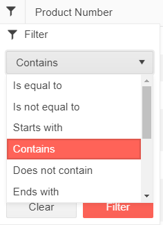
The idea of the feature is to be able to customize the list of FilterOperators displayed in the list of the FilterRow and FilterMenu.
FilterRow UI element
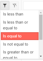
FilterMenu UI element
Currently the blazor grid must be a specific, static height. If one is not provided, the grid uses a default of 500px.
Kendo grid implementations in other UI frameworks allow for more flexibility in the height of the grid. It would be great if the blazor implementation could support this as well.
Two specific scenarios that are valueable:
1) Grid height adjusts to accomodate all of the items in the grid
For other kendo grid implementations, this is typically the case when "Scrollable" is set to false. If there is a plan to allow toggling scrolling for the blazor grid, then I think that this would come along with that.
2) Ability to set grid height to 100%
With other kendo implementations this is normally done via CSS, and is useful for when you want a "full screen" grid. This is normally combined with "Scrollable=true" and often combined with Pagination="true" as well. Currently it's not possible to do this - since the height is defined on the k-grid element, it cannot be overridden with CSS.
My grid starts with Groupable=false and at some point I may need to make it groupable. The group panel appears, but I cannot drag the column headers to it to actually group.
---
ADMIN EDIT
A workaround is to hide the grid so it can re-initialize with the new groupable setting:
Is Groupable: @IsGroupable
<TelerikButton OnClick="@ToggleGroupable">Toggle Groupable</TelerikButton>

@if (isGridVisible)
{
    <TelerikGrid Data=@GridData @ref="@GridRef" Groupable="@IsGroupable" Pageable="true" Height="400px">
        <GridColumns>
            <GridColumn Field=@nameof(Employee.Name) Groupable="false" />
            <GridColumn Field=@nameof(Employee.Team) Title="Team" />
            <GridColumn Field=@nameof(Employee.IsOnLeave) Title="On Vacation" />
        </GridColumns>
    </TelerikGrid>
}

@code {
    bool IsGroupable { get; set; }
    bool isGridVisible { get; set; } = true;
    TelerikGrid<Employee> GridRef { get; set; }
    async Task ToggleGroupable()
    {
        //save state (sorting, paging,...) - it will be lost when we hide the grid
        var state = GridRef.GetState();

        //hide the grid so it can later re-initialize with the new groupable setting
        isGridVisible = false;
        await InvokeAsync(StateHasChanged);
        await Task.Delay(20);
        IsGroupable = !IsGroupable;
        isGridVisible = true;

        //afte the grid re-initialized and rendered with the new setting, restore its state
        await InvokeAsync(StateHasChanged);
        await Task.Delay(20);
        await GridRef.SetState(state);
    }


    public List<Employee> GridData { get; set; }

    protected override void OnInitialized()
    {
        GridData = new List<Employee>();
        var rand = new Random();
        for (int i = 0; i < 15; i++)
        {
            GridData.Add(new Employee()
            {
                EmployeeId = i,
                Name = "Employee " + i.ToString(),
                Team = "Team " + i % 3,
                IsOnLeave = i % 2 == 0
            });
        }
    }

    public class Employee
    {
        public int EmployeeId { get; set; }
        public string Name { get; set; }
        public string Team { get; set; }
        public bool IsOnLeave { get; set; }
    }
}
---
Hi,
I'm testing the grid on mobile and I've noticed that the pager can end up being cut off the edge of the screen. The app is designed to not allow scrolling in the HTML window but it does allowing scrolling in the grid (and navbar). This works, but the pager is cutting off. Is there any way it can be made more responsive or made to wrap in a relatively neat way without breaking the control?
See attached image.
Thanks,
Nick
With OnRead, AllPages cannot be exported because the grid Data only has the current page: https://docs.telerik.com/blazor-ui/components/grid/export/excel#notes:
If you are using the OnRead event, only the current page of data will be exported, because that's all the grid has at the time of the export action.
I load my data via "OnRead", because i need to implement pagination by myself, and I would like the export option to work with that too.
Please add a property to the grid that lets me specify a debounce time for filtering. This way I can (for example) set the debounce time to 500(ms), and then only have the grid filter (which is slow) when the user stops typing (it current takes about 300ms per keypress anyway).
---
ADMIN EDIT
We are reopening this feature request because it can make sense for the FilterRow filter mode as an out-of-the-box feature, even if it can be achieved right now with a bit of application code (example).
---
 - copy.png)
I would like to set increase the searchbox width with a parameter.
---
ADMIN EDIT
Here is a CSS workaround:
<style>
    .custom-searchbox-width .k-grid-search {
        width: 50%;
    }
</style>

<TelerikGrid Data=@GridData Pageable="true" Height="400px" Class="custom-searchbox-width">
    <GridToolBar>
        <span class="k-toolbar-spacer"></span> @* add this spacer to keep the searchbox on the right *@
        <GridSearchBox />
    </GridToolBar>
    <GridColumns>
        <GridColumn Field="@(nameof(Employee.EmployeeId))" />
        <GridColumn Field=@nameof(Employee.Name) />
        <GridColumn Field=@nameof(Employee.Team) Title="Team" />
        <GridColumn Field=@nameof(Employee.IsOnLeave) Title="On Vacation" />
    </GridColumns>
</TelerikGrid>

@code {
    public List<Employee> GridData { get; set; }

    protected override void OnInitialized()
    {
        GridData = new List<Employee>();
        var rand = new Random();
        for (int i = 0; i < 15; i++)
        {
            GridData.Add(new Employee()
            {
                EmployeeId = i,
                Name = "Employee " + i.ToString(),
                Team = "Team " + i % 3,
                IsOnLeave = i % 2 == 0
            });
        }
    }

    public class Employee
    {
        public int EmployeeId { get; set; }
        public string Name { get; set; }
        public string Team { get; set; }
        public bool IsOnLeave { get; set; }
    }
}
---