Allow the Grid to support Enums which are mapped to use datatypes different from int. Currently, if I try to use the following Enum, an InvlidCastException is generated:
public enum ShortEnum : short
{
    Value1,
    Value2,
    Value3
}
Does the Blazor grid have any support for any or all queries on sub-property collections? I would like to have the grid OnRead be able to generate a query against a sub-entity collection.
E.g.
GET serviceRoot/People?$filter=Emails/any(s:endswith(s, 'contoso.com'))From what I can tell the Column.FieldName property only will generate a valid query for scalar properties. Is there any way to make this work?
Given the Northwind OData sample https://demos.telerik.com/kendo-ui/service-v4/odata. I would like to display a grid of all customers. In the grid, I would like to have a column that provides filtering for the orders shipper column as in the query below.
https://demos.telerik.com/kendo-ui/service-v4/odata/Customers?$expand=Orders&$filter=Orders/any(d: contains(d/Shipper/CompanyName,'Speedy Express'))
There does not seem to be a way for the in-built filter mechanism to use a lambda and it seems like there should be.
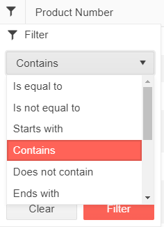
The idea of the feature is to be able to customize the list of FilterOperators displayed in the list of the FilterRow and FilterMenu.
FilterRow UI element
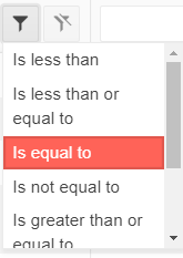
FilterMenu UI element
How can I get the tooltips for validation of each field displayed at the corresponding field in a Grid Popup form, not just the summary below the Form, etc?
---
ADMIN EDIT
---
This will be handled through exposing an option to set your preferred field validation message type - tooltip or inline. It will cover all edit modes (Popup, Inline, InCell).
If you want to remove the ValidationSummary after adding field validation messages, check the ability to remove ValidationSummary from the Popup edit form.
Please support Display(Order = ...) with autogenerated Grid columns.
Such functionality will also be useful for controlling the order of manually declared columns when using a custom component for reusable columns. For example: https://blazorrepl.telerik.com/cGOtbwOX21f6zQcy35 - the "Name" column is rendered last and currently one cannot control its order.
public class DateModel
{
  [Display(Order = 2)]
  public string Id { get; set; }
  [Display(Order = 1)]
  public string Text { get; set; }
}
I would prefer if you can use the FilterMenuTemplate in such a way that you can fetch also "filter criteria" from other fields/columns.
An example:
- grid has 3 coluns > Name, City, Population
- filter mode is set to filter menu and my filter menu should display at the first column.
- after the filter dialog is opened my expactation is that it includes also entries from other fields
In summary, my team would welcome the opportunity of central approach for filtering with multiple fields.
Regards,
Özmen
AutoFitting all columns should not leave blank space in the Grid, the last column should take the available space.
This functionality might be triggered by a setting a bool parameter to true.
 - copy.png)
I would like to set increase the searchbox width with a parameter.
---
ADMIN EDIT
Here is a CSS workaround:
<style>
    .custom-searchbox-width .k-grid-search {
        width: 50%;
    }
</style>

<TelerikGrid Data=@GridData Pageable="true" Height="400px" Class="custom-searchbox-width">
    <GridToolBar>
        <span class="k-toolbar-spacer"></span> @* add this spacer to keep the searchbox on the right *@
        <GridSearchBox />
    </GridToolBar>
    <GridColumns>
        <GridColumn Field="@(nameof(Employee.EmployeeId))" />
        <GridColumn Field=@nameof(Employee.Name) />
        <GridColumn Field=@nameof(Employee.Team) Title="Team" />
        <GridColumn Field=@nameof(Employee.IsOnLeave) Title="On Vacation" />
    </GridColumns>
</TelerikGrid>

@code {
    public List<Employee> GridData { get; set; }

    protected override void OnInitialized()
    {
        GridData = new List<Employee>();
        var rand = new Random();
        for (int i = 0; i < 15; i++)
        {
            GridData.Add(new Employee()
            {
                EmployeeId = i,
                Name = "Employee " + i.ToString(),
                Team = "Team " + i % 3,
                IsOnLeave = i % 2 == 0
            });
        }
    }

    public class Employee
    {
        public int EmployeeId { get; set; }
        public string Name { get; set; }
        public string Team { get; set; }
        public bool IsOnLeave { get; set; }
    }
}
---
I'd like to be able to enable the Column Chooser menu on just the Command Column and then keep all the other column menus as-is (I have a combination of various custom filter controls on them, so I don't watch to switch to the Column Menu)
When storing and restoring grid state, the selected page size is not included as part of that state currently, and needs to be stored seperately.
(When using GridPagerSettings, the user can select the page size based on inputs provided to PageSizes param. This selection is not synced and will revert to default each time the grid is loaded.
Hi, please expose a property in TelerikGrid where we can set the number of virtual columns to load in advance. A lot of times we would like to load data in advance for 5-10 columns left & right of the current viewport, so the user doesn't see empty columns while scrolling. This may apply to rows as well. It would be very helpful to have this property, please consider exposing it. Thank you.
============
ADMIN EDIT
============
The column Virtualization feature improves the Grid performance when it has a lot of columns. This does not include loading data on demand, but rather UI virtualization. All the data is retrieved and the performance optimization is achieved by rendering only the columns for the current Grid viewport. When the user scrolls horizontally the content for the other columns is rendered and while this happens, the cells appear empty. The requested parameter will control the number of columns that will be rendered in the current viewport but will not be visible until the user scrolls. Thus, the user will not see empty columns.
Hi, please expose the debounce delay as a property of TelerikGrid so we can set how soon virtualized columns are loaded after the user scrolls.
**Admin Edit**
This feature request requires research, and if such DebounceDelay parameter can work with good quality in all cases - it will be implemented. Additionally, we will revise the feature together with loading next set of columns if it will be applicable.
**Admin Edit**