Hello,
I need to be able to set the colors of x-axis category labels conditionally. My current use case for this is that I'm displaying dates and need weekends and holidays to be their own colors. As far as I'm aware this cannot be accomplished in any way currently:
- ChartCategoryAxisLabels Color parameter cannot be conditional and applies to all labels
- ChartCategoryAxisLabels Template parameter must return plain text and cannot render styling or HTML
- The labels are drawn via canvas and therefore cannot be styled externally
The two solutions I could suggest are as follows:
- Make the ChartCategoryAxisLabels Color parameter able to be Kendo UI parsed like the Template Parameter
- In addition to the ChartCategoryAxis Categories parameter, support providing categories as render fragment children, with each having its own Color parameter
Thanks,
Robert
It would be nice to be able to use Html markup in the ChartCategoryAxisLabel.
I can see in the documentation that it currently doesn't support this. I am curious if it is possible. Thank you.
How do I stop a column chart generating over the hover-over effect?
The property exists in the Kendo Chart.
See attached image. I want an option to change position on ticks, like in Kendo (see here).
I can't find an option in docs to move the axis position.
Currently, I get the desired result using SyncFusion Chart Component, attribute LabelPlacement allow selection between OnTicks and BetweenTicks option.
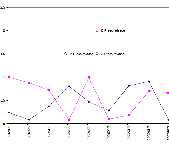
I would love to see the ability to put "pins" or "markers" for events on a time based chart. A lot of the work I'm doing with charts revolves around IoT, so we see a lot of value based data that needs to be contextualized with events.
Example:
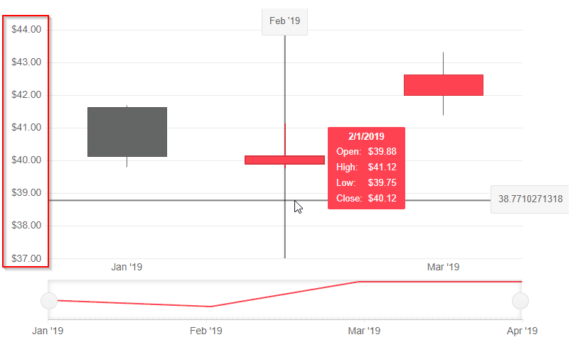
The additional functionality of the stock chart (crosshairs, navigator) fits our needs very well, but our data is not currency formatted. As far as we have found, we have not seen a way to remove currency as a default format. I'm not sure if this is a bug, or intended functionality; but it's preventing us from rolling charts with that extended functionality.
Is there any plan to add an Org Chart as a control?
For reference - Kendo jQuery Org Chart.
The Org Chart should display the reports to / is a manager of relation (1:0,m) between employees and/or managers graphically.