See attached image. I want an option to change position on ticks, like in Kendo (see here).
I can't find an option in docs to move the axis position.
Currently, I get the desired result using SyncFusion Chart Component, attribute LabelPlacement allow selection between OnTicks and BetweenTicks option.
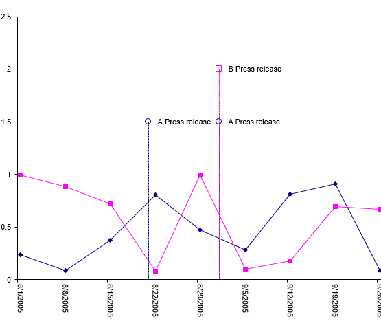
I would love to see the ability to put "pins" or "markers" for events on a time based chart. A lot of the work I'm doing with charts revolves around IoT, so we see a lot of value based data that needs to be contextualized with events.
Example:
Is there any plan to add an Org Chart as a control?
For reference - Kendo jQuery Org Chart.
The Org Chart should display the reports to / is a manager of relation (1:0,m) between employees and/or managers graphically.
How do I stop a column chart generating over the hover-over effect?
The property exists in the Kendo Chart.
It would be nice to be able to use Html markup in the ChartCategoryAxisLabel.
I can see in the documentation that it currently doesn't support this. I am curious if it is possible. Thank you.