Completed
Last Updated:
25 Sep 2019 08:37
by ADMIN
Release 2.1.0
Created by:
Mark Stevens
Comments:
2
Category:
Charts
Type:
Feature Request
Do you have any timelines for adding additional chart types to bring your charting functionality in line with your other platforms (ASP.NET Core charts for instance) I'm using scatter/bubble and have to use competitors charts to reproduce this functionality.
Completed
Last Updated:
02 Jan 2023 15:03
by ADMIN
Release 2.0.0
Created by:
John
Comments:
9
Category:
Charts
Type:
Feature Request
If a chart is too narrow and x-axis labels overlap, the user can zoom out and refresh the charts to allow the labels to fit. This feature request is to allow the charts to reformat themselves as the zoom level is changed (without having to refresh the page). Steps to reproduce:
- Make browser narrow (say half screen)
- Change zoom to 500%
- Go to https://demos.telerik.com/blazor-ui/chart/line-chart
- See line chart is squished with overlapping x-axis labels
- Zoom out to 100%
- See line chart remains squished with overlapping x-axis labels even though there is a lot more room
- Now refresh the page
- See line chart is no longer squished with x-axis labels visible
Completed
Last Updated:
02 Feb 2022 21:01
by ADMIN
Release 3.1.0
Created by:
Mark Stevens
Comments:
0
Category:
Charts
Type:
Feature Request
At the moment, the charts always have a flat look, but I want the rounded (gradient) look that you get when you don't reference the theme (see attached).
Completed
Last Updated:
10 Jun 2020 10:03
by ADMIN
Release 2.15.0
Created by:
Bryon
Comments:
2
Category:
Charts
Type:
Feature Request
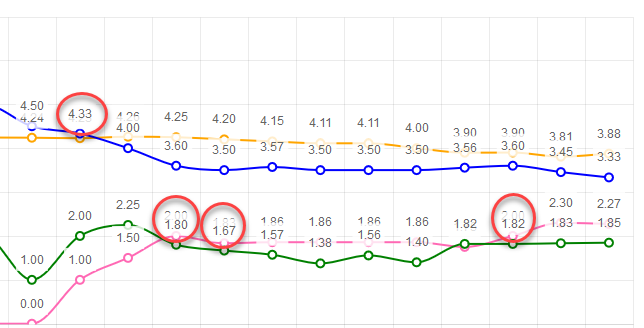
The idea is to ensure labels don't render on top of each other. If series values are close to each other, labels start overlapping. Having tooltips will let me remove the labels.
Example:
Completed
Last Updated:
28 Jan 2021 10:05
by ADMIN
Release 2.15.0
Created by:
Bryon
Comments:
12
Category:
Charts
Type:
Feature Request
I'm using version 1.1 of the UI for Blazor and have leveraged several different types of charts. I now need to add click events on different parts of the chart so I can navigate to a drilldown page. How can I accomplish this?
Completed
Last Updated:
25 Sep 2019 08:36
by ADMIN
Release 2.1.0
Created by:
Bill
Comments:
0
Category:
Charts
Type:
Feature Request
Please add the capability to provide XY scatter chart data plots into the Charts toolset.