Hi,
Please add Resizable flag for All your Popups (DropDownList, CombobBox, etc...)
It would be also good to allow Resize AnimationContainer
Regards
Andrzej
I saw that DropDown TreeList is already in the to-do list, but I would like to even extend it by adding MultiSelect feature to it
So basically add MultiSelect but with TreeList inside
Regards
Andrzej
I would like to add inline styles to different elements across the components, for example - the Grid Rows and Cells.
<AdminEdit>
The implementation of this might be by adding an args.InlineStyles (this is a sample name, it might not be the same when this is implemented) like the args.Class for the OnRow and OnCellRender events for the Grid.
</AdminEdit>
Hi Telerik team,
in our Blazor App we have implemented the skip handling logic according to your documentation, but we have noticed an issue. When the sum of the skip and the page size is bigger then the total count of the items and we try to set the Skip property for the second time, some of the top items are not shown.
To demonstrate this, we have created a simple app: https://github.com/0rce/blazor-app-telerik-grid-skip-bug.git
Please clone the repo, start the application and follow the steps displayed above the grid to reproduce the bug.
Do you think it is a bug or is our implementation wrong?
Best regards,
Orce
---
ADMIN EDIT
I have linked this case in the Limitations section of the documentation and you can find more details and a path forward in this KB article: https://docs.telerik.com/blazor-ui/knowledge-base/grid-large-skip-breaks-virtualization.
Considering this and why the grid cannot and should not change this value for you, I am marking this with the "Won't Fix" status - I acknowledge it is behavior that is less than ideal, yet it stems from application logic and the grid cannot fix that.
If someone is looking at the provided repository - please also be aware that it showcases an invalid approach for fetching grid data that I strongly advise against. Review the rest of the thread for more details.
---
Greetings, tell me, I can't figure out what's the matter.
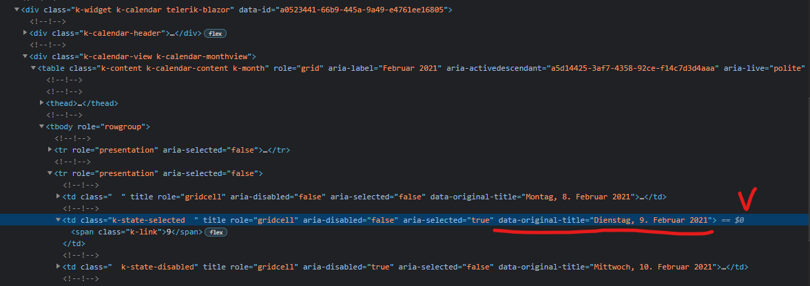
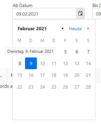
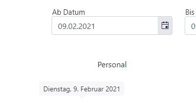
When using the TelerikDatePicker component together with the bootstrap tooltip, the tooltip continues to hang until the page is reloaded.
Telerik UI Blazor: 2.20.0
OS Windows 10
Google Chrome 90.0.4408.5
Framework Bootstrap v. 4.6.0
Kendo-theme-bootstrap 4.24.0
Registration bootstrap tooltip:
$(function () {
  $('[title]').tooltip()
})
How to repeat? Click on a component, point to any day, wait from 1 to 1.5 seconds and select an item (click), do not move the cursor for 1 second.
I would like to have the Label property to all input components, like ComboBox, NumericTextBox, all date inputs and pickers and so on. Right now only TextBox have it.
There a hack using HTML labels and CSS to get that but I think it is necessary to unify and not have to deal with two different concepts within the same form.
Input with Label property:
<TelerikTextBox Label="Container Name" @bind-Value="@ContainerSettings.ContainerName"></TelerikTextBox>
Hack to get same result in other inputs:
<label class="k-label" for="port">
Port <br>
<TelerikNumericTextBox Id="port" Arrows="false" @bind-Value="@ContainerSettings.Port"></TelerikNumericTextBox>
</label>
I would like to pass a defined piece of data in when I add a new row in a hierarchical Blazor grid. in the example below, I have a hierarchy of Agency > District > School. When I add a new school within a district, I would like to pass the District ID so that the user does not have to select it or type it in.
I have a district ID column in the schools grid, but (a) it would be better if the user did not see this and (b) when I click "Add school" that field is always passed as empty. Is there any way to pass the
districtSchools.Dist.DISTRICT_ID
variable when I add a row?
<TelerikGrid Data="@Agencies" Sortable="true" Reorderable="true" OnUpdate="@UpdateHandlerAgency">
                <DetailTemplate Context="granteeAgency">
                    @{
                        var leadAgency = granteeAgency as Agency;
                        <TelerikGrid Data="leadAgency.Districts" OnUpdate="@UpdateHandlerDistrict" OnRowRender="@OnRowRenderHandlerDistrict">
                            <GridColumns>
                                <GridColumn Field="@(nameof(District.Dist.DistrictName))" Editable="false">
                                    <Template>
                                        @((context as District).Dist.DistrictName.ToString())
                                    </Template>
                                </GridColumn>
                                <GridColumn Field="@(nameof(District.DistAlloc))">
                                    <Template>
                                        @((context as District).DistAlloc.ToString("C"))
                                    </Template>
                                </GridColumn>
                                <GridCommandColumn>
                                    <GridCommandButton Command="Edit" Icon="edit">Edit</GridCommandButton>
                                    <GridCommandButton Command="Save" Icon="save" ShowInEdit="true">Update</GridCommandButton>
                                    <GridCommandButton Command="Cancel" Icon="cancel" ShowInEdit="true">Cancel</GridCommandButton>
                                </GridCommandColumn>
                            </GridColumns>
                            <DetailTemplate Context="districtSchools">
                                    <TelerikGrid Data="districtSchools.Schools" OnCreate="@CreateHandlerSchool" OnDelete="@DeleteHandlerSchool" OnUpdate="@UpdateHandlerSchool" OnRowRender="@OnRowRenderHandlerSchool">
                                        <GridToolBar>
                                            <GridCommandButton Command="Add" Icon="add">Add School</GridCommandButton>
                                        </GridToolBar>
                                        <GridColumns>
                                            <GridColumn Field="@(nameof(School.SchoolName))">
                                                <Template>
                                                    @((context as School).SchoolName.ToString())
                                                </Template>
                                            </GridColumn>
                                            <GridColumn Field="@(nameof(School.SchoolAlloc))">
                                                <Template>
                                                    @((context as School).SchoolAlloc.ToString("C"))
                                                </Template>
                                            </GridColumn>
                                            <GridColumn Field="" Visible="true">
                                                <Template>
                                                    @districtSchools.Dist.DISTRICT_ID
                                                </Template>
                                                <EditorTemplate>
                                                    @districtSchools.Dist.DISTRICT_ID
                                                </EditorTemplate>
                                            </GridColumn>
                                            <GridCommandColumn>
                                                <GridCommandButton Command="Edit" Icon="edit">Edit</GridCommandButton>
                                                <GridCommandButton Command="Save" Icon="save" ShowInEdit="true">Update</GridCommandButton>
                                                <GridCommandButton Command="Delete" Icon="delete">Delete</GridCommandButton>
                                                <GridCommandButton Command="Cancel" Icon="cancel" ShowInEdit="true">Cancel</GridCommandButton>
                                            </GridCommandColumn>
                                        </GridColumns>
                                    </TelerikGrid>
                            </DetailTemplate>
                        </TelerikGrid>
                    }
                </DetailTemplate>
                <GridColumns>
                    <GridColumn Field="@(nameof(Agency.AgencyName))" Editable="false">
                        <Template>
                            @((context as Agency).AgencyName.ToString())
                        </Template>
                    </GridColumn>
                    <GridColumn Field="@(nameof(Agency.AgencyAlloc))">
                        <Template>
                            @((context as Agency).AgencyAlloc.ToString("C"))
                        </Template>
                    </GridColumn>
                    <GridCommandColumn>
                        <GridCommandButton Command="Edit" Icon="edit">Edit</GridCommandButton>
                        <GridCommandButton Command="Save" Icon="save" ShowInEdit="true">Update</GridCommandButton>
                        <GridCommandButton Command="Cancel" Icon="cancel" ShowInEdit="true">Cancel</GridCommandButton>
                    </GridCommandColumn>
                </GridColumns>
</TelerikGrid>Wè would like to have the Fluent UI style available for Blazor. We are using the Telerik UI controls in a large project werd the UI has to be very similar to the one of Microsoft D365 Customer Service.
Regards, Henk
Hi Team,
We tried to use the TelerikLoader in Blazor WASM app, but the loader is not appearing on the page. We tried the basic example given in the Demo but did not work.
We are using latest Telerik Version (2.20.0).
@if (IsLoading)
{
    <TelerikLoader />
}
else
{
    @Data
}
We have below references in index.html
<head>
<meta charset="utf-8" />
<meta name="viewport" content="width=device-width, initial-scale=1.0, maximum-scale=1.0, user-scalable=no" />
<title>THOR.UI</title>
<base href="/" />
<link href="css/bootstrap/bootstrap.min.css" rel="stylesheet" />
<link href="css/app.css" rel="stylesheet" />
<link href="css/toggle.css" rel="stylesheet" />
<link href="css/spinner.css" rel="stylesheet" />
<script src="_content/Telerik.UI.for.Blazor/js/telerik-blazor.js"></script>
<link href="https://fonts.googleapis.com/icon?family=Material+Icons"
rel="stylesheet">
<link id="theme" rel="stylesheet" href="./css/thor-light-theme-material.css" />
<link href="_content/Blazored.Toast/blazored-toast.min.css" rel="stylesheet" />
<script src="./site.js"></script>
<script src="_content/BlazorInputFile/inputfile.js"></script>
<script src="_content/BlazorPro.BlazorSize/blazorSize.min.js"></script>
<script src="_content/Fluxor.Blazor.Web/scripts/index.js"></script>
<script src="./scripts/download.js"></script>
</head>
I tried to follow this below article and add the reference as below and CDN also but it did not work.
<!DOCTYPE html>
<html>
<head>
    . . .
    <link href="/css/kendo-themes/default/dist/all.css" rel="stylesheet"/>
    <!-- Choose only one of the themes -->
    <!-- <link href="/css/kendo-themes/bootstrap/dist/all.css" rel="stylesheet" />
    <link href="/css/kendo-themes/material/dist/all.css" rel="stylesheet" /> -->
</head>
Please let us know what changes we have to make this to work.
Thanks
Chandra Vanama
1. Create tree model from class:
public class TreeNodeViewModel
{
    public string NodeName { get; set; }
    public IEnumerable<TreeNodeViewModel> Children { get; set; }
    public bool Expanded { get; set; }
    public string Color { get; set; }
    public string IconClass { get; set; }
}
2. Pass this tree for rendering to the component "TelerikTreeView".
3. An error comes out:
2020-12-03T09:44:15.312Z] Error: System.AggregateException: One or more errors occurred. (Object reference not set to an instance of an object.)
---> System.NullReferenceException: Object reference not set to an instance of an object.
at Telerik.Blazor.Data.TelerikTreeViewDataSource.GetFlatItems(IEnumerable`1 tree, List`1 result)
at Telerik.Blazor.Data.TelerikTreeViewDataSource.GetFlatItems(IEnumerable`1 tree, List`1 result)
at Telerik.Blazor.Data.TelerikTreeViewDataSource.GetFlatItems(IEnumerable`1 tree, List`1 result)
at Telerik.Blazor.Data.TelerikTreeViewDataSource.GetFlatItems(IEnumerable`1 tree, List`1 result)
at Telerik.Blazor.Data.TelerikTreeViewDataSource.FlattenTree()
at Telerik.Blazor.Data.TelerikTreeViewDataSource.InitData(IEnumerable`1 sourceData)
at Telerik.Blazor.Data.TelerikTreeViewDataSource.ProcessData(IEnumerable data)
at Telerik.Blazor.Components.TelerikTreeView.ProcessDataInternal()
at Telerik.Blazor.Components.Common.DataBoundComponent`1.ProcessDataAsync()
at Telerik.Blazor.Components.TelerikTreeView.OnAfterRenderAsync(Boolean firstRender)
--- End of inner exception stack trace ---
Note: This problem is due to the fact that there are no children in the last node of the tree and IEnumerable Children == NULL. Method "GetFlatItems" in version 2.18.0 it had a NULL check, in version 2.20.0 it is not.
Subject says it all. We're porting a large WPF application to Blazor and need WPF Telerik controls with corresponding functionality. One of those controls is the breadcrumb control.
Would need to work in Blazor client or server topologies.
In many cases users need to be able to specify a number which is easily visualized using a horizontal slider.
This allows the user to easily move the point to their desired location.
It can be helpful to allow this to also be constrained using a forced range selection.
Greetings!
Since the focus events are natively supported by blazor, could they be implemented in the input controls? Workarounds via JS are possible but they create a lot of redundant and cluttered code around the code base. OnChange/ValueChange only fire when the value has changed. Though, we have a lot of scenarios where we need the focus events when a value did not change.
I have a numeric text box that is bound to a nullable int. There is also a combo box on the page that will auto set the value and disable the numeric text box if certain values are selected. as follows:
<TelerikComboBox Data="@TareTypes"
TextField="Name" ValueField="Id"
ValueExpression="@(() => Material.TareTypeId)"
ValueChanged="@((int? e) => TareTypeChanged(e))"
Width="200px"
Placeholder="Tare Type" ClearButton="true"></TelerikComboBox>
<TelerikNumericTextBox @bind-Value="@Material.TareWeight" Arrows="false" Enabled="@tareWeightEnabled" ></TelerikNumericTextBox>
and the code...
private void TareTypeChanged(int? tareTypeId)
        {
            Material.TareTypeId = tareTypeId;
            tareWeightEnabled = true;
            if (tareTypeId > 0)
            {
                var tareTypeWeight = TareTypes.Single(t => t.Id == tareTypeId).Weight;
                if (tareTypeWeight.HasValue)
                {
                    Material.TareWeight = tareTypeWeight;
                    tareWeightEnabled = false;
                    editContext.NotifyFieldChanged(editContext.Field("TareWeight"));
                }
            }
        }
the following steps should reproduce the problem
- enter a value in the numeric text box and then clear it out
- select a value from the combo box that auto sets the numeric text box value and disables it
- select a value from the combo box that re-enables the text box. At this point the value is still visible in the text box (as it should be) and the text box is enabled
- Focus in the text box. this causes the number to disappear. it's as if the number was just a place holder which clears out when you focus on the control.
Hi!
Is there a reason the label has to be defined separately from the label? We'd love a "Label" parameter to be specified in the TelerikCheckbox control directly instead of having to create a separate element
If I set the Visible parameter to false for either ToolBarButton or ToolBarToggleButton it does not hide them from the UI.
<AdminEdit>
A workaround would be to use the Class parameter and add a display:none CSS rules.
Code snippet for the workaround:
<style>
    .hidden-button{
        display:none;
    }
</style>

<TelerikToolBar>
    <ToolBarButton Class="hidden-button">Hidden button</ToolBarButton>
    <ToolBarButton Icon="@IconName.Star">Visible button</ToolBarButton>
    <ToolBarToggleButton Class="hidden-button">Hidden toggle button</ToolBarToggleButton>
    <ToolBarToggleButton @bind-Selected="@isSelected">Visible toggle button</ToolBarToggleButton>
</TelerikToolBar>

@code {
    public bool isSelected { get; set; } = true;
}
</AdminEdit>
I would like to be able to style, for example, all grids on my page with certain rules. Thus, if each component had a unique class in its top-level rendering I could use it to cascade through it.
This also applies to dropdown/popup elements (for example, be able to target the popups of dropdownlists).
Ideally, elements that have additional popups (like the dropdownlists) will also expose parameters like DropDownClass so I can add my own class to them and style them per instance, so I don't affect all other instances in my app.


