Please expose the popup collision settings of the Popup and Popover components to all other applicable components, such as:
- AutoComplete
- ColorPicker
- ComboBox
- DropDownList
- DatePicker
- DateRangePicker
- DateTimePicker
- MultiColumnComboBox
- MultiSelect
- TimePicker
- Tooltip
After upgrading to 12.0.0, the Content does not change when clicking tabs. I always see the Content of the first tab.
My project targets .net8.
I realize we can build Blazor components to associate "label" to controls, but IMHO, this should come standard with any control tool set. Reasons:
1. Coding simplicity
2. Automatic theme inheritance
3. Flexibility in label positioning relative to the control (left, right, top, bottom)
Example:
<TelerikCheckBox Label="Is Chasssis" LabelPosition="left" @bind-Value="equipment.IsChassis"/>
I realize you folks put some effort into a "Floating Label", but my users have rejected this implementation because:
1. Having Text in a label as a means to identify the label makes them think a value is already provided (so they try to remove it or call for support).
2. When typing in the label and the appearance of the label identification appears above adds to their confusion as they are used to seeing validation errors appearing above a label.
When a TelerikComboBox is defined inside a window and the ContainmentSelector attribute is set for that window, the ComboBox exhibits erratic behavior: it sometimes fails to open, and selections from the dropdown may not register. Overall, the ComboBox does not function reliably in this configuration.
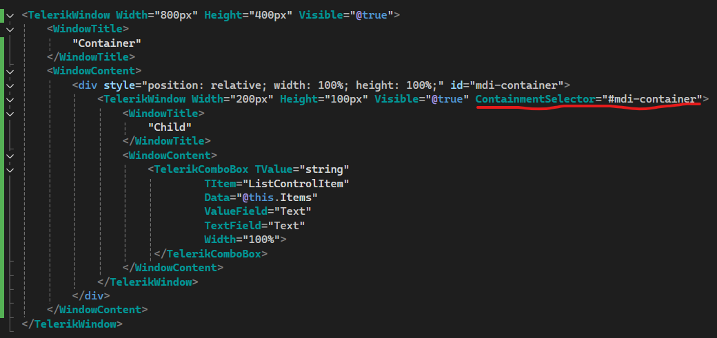
See attached video for current behavior.
If the ContainmentSelector attribute is removed, TelerikComboBox works as expected.
See attached example to reproduce the issue.
1. Can you please add the ability to choose a chevron instead of a caret to signify there are menu items under it?
2. Can you please add the ability to collapse/expand the menu and just show the icon when collapsed.
For inspiration - https://www.fluentui-blazor.net/NavMenuTree
Thank you.
Description
Affected components: those inheriting from TelerikInputBase (e.g., TelerikDatePicker). When an exception is thrown inside an async Task event handler for the OnChange, OnBlur, OnOpen, and ValueChanged events, the exception is completely and silently swallowed. The exception is not caught by ErrorBoundary.
Steps To Reproduce
- Use a standard ErrorBoundary in MainLayout.razor.
<ErrorBoundary>
    <ChildContent>
        @Body
    </ChildContent>
    <ErrorContent>
        <p class="error">An unhandled error has occurred.</p>
    </ErrorContent>
</ErrorBoundary>
- Declare a TelerikDatePicker and bind an async Task method to the ValueChanged or OnChange event.
<TelerikDatePicker Value="@DatePickerValue"
                   ValueChanged="@((DateTime inputDate) => OnDatePickerValueChanged(inputDate))">
</TelerikDatePicker>


<TelerikButton OnClick="@(() => throw new Exception("Exception from button"))">Click to test ErrorBoundary</TelerikButton>

@code {
    private DateTime DatePickerValue { get; set; } = DateTime.Today;

    private async Task OnDatePickerValueChanged(DateTime newValue)
    {
        throw new InvalidOperationException("This exception should be caught by the ErrorBoundary!");
    }
}
- Run the page and select a date in the DatePicker.
Actual Behavior
The exception thrown in the OnDatePickerValueChanged event handler is not caught by ErrorBoundary.
Expected Behavior
The exception thrown in the OnDatePickerValueChanged event handler is caught by ErrorBoundary.
Browser
All
Last working version of Telerik UI for Blazor (if regression)
No response
Description
Affected components: those inheriting from TelerikSelectBase (e.g., TelerikDropDownList, TelerikComboBox, TelerikMultiSelect, TelerikAutoComplete). When an exception is thrown inside an async Task event handler for the OnChange, OnBlur, OnOpen, and ValueChanged events, the exception is completely and silently swallowed. The exception is not caught by ErrorBoundary.
Related: #6333
Steps To Reproduce
Steps to Reproduce
- Use a standard ErrorBoundary in MainLayout.razor.
<ErrorBoundary>
    <ChildContent>
        @Body
    </ChildContent>
    <ErrorContent>
        <p class="error">An unhandled error has occurred.</p>
    </ErrorContent>
</ErrorBoundary>
- Declare a TelerikDropDownList and bind an async Task method to the ValueChanged or OnChange event.
<TelerikDropDownList
    Data="@DropDownData"
    ValueChanged="@( (int newValue) => OnDropDownValueChanged(newValue))"
    TextField="@nameof(TestItem.Name)"
    ValueField="@nameof(TestItem.Id)" />

<TelerikButton OnClick="@(() => throw new Exception("Exception from button"))">Click to test ErrorBoundary</TelerikButton>

@code {
    private int? SelectedDropDownValue;

    private List<TestItem> DropDownData = new()
    {
        new() { Id = 1, Name = "Select me to throw exception" },
    };

    private async Task OnDropDownValueChanged(int newValue)
    {
        throw new InvalidOperationException("This exception should be caught by the ErrorBoundary!");
    }

    public class TestItem
    {
        public int Id { get; set; }
        public string Name { get; set; } = string.Empty;
    }
}
- Run the page and select the item in the DropDownList's list.
Actual Behavior
The exception thrown in the OnDropDownValueChanged event handler is not caught by ErrorBoundary.
Expected Behavior
The exception thrown in the OnDropDownValueChanged event handler is caught by ErrorBoundary.
Browser
All
Last working version of Telerik UI for Blazor (if regression)
No response
Hi !
I tried using the combobox but, since my datasource is too big and I need grouping, therefore virtualization is not possible, I need to do the filtering on the server side, using the OnRead method to fetch my data based on what the user has entered in the input field. The problem is that the client side filtering is always active and I can't reproduce the same type of filtering I do server side on the client side and I lose some results. I think it would be really nice if we could specify to not filter client side or something like that, to give us more control.
Thank you very much !
Do you have a planned date for Telerik UI for Blazor to fully support Visual Studio 2022 Professional?
Telerik UI for Blazor cannot be used with Visual Studio 2022 Professional in Debug mode and Hot Reload. There are couple issues, see below, that seems to be related, and that Telerik are not willing to fix. Those issues render Telerik UI for Blazor unusable when working with Visual Studio 2022 Professional with Hot Reload.
Predefined dialogs are not shown after hot reload updates are applied and Predefined dialogs throw when hot reload updates are applied
Blazor WASM breaks in VS2022 after Hot Reload in UI for Blazor | Telerik Forums
Hello guys,
I know you probably gonna redirect me to these topics:
https://feedback.telerik.com/blazor/1581128-ability-to-change-the-color-of-the-shape-on-click
But that is not a solution. The OnShapeClick-Event of the TelerikMap still triggers only if you click the shape, that was added last. Which means if I have 3 shapes in my TelerikMap, only a click on the third map will lead to the OnShapeClick event being triggered.
This is not a feature request, as you told Michael in his bug report und not at all related to the feature request of chaning a shape's color up on clicking it...but this is clearly a bug.
Please provide some short feedback on how / when this will be solved. Otherwise as a user of Blazor UI I have to manually write JavaScript Code, dismantle the DOM, trigger Interop-Methods etc. to achieve that behavior that should actually just work out of the box as documented.
Thanks and best regards!
Sebastian
Hello,
I would like to have the Polar chart available in Blazor.
Radar Chart are nice but the categorical axis are not usable when having directional data to display
Thank you
Thomas
.png)
The latest version has broken one of our projects due to;
- Throw when using Data and OnRead for the same component
So we deliberately used both events which worked quite well (but is now disallowed);
<TelerikGrid Data="@SheetList"
@ref="_grid"
SelectionMode="@GridSelectionMode.Multiple"
@bind-SelectedItems="@SelectedSheets"
EditMode="GridEditMode.Inline"
OnRowContextMenu="@OnContextMenu"
OnRowClick="@OnRowClick"
OnAdd="OnAddHandler"
OnEdit="@OnEditHandler"
OnUpdate="OnUpdateHandler"
OnCreate="OnCreateHandler"
OnDelete="OnDeleteHandler"
OnRead="@(IsFromHierarchy ? null : OnReadItemsAsync)"
This pattern enabled us to create components that did EITHER server-side pagination, or if it was send a data list as a parameter from a parent component, then it would use that instead (and turn off server pagination).
What would now be the recommended pattern for this scenario? Or do we need to duplicate the whole grid in the component (which isnt ideal).
Hello,
it seems that something is missing to get it working in "SpeecToTextButton".
how to reproduce:
- tested in different browser(edge,vivaldi,ff), even in private mode https://www.telerik.com/blazor-ui/documentation/components/speechtotextbutton/integration
- load the page
- click start recording
- allow microphone access for the first time
- nothing recorded(it stays max at 2secs in recording state), goto 1
it flickers for a while(at system taskbar, there is also indication of recording) but nothing is "recorded/transcribed".
Is there any additional setup at clientside?
namespace Telerik.Blazor.Components.Common;
TelerikGrid<T>
{
public virtual void Rebind()
{
ProcessDataAsync();
}
}
Rebind() doesnt use async/await, but ProcessDataAsync() does, which leads to race conditions.
Using the TelerikTabSrip, If the first tab is not visible when rendered, the tab content for all tabs doesnt render.
Replicated here https://blazorrepl.telerik.com/cpEWGOPk22VW8be254
If you change the code to make the first tab visible, all is well.
You can make other tabs invisible, and all is well.