The MCP assistant server currently supports Visual Studio, Visual Studio Code and Cursor.
Provide official support for Claude Code as well:
Maybe adding it to the Kendo UI .Net Core offering would at least entice us to sign up for that too!
Hi Team,
I would like to request to add an Html/Tag Helper for the kendo.ui.icon.
Thanks!
I'm using an OData datasource to populate the grid. To make matters worse, the Autocomplete retrieves data for *all* of the grid columns. I'd say the default behavior should only retrieve the current column's data and preferably use OData groupby to limit the results to distinct values.
Interestingly, the CheckBoxList filter *is* populated from the current grid data, behaving as expected.
My page is attached and the issue is occurring in the detail grid where Server Filtering is disabled.
I am seeing that once a grid checkboxlist column filter exceeds about 1000 items the wait time appears to increase non-linearly (performance is worse than linear.) For example, with 3,000 items the page freezes for about 30 seconds. The data is fetched in under 50 milliseconds, so the vast majority of this time appears to be processing by Kendo.
Please see the attached for my configuration.
Serializing DataSourceResult when it contains several groups is significantly slower compared to serializing the object when no grouping is used. Consider ways to improve the performance. For more context and an example, see Ticket ID:
It would be nice to extend dialog like office 365 right dialog ( docked to the right).
It would be nice to have a dropdown button with a container
In the example below products is actually DbSet<Product>
public async Task<ActionResult> Products_Read([DataSourceRequest]DataSourceRequest request)
{
    using (var northwind = new SampleEntities())
    {
        IQueryable<Product> products = northwind.Products;
        DataSourceResult result = await products.ToDataSourceResultAsync(request);
        return Json(result);
    }
}
Under the hood the ToDataSourceResultAsync call is executed inside Task.Run
And that Task.Run is calling sync methods of IQueryable which means EntityframeworkCore queries are not taking place with async I/O
Whilst I'm aware that I can create a HTML label and add the k-label class. I feel that a Label and a LabelFor are essential parts of the toolkit to prevent brittle code getting created when/if the labels that are created within the toolkit have other requirements
I have created my own implementation for now but I think this should be added to your roadmap, especially as it's such a simple thing to do
*** Please follow-up with additional details, if necessary. Thank you. ***
There is currently no built-in feature to dynamically disable pagination when the number of grid rows is fewer than the defined page size. I need a way to automatically disable pagination when the number of records is less than or equal to the page size for a smoother user experience. Fig: 1(a)
In the above image, After filtering the data, despite current records are less than the page size but pagination is still appearing.
Add a 3 state mode to the Switch component (like it is already implemented in the Telerik UI for WPF) or create new component with that feature.
Example:

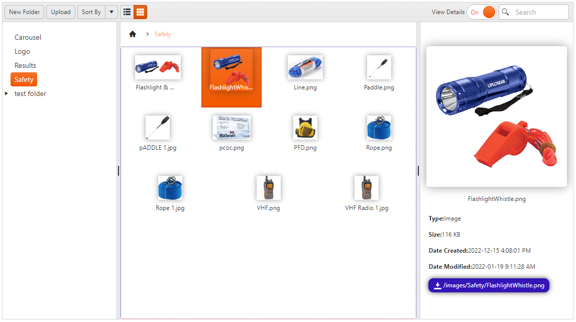
Would you be able to implement a more visual aspect for the FileManagement so it look close to this picture.
Attach is the modified Kendo.all.min.js file that you may want to alter so it becomes a permanent in you repository. Changes made for those following :
* Changed:
* template:
* var i
* singleFileTemplate
The style sheet for the effects:
/* 5.7.3 - Filemanager Image Grid View */
.FileManagerImgGridView {
    display: flex;
    justify-content: start;
    align-items: center;
    gap: 10px;
    cursor: zoom-in;
}
/* 5.7.4 - Filemanager Image List View */
.FileManagerImgListView {
    cursor: zoom-in;
    max-width: 115px;
    box-shadow: 0 0 10px rgba(0,0,0,0.4);
    transition-duration: .5s;
}

    .FileManagerImgListView:hover {
        transition-duration: .5s;
        transform: translateY(5px) scale(1.75);
        border-radius: 3px;
        z-index: 100;
    }

/* 5.7.5 - Filemanager Image Detail */
.FileManagerImgDetail {
    max-height: 280px;
    max-width: 280px;
    border-radius: 5px;
    box-shadow: 0 0 20px rgba(0,0,0,0.4);
    cursor: pointer;
    transition-duration: .5s;
}

    .FileManagerImgDetail:hover {
        transition-duration: .5s;
        transform: scale(1.2);
        max-width: 80%;
        border-radius: 50%;
        box-shadow: 0 0 20px rgba(0,0,0,0.4);
    }

.FileManagerImgDownloadLink {
    display: flex;
    justify-content: center;
    align-items: center;
    margin-left: 10px;
    padding: 5px 10px;
    border-radius: 10px;
    color: var(--bs-primary-inverted);
    background-color: var(--bs-primary);
    box-shadow: 0 0 10px rgba(0 0 0 /.7);
    gap: 5px;
}

    .FileManagerImgDownloadLink a {
        text-decoration: none;
        color: var(--bs-primary-inverted);
    }
also here is the C# Thumbnail Class that can be modified if you intend to have you own fabrication of thumbnail as it use to be years ago :-)
using SixLabors.ImageSharp;
using SixLabors.ImageSharp.Processing;

public virtual IActionResult Thumbnail(string path)
    {
        var virtualPath = Path.Combine(_thumbnailFolderRoot);
        var physicalPath = Path.Combine(ConstantVar.webEnv.WebRootPath, virtualPath.Replace('/', '\\'));
        path = Path.Combine(physicalPath, path);
        FileInfo imageInfo = new FileInfo(path);

        int width = 75;
        int height = 75;
        bool KeepRatio = true;

        using (Image image = Image.Load(imageInfo.FullName))
        {

            // Figure out the ratio
            double ratioX = (double)width / (double)image.Width;
            double ratioY = (double)height / (double)image.Height;
            // use whichever multiplier is smaller
            double ratio = ratioX < ratioY ? ratioX : ratioY;

            int newHeight = height;
            int newWidth = width;

            if (KeepRatio)
            {
                // now we can get the new height and width
                newHeight = Convert.ToInt32(image.Height * ratio);
                newWidth = Convert.ToInt32(image.Width * ratio);
            }

            image.Mutate(s => s.Resize(width: newWidth, height: newHeight));
            using (var ms = new MemoryStream())
            {
                image.SaveAsJpeg(ms);
                return File(ms.ToArray(), "image/jpg");
            }
        }
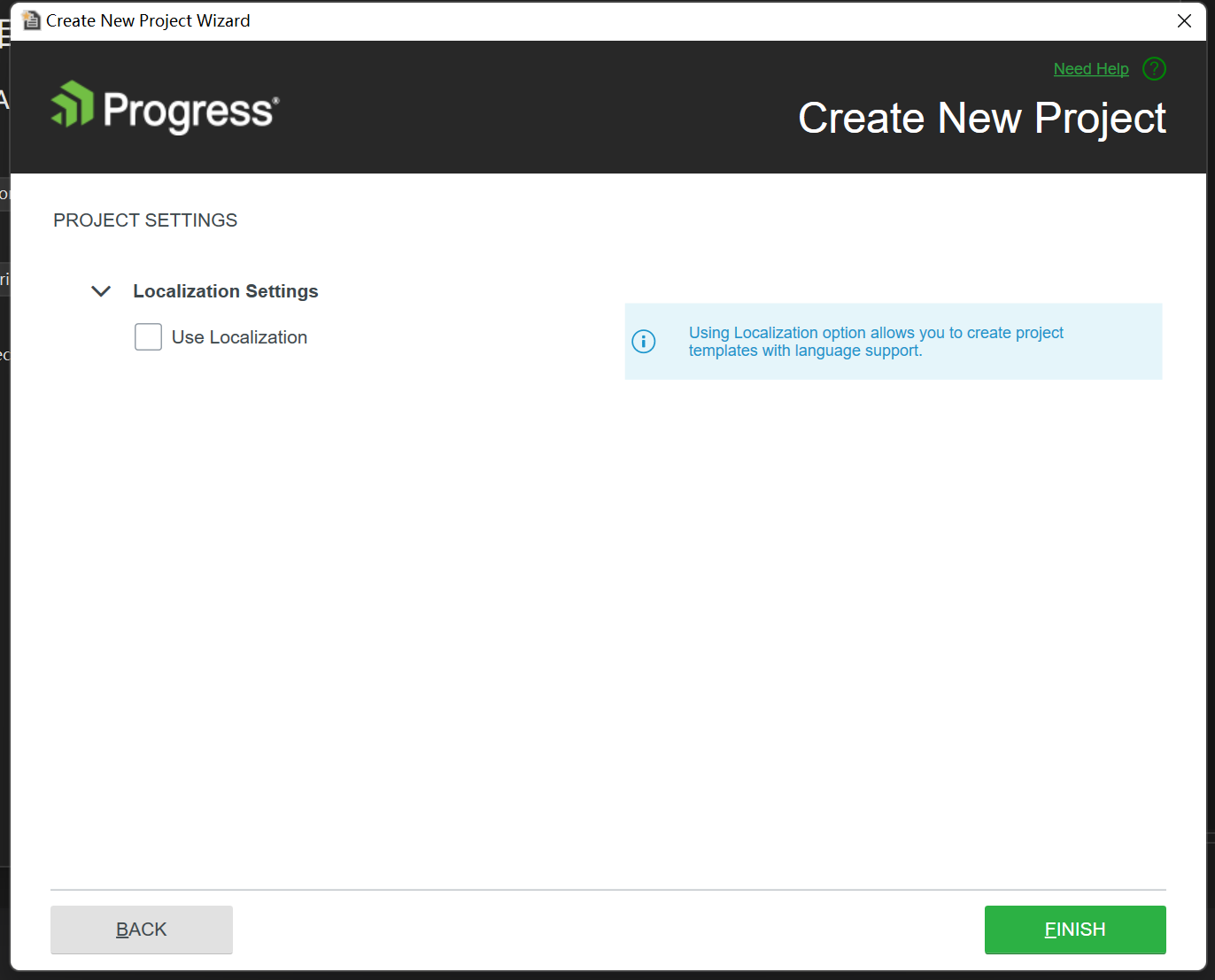
}When uncheck "Use localization" while create project the Localization resources are still auto copied while publish the project.
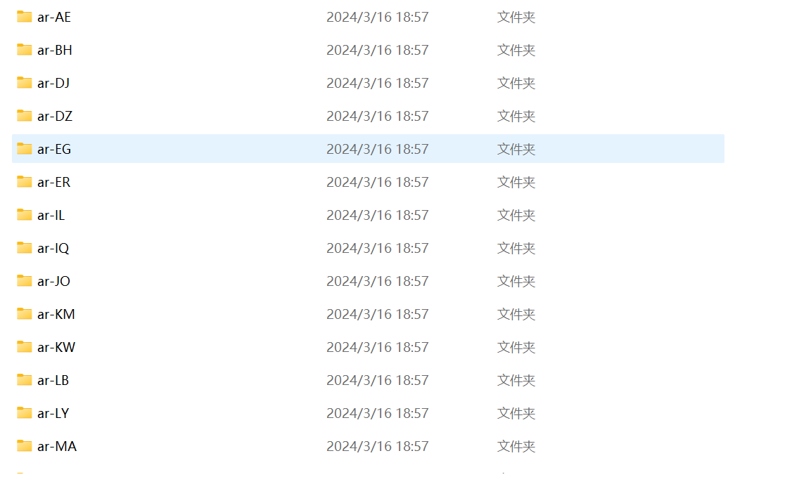
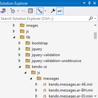
The resources are part of the telerik.ui.for.aspnet.core.yyyy.q.mmdd.nupkg and therefore are copied to the bin folder regardless of the "Use localization" option. The "Use localization" option controls the availability only of the messages files.
This a feature request for providing another lightweight NuGet which does not contain the localization dlls that could be used for non-localized projects.
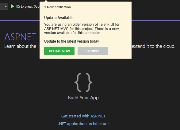
When both UI for ASP.NET MVC and UI for ASP.NET Core Visual Studio extensions are installed and only UI for ASP.NET Core project is loaded, the notification for new version is shown for UI for ASP.NET MVC.
When trying to install Microsoft.VisualStudio.Web.CodeGeneration.Design 7.0.4 NuGet package in a Telerik UI for ASP.NET Core 2022.3.1109 application, it throws an exception:
NU1107: Version conflict detected for Microsoft.CodeAnalysis.CSharp.Workspaces. Install/reference Microsoft.CodeAnalysis.CSharp.Workspaces 4.4.0 directly to
project TelerikAspNetCoreApp3 to resolve this issue.
### Reproduction of the problem
1) Create a Telerik UI for ASP.NET Core 2022.3.1109 application (.NET 7.0).
2) Install Microsoft.VisualStudio.Web.CodeGeneration.Design NuGet package (version 7.0.4).
3) Review the NuGet Error in the output.
### Workaround
Install the the following NuGet packages:
- Microsoft.CodeAnalysis.Common
- Microsoft.CodeAnalysis.Workspaces.Common
- Microsoft.CodeAnalysis.CSharp
- Microsoft.CodeAnalysis.CSharp.Workspaces
- Microsoft.CodeAnalysis.VisualBasic
- Microsoft.CodeAnalysis.VisualBasic.Workspaces
Alternatively, install an older version of the Microsoft.VisualStudio.Web.CodeGeneration.Design package.
### Environment
* **Telerik UI for ASP.NET Core version: 2022.3.1109
* **.NET version: 7
I know you can query the client side JavaScript version using
kendo.versionIt would be handy if you could query the dll assembly version or cdn url so the URLs can automatically match the dll used in the solution especially when nuget is used to update it currently I work around this using:
    @{  var version = typeof(Kendo.Mvc.KendoServices).Assembly.GetName().Version;
        string kendoCDN = $"//kendo.cdn.telerik.com/{version.Major}.{version.Minor}.{version.Build}";}
    <link href="@Url.Content(kendoCDN + "/styles/kendo.bootstrap-v4.min.css")" rel="stylesheet" type="text/css" />
