Hi,
many customers are asking us a more MS Word-like editor supporting true document layout features such as:
- page margins and rulers
- Headers and footers
- section breaks or document structure more similar to MS Word
- Microsoft Word-inspired UI
Many thanks,
Max
I know its a long shot, but do you have anything that resembles the attached control.
Thank you
I reeally would like to see the Blazor Sankey Chart component in the ASP.NET AJAX library!
Kind regards
Robert
.png)
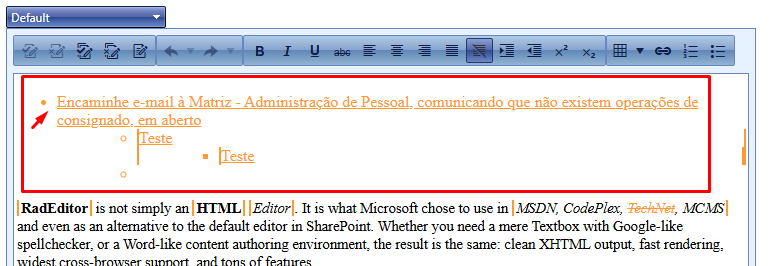
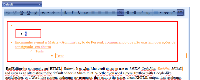
There is a formatting issue in the editor when the "Tab" key is pressed, triggering the editor's "InsertTab" event on text that has been modified by another user. In this event, when set_enableTrackChangesOverride(true) is enabled, the editor inserts an "a" character and misformats the text in question (as shown in the video). When set_enableTrackChangesOverride(false) is set, this error does not occur.
Note: In this scenario, we need track changes enabled so the user can accept or reject the changes made by the previous user, and set_enableTrackChangesOverride(true) so that the current user can reconcile the changes made by both User 1 and User 2 without tracking their own modifications.
Before insert Tab:
After insert Tab:
<%-- <dx:ASPxFormLayout ID="layout" runat="server" Width="100%" Visible="true" Theme="ios" >
<Items>
<dx:TabbedLayoutGroup Caption="tabbed group" Width="100%">
<Items>
<dx:LayoutGroup Caption="Location Information">
<Items>
<dx:LayoutItem Caption="" FieldName="">
<LayoutItemNestedControlCollection>
<dx:LayoutItemNestedControlContainer ID="LayoutItemNestedControlContainer1" runat="server">
<dx:ASPxFormLayout ID="ASPxFormLayout1" runat="server"
DataSourceID="datasourceThisLocation" ColumnCount="2" Theme="Aqua">
<Items>
<dx:LayoutItem FieldName="company" ColSpan="1" Caption="location">
<LayoutItemNestedControlCollection>
<dx:LayoutItemNestedControlContainer runat="server">
<dx:ASPxTextBox runat="server" Width="310px" ID="ASPxFormLayout1_E2"></dx:ASPxTextBox>
</dx:LayoutItemNestedControlContainer>
</LayoutItemNestedControlCollection>
</dx:LayoutItem>
<dx:LayoutItem FieldName="phone" ColSpan="1">
<LayoutItemNestedControlCollection>
<dx:LayoutItemNestedControlContainer runat="server">
<dx:ASPxTextBox runat="server" Width="310px" ID="ASPxFormLayout1_E3"></dx:ASPxTextBox>
</dx:LayoutItemNestedControlContainer>
</LayoutItemNestedControlCollection>
</dx:LayoutItem>
<dx:LayoutItem FieldName="fax" ColSpan="1">
<LayoutItemNestedControlCollection>
<dx:LayoutItemNestedControlContainer runat="server">
<dx:ASPxTextBox runat="server" Width="310px" ID="ASPxFormLayout1_E4"></dx:ASPxTextBox>
</dx:LayoutItemNestedControlContainer>
</LayoutItemNestedControlCollection>
</dx:LayoutItem>
<dx:LayoutItem FieldName="contractStatus" Caption="contract status" ColSpan="1">
<LayoutItemNestedControlCollection>
<dx:LayoutItemNestedControlContainer runat="server">
<dx:ASPxTextBox runat="server" Width="310px" ID="ASPxFormLayout1_E5"></dx:ASPxTextBox>
</dx:LayoutItemNestedControlContainer>
</LayoutItemNestedControlCollection>
</dx:LayoutItem>
<dx:LayoutItem FieldName="timeZone" ColSpan="1" Caption="time zone">
<LayoutItemNestedControlCollection>
<dx:LayoutItemNestedControlContainer runat="server">
<dx:ASPxTextBox runat="server" Width="310px" ID="ASPxFormLayout1_E6"></dx:ASPxTextBox>
</dx:LayoutItemNestedControlContainer>
</LayoutItemNestedControlCollection>
</dx:LayoutItem>
<dx:LayoutItem FieldName="primaryContact" ColSpan="1" Caption="prinary contact">
<LayoutItemNestedControlCollection>
<dx:LayoutItemNestedControlContainer runat="server">
<dx:ASPxTextBox runat="server" Width="310px" ID="ASPxFormLayout1_E7"></dx:ASPxTextBox>
</dx:LayoutItemNestedControlContainer>
</LayoutItemNestedControlCollection>
</dx:LayoutItem>
<dx:LayoutItem FieldName="street" ColSpan="1" Caption="address">
<LayoutItemNestedControlCollection>
<dx:LayoutItemNestedControlContainer runat="server">
<dx:ASPxTextBox runat="server" Width="310px" ID="ASPxFormLayout1_E10"></dx:ASPxTextBox>
</dx:LayoutItemNestedControlContainer>
</LayoutItemNestedControlCollection>
</dx:LayoutItem>
<dx:LayoutItem FieldName="street2" ColSpan="1" Caption="address">
<LayoutItemNestedControlCollection>
<dx:LayoutItemNestedControlContainer runat="server">
<dx:ASPxTextBox runat="server" Width="310px" ID="ASPxFormLayout1_E11"></dx:ASPxTextBox>
</dx:LayoutItemNestedControlContainer>
</LayoutItemNestedControlCollection>
</dx:LayoutItem>
<dx:LayoutItem FieldName="city" ColSpan="1">
<LayoutItemNestedControlCollection>
<dx:LayoutItemNestedControlContainer runat="server">
<dx:ASPxTextBox runat="server" Width="310px" ID="ASPxFormLayout1_E12"></dx:ASPxTextBox>
</dx:LayoutItemNestedControlContainer>
</LayoutItemNestedControlCollection>
</dx:LayoutItem>
<dx:LayoutItem FieldName="state" ColSpan="1">
<LayoutItemNestedControlCollection>
<dx:LayoutItemNestedControlContainer runat="server">
<dx:ASPxTextBox runat="server" Width="310px" ID="ASPxFormLayout1_E13"></dx:ASPxTextBox>
</dx:LayoutItemNestedControlContainer>
</LayoutItemNestedControlCollection>
</dx:LayoutItem>
<dx:LayoutItem FieldName="zip" ColSpan="1">
<LayoutItemNestedControlCollection>
<dx:LayoutItemNestedControlContainer runat="server">
<dx:ASPxTextBox runat="server" Width="310px" ID="ASPxFormLayout1_E14"></dx:ASPxTextBox>
</dx:LayoutItemNestedControlContainer>
</LayoutItemNestedControlCollection>
</dx:LayoutItem>
<dx:LayoutItem FieldName="email" ColSpan="1">
<LayoutItemNestedControlCollection>
<dx:LayoutItemNestedControlContainer runat="server">
<dx:ASPxTextBox runat="server" Width="310px" ID="ASPxFormLayout1_E16"></dx:ASPxTextBox>
</dx:LayoutItemNestedControlContainer>
</LayoutItemNestedControlCollection>
</dx:LayoutItem>
</Items>
</dx:ASPxFormLayout>--%>
Describe service request:
<telerik:RadTextBox ID="srevicetroubles" runat="server" Width="350px"></telerik:RadTextBox>
<%--<dx:ASPxTextBox ID="srevicetroubles" runat="server" Width="350px" Theme="Aqua" ></dx:ASPxTextBox>--%>
<telerik:RadButton ID="ASPxButton2" runat="server" Text="click here send request for service at this location"></telerik:RadButton>
<%--<dx:ASPxButton ID="ASPxButton2" runat="server" Text="click here send request for service at this location" Theme="Aqua"> </dx:ASPxButton>--%>
<asp:Label ID="Label1" runat="server" Text="" Visible="false"></asp:Label>
<%-- </dx:LayoutItemNestedControlContainer>
</LayoutItemNestedControlCollection>
</dx:LayoutItem>
</Items>
</dx:LayoutGroup>--%>
<%-- <dx:LayoutGroup Caption="Notes and Communication">
<Items>
<dx:LayoutItem Caption="" FieldName="">
<LayoutItemNestedControlCollection>
<dx:LayoutItemNestedControlContainer ID="LayoutItemNestedControlContainer3" runat="server">
<dx:ASPxGridView ID="ASPxGridView1" runat="server" DataSourceID="myStoreNotes"
EnableTheming="True" Theme="Moderno" KeyFieldName="id">
<Columns>
<dx:GridViewCommandColumn VisibleIndex="0" ShowNewButton="True" ShowUpdateButton="True" ShowClearFilterButton="True" />
<dx:GridViewDataColumn FieldName="DateAdded" Caption="Date Added" VisibleIndex="1">
<EditFormSettings VisibleIndex="1" Visible="False" />
</dx:GridViewDataColumn>
<dx:GridViewDataColumn FieldName="AddedBy" Caption="Added By" VisibleIndex="2">
<EditFormSettings VisibleIndex="2" Visible="False" />
</dx:GridViewDataColumn>
<dx:GridViewDataTextColumn FieldName="Note" Caption="Note" VisibleIndex="3">
<PropertiesTextEdit EncodeHtml="true"></PropertiesTextEdit>
</dx:GridViewDataTextColumn>
<dx:GridViewDataColumn FieldName="Ack" Caption="Acknowledged" VisibleIndex="4">
<EditFormSettings VisibleIndex="4" Visible="False" />
</dx:GridViewDataColumn>
<dx:GridViewDataColumn FieldName="ackBy" Caption="Acknowledged By" VisibleIndex="5">
<EditFormSettings VisibleIndex="5" Visible="False" />
</dx:GridViewDataColumn>
<dx:GridViewDataColumn FieldName="AckDate" Caption="Acknowledged Date" VisibleIndex="6">
<EditFormSettings VisibleIndex="6" Visible="False" />
</dx:GridViewDataColumn>
</Columns>
<Settings ShowFilterRow="True" />
<SettingsCommandButton>
<NewButton Text="Add Post-It Note" />
<UpdateButton Text="Save" />
</SettingsCommandButton>
</dx:ASPxGridView>
</dx:LayoutItemNestedControlContainer>
</LayoutItemNestedControlCollection>
</dx:LayoutItem>
</Items>
</dx:LayoutGroup>
<dx:LayoutGroup Caption="Open Work Orders">
<Items>
<dx:LayoutItem Caption="" FieldName="">
<LayoutItemNestedControlCollection>
<dx:LayoutItemNestedControlContainer ID="LayoutItemNestedControlContainer7" runat="server">
<dx:ASPxGridView ID="ASPxGridView2" runat="server" AutoGenerateColumns="true"
Visible="true" Theme="Moderno" Width="100%"
DataSourceID="dataSourceOpenTickets" KeyFieldName ="REQUESTNUMBER">
<Columns>
<dx:GridViewDataHyperLinkColumn Caption="WO #" FieldName="REQUESTNUMBER"
VisibleIndex="10" >
<PropertiesHyperLinkEdit NavigateUrlFormatString="/orders/edit.aspx?ID={0}"
TextField="REQUESTNUMBER">
</PropertiesHyperLinkEdit>
</dx:GridViewDataHyperLinkColumn>
<dx:GridViewDataColumn Caption="Service Facility" FieldName="branch" VisibleIndex="30">
</dx:GridViewDataColumn>
<dx:GridViewDataColumn Caption="My PO" FieldName="PO" VisibleIndex="40">
</dx:GridViewDataColumn>
<dx:GridViewDataMemoColumn Caption="Description" FieldName="DESCRIPTION" VisibleIndex="50">
</dx:GridViewDataMemoColumn>
<dx:GridViewDataColumn Caption="Type of Service" FieldName="serviceType" VisibleIndex="60">
</dx:GridViewDataColumn>
<dx:GridViewDataDateColumn Caption="Expected Completion" FieldName="ExpectedCompletionDate" VisibleIndex="80"></dx:GridViewDataDateColumn>
<dx:GridViewDataColumn Caption="Status of WO" FieldName="CurrentCustodyDisplay" VisibleIndex="90">
</dx:GridViewDataColumn>
</Columns>
<Templates>
<DetailRow>
<iframe id="myframeDetailGridView2" runat="server" scrolling="yes" marginwidth="0" marginheight="0" frameborder="0"
vspace="0" hspace="0" width="100%" height="650px" oninit="myframeDetailGridView2_Init"></iframe>
</DetailRow>
</Templates>
<Styles>
<AlternatingRow Enabled="true" />
<Header Wrap="True" />
</Styles>
<SettingsDetail ShowDetailRow="true" />
<Settings ShowFilterRow="True" ShowFilterRowMenu="true" ShowGroupPanel="True" />
<SettingsPager PageSize="15" />
<SettingsBehavior ColumnResizeMode="Control" />
<SettingsBehavior EnableRowHotTrack="true" />
</dx:ASPxGridView>
</dx:LayoutItemNestedControlContainer>
</LayoutItemNestedControlCollection>
</dx:LayoutItem>
</Items>
</dx:LayoutGroup>
<dx:LayoutGroup Caption="Completed Work Oders" Visible="true">
<Items>
<dx:LayoutItem Caption="" FieldName="">
<LayoutItemNestedControlCollection>
<dx:LayoutItemNestedControlContainer ID="LayoutItemNestedControlContainer2" runat="server">
<dx:ASPxGridView ID="ASPxGridView3" runat="server" AutoGenerateColumns="true"
Visible="true" Theme="Moderno" Width="100%"
DataSourceID="dataSourceCompletedTickets" KeyFieldName ="REQUESTNUMBER">
<Columns>
<dx:GridViewDataHyperLinkColumn Caption="WO #" FieldName="REQUESTNUMBER"
VisibleIndex="10" >
<PropertiesHyperLinkEdit NavigateUrlFormatString="/orders/edit.aspx?ID={0}"
TextField="REQUESTNUMBER">
</PropertiesHyperLinkEdit>
</dx:GridViewDataHyperLinkColumn>
<dx:GridViewDataColumn Caption="Service Facility" FieldName="branch" VisibleIndex="30">
</dx:GridViewDataColumn>
<dx:GridViewDataColumn Caption="My PO" FieldName="PO" VisibleIndex="40">
</dx:GridViewDataColumn>
<dx:GridViewDataColumn Caption="Description" FieldName="DESCRIPTION" VisibleIndex="50">
</dx:GridViewDataColumn>
<dx:GridViewDataColumn Caption="Type of Service" FieldName="serviceType" VisibleIndex="60">
</dx:GridViewDataColumn>
<dx:GridViewDataDateColumn Caption="Expected Completion" FieldName="ExpectedCompletionDate" VisibleIndex="80"></dx:GridViewDataDateColumn>
<dx:GridViewDataColumn Caption="Status of WO" FieldName="CurrentCustodyDisplay" VisibleIndex="90">
</dx:GridViewDataColumn>
</Columns>
<Templates>
<DetailRow>
<iframe id="myframeDetailGridView2" runat="server" scrolling="yes" marginwidth="0" marginheight="0" frameborder="0"
vspace="0" hspace="0" width="100%" height="650px" oninit="myframeDetailGridView2_Init"></iframe>
</DetailRow>
</Templates>
<Styles>
<AlternatingRow Enabled="true" />
<Header Wrap="True" />
</Styles>
<SettingsDetail ShowDetailRow="true" />
<Settings ShowFilterRow="True" ShowFilterRowMenu="true" ShowGroupPanel="True" />
<SettingsPager PageSize="15" />
<SettingsBehavior ColumnResizeMode="Control" />
<SettingsBehavior EnableRowHotTrack="true" />
</dx:ASPxGridView>
</dx:LayoutItemNestedControlContainer>
</LayoutItemNestedControlCollection>
</dx:LayoutItem>
</Items>
</dx:LayoutGroup>
<dx:LayoutGroup Caption="Onsite Equipment" Visible="true">
<Items>
<dx:LayoutItem Caption="" FieldName="">
<LayoutItemNestedControlCollection>
<dx:LayoutItemNestedControlContainer ID="LayoutItemNestedControlContainer5" runat="server">
<dx:ASPxGridView ID="ASPxGridView5" runat="server" AutoGenerateColumns="false" Visible="true"
Theme="Office2003Blue" Width="100%" KeyFieldName="EquipmentID" DataSourceID="myEquipment">
<Columns>
<dx:GridViewDataColumn Caption="Description" FieldName="EquipmentDescription" VisibleIndex="1">
</dx:GridViewDataColumn>
<dx:GridViewDataColumn Caption="Quantity" FieldName="EquipmentQTY" VisibleIndex="2">
</dx:GridViewDataColumn>
<dx:GridViewDataColumn Caption="Type" FieldName="EquipmentType" VisibleIndex="3">
</dx:GridViewDataColumn>
<dx:GridViewDataColumn Caption="Location" FieldName="EquipmentLocation" VisibleIndex="4">
</dx:GridViewDataColumn>
<dx:GridViewDataColumn Caption="Size" FieldName="EquipmentSize" VisibleIndex="5">
</dx:GridViewDataColumn>
<dx:GridViewDataColumn Caption="Last Inspection" FieldName="LastInspection" VisibleIndex="6">
</dx:GridViewDataColumn>
</Columns>
<Templates>
<DetailRow>
<dx:ASPxGridView ID="detailGrid" runat="server" DataSourceID="equipmentdetailrecord"
Width="100%" OnBeforePerformDataSelect="detailGrid_DataSelect" AutoGenerateColumns="false">
<Templates>
<DataRow>
<table cellpadding="2" cellspacing="1" style="border-style: none; width: 100%">
<tr>
<td colspan="2">
<h1>Equipment Information</h1>
</td>
</tr>
<tr>
<td align="right">description:</td>
<td><%# Eval("EquipmentDescription")%></td>
</tr>
<tr>
<td align="right">type:</td>
<td><%# Eval("EquipmentSize")%></td>
</tr>
<tr>
<td align="right">size:</td>
<td><%# Eval("EquipmentDescription")%></td>
</tr>
<tr>
<td align="right">serial number:</td>
<td><%# Eval("SerialNumber")%></td>
</tr>
<tr>
<td align="right">location:</td>
<td><%# Eval("EquipmentLocation")%></td>
</tr>
<tr>
<td align="right">model:</td>
<td><%# Eval("EquipmentModel")%></td>
</tr>
<tr>
<td align="right">warrenty expires:</td>
<td><%# Eval("WarrentyExpires")%></td>
</tr>
<tr>
<td align="right">inspection frequency:</td>
<td><%# Eval("Freq")%></td>
</tr>
<tr>
<td align="right">last inspection:</td>
<td><%# Eval("LastInspection")%></td>
</tr>
<tr>
<td align="right">next inspection:</td>
<td><%# Eval("EquipmentDescription")%></td>
</tr>
</table>
</DataRow>
</Templates>
</dx:ASPxGridView>
</DetailRow>
</Templates>
<Settings ShowFilterRow="True" ShowFilterRowMenu="true" ShowGroupPanel="True" />
<SettingsPager PageSize="25" />
<SettingsBehavior ColumnResizeMode="Control" />
<SettingsDetail ShowDetailRow="true" ShowDetailButtons="true" />
</dx:ASPxGridView>
<p><dx:ASPxButton ID="btnXlsExport" runat="server" OnClick="btnXlsExport_Click" Theme="Office2003Blue"
Text="Export to XLS">
</dx:ASPxButton></p>
<p> </p>
<dx:ASPxGridViewExporter ID="ASPxGridViewExporter1" runat="server" GridViewID="ASPxGridView1">
</dx:ASPxGridViewExporter>
</dx:LayoutItemNestedControlContainer>
</LayoutItemNestedControlCollection>
</dx:LayoutItem>
</Items>
</dx:LayoutGroup>
<dx:LayoutGroup Caption="Documents" Visible="true">
<Items>
<dx:LayoutItem Caption="" FieldName="">
<LayoutItemNestedControlCollection>
<dx:LayoutItemNestedControlContainer ID="LayoutItemNestedControlContainer4" runat="server">
<dx:ASPxGridView ID="ASPxGridView4" runat="server" Width="100%"
Theme="Moderno" DataSourceID="dsDocuments" KeyFieldName="DocID">
<Columns>
<dx:GridViewDataTextColumn Caption="Type" FieldName="DocType" VisibleIndex="40">
<EditFormSettings VisibleIndex="40" Visible="False" Caption="name:" />
</dx:GridViewDataTextColumn>
<dx:GridViewDataTextColumn Caption="WT #" FieldName="FalconServiceNumber" VisibleIndex="45">
<EditFormSettings VisibleIndex="45" Visible="False" Caption="name:" />
</dx:GridViewDataTextColumn>
<dx:GridViewDataDateColumn Caption="Index Date" FieldName="DocDate" VisibleIndex="46">
<EditFormSettings VisibleIndex="46" Visible="False" Caption="name:" />
</dx:GridViewDataDateColumn>
<dx:GridViewDataHyperLinkColumn Caption="Document" FieldName="DocID" VisibleIndex="110">
<PropertiesHyperLinkEdit NavigateUrlFormatString="javascript:ShowDetailPopup('{0}');" TextField="DocDescription">
</PropertiesHyperLinkEdit>
<EditFormSettings VisibleIndex="110" Visible="False" Caption="name:" />
</dx:GridViewDataHyperLinkColumn>
</Columns>
<Styles>
<AlternatingRow Enabled="true" />
<Header Wrap="True" />
<RowHotTrack BackColor="lightgray"></RowHotTrack>
</Styles>
<Settings ShowFilterRow="True" ShowFilterRowMenu="true" ShowGroupPanel="True" ShowFilterBar="Visible" />
<SettingsPager PageSize="20" />
<SettingsBehavior ColumnResizeMode="Control" />
</dx:ASPxGridView>
</dx:LayoutItemNestedControlContainer>
</LayoutItemNestedControlCollection>
</dx:LayoutItem>
</Items>
</dx:LayoutGroup>
</Items>
</dx:TabbedLayoutGroup>
</Items>
</dx:ASPxFormLayout>
No Ticket 1659890 is explained a problem that occurs with our customers.
Hello,
For ASPX.NET AJAX... JQuery 1.x branch is still being utilized / embedded (even though some of the bigger issues have been manually changed by your Progress Team) does not cut it with our client base. JQuery Branch 1.x is not acceptable and has been a Severe security item for ALL PEN testing solutions for some time.
What are the Progress plans to get jQuery up to SPEC (3.7.x... etc.). We have no interest in over-riding the version of jQuery as is noted in some of the forums. This creates other issues at the Telerik component level... we do not want to deal with component issues as that is why we procure 3rd party Components in the first place.
"Security is paramount over functionality in most web applications today."
This is major, as we would have to move on to other technologies if your roadmap does not meet our needs. Q1 2025 at min.
I am certain many other users are in the same boat.
Kind Regards
In my AJAX web applications I am using RadScriptManager. However, it seems that the "integrity" directive is not supported by RadScriptReference.
E.g.:
<telerik:RadScriptManager ID="RadScriptManager1" runat="server">
    <Scripts>
            <telerik:RadScriptReference  Path="https://code.jquery.com/jquery-3.7.1.js" integrity="sha384-NdBrHQkGhjPzZhn" crossorigin="anonymous" />
        <telerik:RadScriptReference Path="https://code.jquery.com/jquery-3.2.1.slim.min.js" integrity="sha384-KJ3o2DKtIkvYIK3UENzmM7KCkRr/rE9/Qpg6aAZGJwFDMVNA/GpGFF93hXpG5KkN" crossorigin="anonymous" />
    </Scripts>
</telerik:RadScriptManager>
In case where the y-axis minimum value < 0 the x-axis label appears below the y=0 line and not below the chat. I am however able move the x-axis label to be below the chart by setting RadHTMLChart.PlotArea.YAxis.AxisCrossingValue = the minimum value on the y-axis.
However the y=0 line on the chart is no longer prominent on the chart. I was advised to use a jQuery-type solution to move the label without affecting the appearance of the y=0 line on the chart:
 <telerik:RadScriptManager ID="RadScriptManager1" runat="server"></telerik:RadScriptManager>
         <script>
             function kendoChartInitializing(sender, args) {
                 //move just the Title of the axis
                 args.xAxis.title.padding = { top: 80 }
             }
         </script>
Please provide a code-behind or design time feature to set this property instead of resorting to a jQuery-type method.
Right now when hiding individual entries in RadHtmlChart the percentage will change so that the visible items always add up to 100%.
For the data we're displaying, we need to have an option for the percentage to still be the original percentage.
For example. if there are five items that are 20% each, if I hide one I want the other four to remain at 20% and the total to now only add up to 80%.
The current behaviour would instead change these all to 25% each with the total being 100%, which for our purposes is displaying inaccurate data to the user.
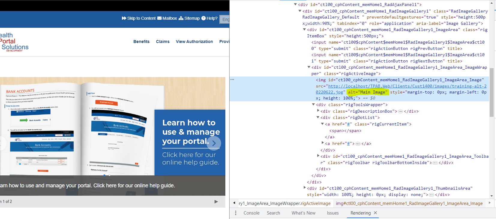
Currently, it's not possible to add Alt text to ImageGalleryItem. By Default it will add "Main Image" as alt.
We can do it in Image Thumbnail but not in the Image Gallery Item, this causes issue with the W3CAG which requires to add alt text to image.
It will be great add on if we can implement this feature to make RadImageGallery accessible.
We have requirements for 3 HtmlCharts showing related data, all with the same dates on the X-axis. There would be too much data to put all series on a single chart.
Each chart has a Navigator. When we want to view a timeframe different to the default, all charts must have the Navigator adjusted separately. It would be a useful feature if a single navigator could change the display of multiple charts.
Hi,
A Feature suggestion to develop a drag-drop Interactive Forms builder, rather than programmatically design a Form. This Feature would simplify and reduce design time to create an Interactive Form for a Designer/User and could be directly integrated into existing applications.
Alan
Currently, when the grid is set to:
<ClientSettings EnablePostBackOnRowClick="true">The post back will be fired even if the clicked row is already selected, which sometimes is not good.
To solve this we need to write a javascript event on rowclick to cancel the event if the row is already selected, but it will be nice to have this as a built in setting like
<ClientSettings EnablePostBackOnRowClick="true" PostBackOnRowClickOnSelectedRow="false">Thanks,
ilan.
The RadSignature has the option to reset the contents of the signature but it would be great to make an event like a OnReset or OnClear so I can set the status of other objects on my page.
RadImageGallery is a great control and supports many image formats out of the box (JPEG, PNG, BMP, etc.)
However, it does not provide native support for HEIF. HEIF is now the default format for most Apple devices (anything after iOS 11 update).
It would be great if RadImageGallery were updated to provide support for this format so that developers don't have to force image conversions of photos taken by Apple devices.
Hi,
currently the only way to set the translation for the "All" option that is created through the enabled "EnableAllOptionInPagerComboBox" property is to set the translation in the "RadGrid1_ItemDataBound" method, which is described here: Localization on RadGrid: Paging Option All
It's a workaround for a missing localisation. By setting the translation in the RadGrid1_ItemDataBound method the if-statement is being checked for every row processed, which is not good for performance.
Could you please make it possible to set the translation with a property and have the default value set in the resource file of the grid?
Thank you.