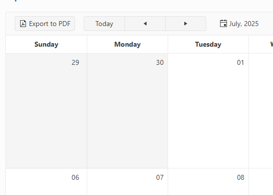
Views - Month - numberOfWeeks (set to 6 weeks), do not need to see previous or next month week. Only show days of the selected month.
This is OK:
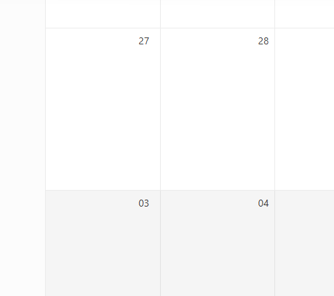
This is not, unnecessary week of Aug 03. The extra week adds to a busy calendar clutter.
Bug Title: Columns are not programmatically associated with their table headers.
Severity: Sev2 (High)
Test Environment:
OS Version: 22H2 (OS Build 25352.1)
URL: https://ppe.oneidentity.core.azure-test.net/
Edge Dev: Version 114.0.1807.6 (Official build) dev (64-bit)
Screen Reader: Narrator
Repro steps:
1.Open kendoSample (codepen.io)
2.Navigate through tables.
Actual Result:
Table header and their data are in different tables. Columns are not associated programmatically with their headers.
Expected Result:
Columns should be associated programmatically with their headers.
Environment (OS, Application, Versions):
OS Version: 22H2 (OS Build 25352.1)
Edge Dev: Version 121.0.2277.112 (Official build) (64-bit)
Third Party Name: Kendo
Repro Steps:
1. Open https://codepen.io/oneID/pen/LYaGREP and turn on NVDA.
2. Navigate to 'Populate' grid and activate it using enter key.
3. Navigate to Expand button present under domain in Export to excel table.
4. Observe if the screen reader is announcing correct role and name for the expand button or not.
Actual Results:
Accessible name for the 'expand' button is not correct, Expand button is defined as link.
Expected Results:
Accessible name of 'expand' button should be sufficient for screen reader user. Accessible name should contain value available in domain as well.
Role should be defined as 'Button' as its behaving as button.
Bug Report
When building with NPM, the glob is mismatched. This is currently related to the source code build.
Reproduction
- Build with version 2025.2.702 in NPM.
Current behavior
Receiving the specific error message:
[!] SyntaxError: The requested module 'glob' does not provide an export named 'default'
Environment
- Kendo UI version: 2025.2.702
- jQuery version: All supported versions
- Browser: all
Bug report
When a user edits a cell/row and presses enter, the cell is marked as dirty. However, the Save and Cancel buttons remain disabled, thus the user should focus on a different cell before being able to save changes.
Reproduction of the problem
- Dojo - https://dojo.telerik.com/JuMumnqH
- Edit a cell and press 'Enter'
Current behavior
The cell is closed and marked as dirty, the 'Save changes and 'Cancel changes' buttons remain disabled.
Expected/desired behavior
The buttons should be enabled once the cell is marked as dirty.
Workaround
cellClose: function(e){
                e.sender._toggleToolbarEditingItemsVisibility()
},
Environment
- Kendo UI version: 2025.2.520
- Browser: [all ]
I have an event template. Inside this template I am using a MultiSelect. It is defined like: <select data-down-Arrow="true"… . The downArrow property does not work. I discovered via debugging the kendo.all.js file the problem. Fortunately this one is fixable outside that file:

Hi team,
I think there is a bug in the dependency detection.
In the attached "config_buged.js" i have chosen some components. The component "chiplist" was partially checked due to dependency.
When lunching my application I got the error :
Message: e(...).kendoChipList is not a function
at init._createList (kendo.custom.min.js:91:8505)
at new init (kendo.custom.min.js:91:3218)
at init._attachGroupable (kendo.custom.min.js:133:96797)
at init._groupable (kendo.custom.min.js:133:96348)
at init._continueInit (kendo.custom.min.js:133:33864)
at new init (kendo.custom.min.js:133:33735)
at HTMLDivElement.<anonymous> (kendo.custom.min.js:1:42737)
at jQuery.each (jquery-3.1.1.js:368:19)
at jQuery.fn.init.each (jquery-3.1.1.js:157:17)
at e.fn.<computed> [as kendoGrid] (kendo.custom.min.js:1:42713)
I was forced to totaly check the "chipList" component as seen in the attached file config.json
Bug report
This is a continuation of the following issue.
Probably related to:
https://source.chromium.org/chromium/chromium/src/+/62d86ddddc8fad157321e42e2acdb18b6ebba951
Reproduction of the problem
- Open the following Dojo in a browser running under the Chromium engine.
- Notice that there is a an console error which showcases sporadically, indicating the following.

Current behavior
The animation container's aria-hidden attribute causes a console error in Chrome and Edge.
Expected/desired behavior
The animation container's aria-hidden attribute should not cause a console error in Chrome and Edge.
Environment
- Kendo UI version: 2024.4.1112
- Browser: [Chrome, Edge]
When the workbook is exported to Excel, it is currently not possible to display the progress for example, in percentage of exported data.
You are returning a "jquery promise", you can call the ".notify" function while the process is running and tell us that you are at step X of Y, when running these settimeout.https://dojo.telerik.com/mHMUMjpg/6
So, we can display a nice progressbar, instead of just a "loading animation" that doesn't tell if the process is really running. In some cases, it can take between 30 and 60 seconds, so the user think that the app is doing nothing!
Hello!
Prior to 2024.2.514 (2024 Q2), the DateRangePicker would "force users first to select start and then end range regardless of the date input selected" [1,2]. However, with the latest 2024 Q2 release, clicking the End input on the DateRangePicker selects the range end.
I did not see this specifically mentioned in the release notes, https://www.telerik.com/support/whats-new/kendo-ui/release-history/kendo-ui-for-jquery-2024-2-514-(2024-q2), so I am reporting this as a bug.
Here is a basic Dojo to demonstrate: https://dojo.telerik.com/IWAbUpuV. You can see the previous behavior by changing the library to the previous version (2024.1.319).
References
The stack property in the Kendo Area Chart does not honor groups as separate stacking contexts.
Instead, everything gets stacked together if `stack: true` is applied.
For other chart types you can overcome this instead of just stack: true, set different stack groups, such as "A" and "B", so they do not stack together.
series: [
{field: "value",
categoryField: "year",
name: "United States Group 1 - Series 1",
stack: "A", // Separate stack group
opacity: 0.5 // Transparency for visibility},
{field: "value1",
categoryField: "year",
name: "United States Group 1 - Series 2",
stack: "A" // Part of the same stack as the first one
},
{field: "value2",
categoryField: "year",
name: "United States Group 2 - Series 1",
stack: "B" // A different stack group
},
{field: "value3",
categoryField: "year",
name: "United States Group 2 - Series 2",
stack: "B" // Part of the second group stack
}
]
The Kendo-UI Diagram widget supports moving the whole diagram using the pan() method. However, the given offset does always have to be absolute.
Consider the following example:
The diagram is zoomed in and therefore not fully visible - assume a current offset of (-100, -100). The users should be able to pan using keyboard shortcuts. Whenever pressing one of the arrow keys, the diagram is moved in the corresponding direction by e.g. 50px:
If the user presses [ArrowRight], pan() needs to be called with an offset of (-50, -100).
If the user presses [ArrowUp], pan() needs to be called with an offset of (-100, -150).
However, since I do not know how much the diagram has already been moved, I cannot set the absolute offset required.
I have seen that pan() returns the current offset when being called without arguments, but this is not documented. Is this safe to use for that purpose or is there a better alternative? If yes, the documentation should be updated.
There are many properties that can be set during initialization that cannot be changed through the API afterwards.

Take the Kendo UI ToolBar for example. You can add a button to the toolbar and set the text, but you cannot change the text afterwards unless you update the element directly. It may seem like a simple thing to change the text of an element, like so: $("#myButton").text("New Text"). However, if you had set the imageUrl as well, setting the text like I did above would remove the image. Knowing that, you could get the text node and update the nodeValue. That may work today but could easily be broken during a Kendo UI update (for example, if the update included a change that wraps the text in a span).

Having to deal with native elements after they have been created by the Kendo UI components is a dangerous practice for developers as it requires an internal knowledge of how elements are rendered based on the different options set. As mentioned above, it is also dangerous as any update could break our code. Therefore, it is imperative to expose methods that allow us to modify any properties through the API (where possible) to allow us to create clean and easy to maintain code.

If you search the feedback, you will see many requests to add a method here and a method there. There is even a related one to this called "Kendo Mobile: Methods to set properties dynamically".

Suggestion: When you have child elements, such as buttons on the toolbar, please allow us to update those widgets directly rather than through the parent. For example, instead of $("#myToolbar").data("kendoToolBar").enable("#myButton"), allow us to do something like this $("#myButton").data("kendoToolBarItem").enable();
Example: https://runner.telerik.io/fullscreen/yypoqSea
This example is based on the example from the docs with `navigatable: true` and enough data that the user needs to scroll in order to see the bottom row.
On Chrome on macOS, the filter menu cannot be used when `navigatable: true` and "Tap to click" is enabled in the macOS Trackpad settings. When clicking on the filter icon, the menu disappears very quickly (see screen recording). As a workaround, setting `navigatable` to false seems to resolve the problem. The same issue does not seem to occur on Safari, however, there is still odd behavior with the scrolling.
For some reason, screen size, resolution, and window settings impact the ability to reproduce the issue. The most reliable way for me to reproduce the issue was with Chrome in full screen on a 16-inch MacBook (13-inch works too) with the bookmarks bar showing and no external displays connected. Hiding the bookmarks bar or not using full screen seems to make it more difficult to reproduce.
The same way it is possible to make the search case-insensitive by setting columns.filterable.ignoreCase to true, it would be great if there was a way to add a custom filter (e.g. make the search diacritics-insensitive, with a custom function or as part of provided functionality). Thanks in advance.
there is no binding for noData
e.g.
noData?: boolean | undefined; interface ChartOptions {
name?: string | undefined;
autoBind?: boolean | undefined;
axisDefaults?: ChartAxisDefaults | undefined;
categoryAxis?: ChartCategoryAxisItem | ChartCategoryAxisItem[] | undefined;
chartArea?: ChartChartArea | undefined;
dataSource?: any|any|kendo.data.DataSource | undefined;
legend?: ChartLegend | undefined;
panes?: ChartPane[] | undefined;
pannable?: boolean | ChartPannable | undefined;
pdf?: ChartPdf | undefined;
persistSeriesVisibility?: boolean | undefined;
plotArea?: ChartPlotArea | undefined;
renderAs?: string | undefined;
series?: ChartSeriesItem[] | undefined;
seriesColors?: any;
seriesDefaults?: ChartSeriesDefaults | undefined;
theme?: string | undefined;
subtitle?: string | ChartSubtitle | undefined;
title?: string | ChartTitle | undefined;
tooltip?: ChartTooltip | undefined;
transitions?: boolean | undefined;
valueAxis?: ChartValueAxisItem | ChartValueAxisItem[] | undefined;
xAxis?: ChartXAxisItem | ChartXAxisItem[] | undefined;
yAxis?: ChartYAxisItem | ChartYAxisItem[] | undefined;
zoomable?: boolean | ChartZoomable | undefined;
axisLabelClick?(e: ChartAxisLabelClickEvent): void;
dataBound?(e: ChartDataBoundEvent): void;
drag?(e: ChartDragEvent): void;
dragEnd?(e: ChartDragEndEvent): void;
dragStart?(e: ChartDragStartEvent): void;
legendItemClick?(e: ChartLegendItemClickEvent): void;
legendItemHover?(e: ChartLegendItemHoverEvent): void;
legendItemLeave?(e: ChartLegendItemLeaveEvent): void;
noteClick?(e: ChartNoteClickEvent): void;
noteHover?(e: ChartNoteHoverEvent): void;
noteLeave?(e: ChartNoteLeaveEvent): void;
paneRender?(e: ChartPaneRenderEvent): void;
plotAreaClick?(e: ChartPlotAreaClickEvent): void;
plotAreaHover?(e: ChartPlotAreaHoverEvent): void;
plotAreaLeave?(e: ChartPlotAreaLeaveEvent): void;
render?(e: ChartRenderEvent): void;
select?(e: ChartSelectEvent): void;
selectEnd?(e: ChartSelectEndEvent): void;
selectStart?(e: ChartSelectStartEvent): void;
seriesClick?(e: ChartSeriesClickEvent): void;
seriesHover?(e: ChartSeriesHoverEvent): void;
seriesOver?(e: ChartSeriesOverEvent): void;
seriesLeave?(e: ChartSeriesLeaveEvent): void;
zoom?(e: ChartZoomEvent): void;
zoomEnd?(e: ChartZoomEndEvent): void;
zoomStart?(e: ChartZoomStartEvent): void;
}
It will be really useful if we could include a new 'filtering mode' in which operators like 'and' or 'or' are allowed in the filtering input box.
For instance, using the "doesnotcontain" with 'march or july or september' will allow users to exclude multiple conditions in a single filter
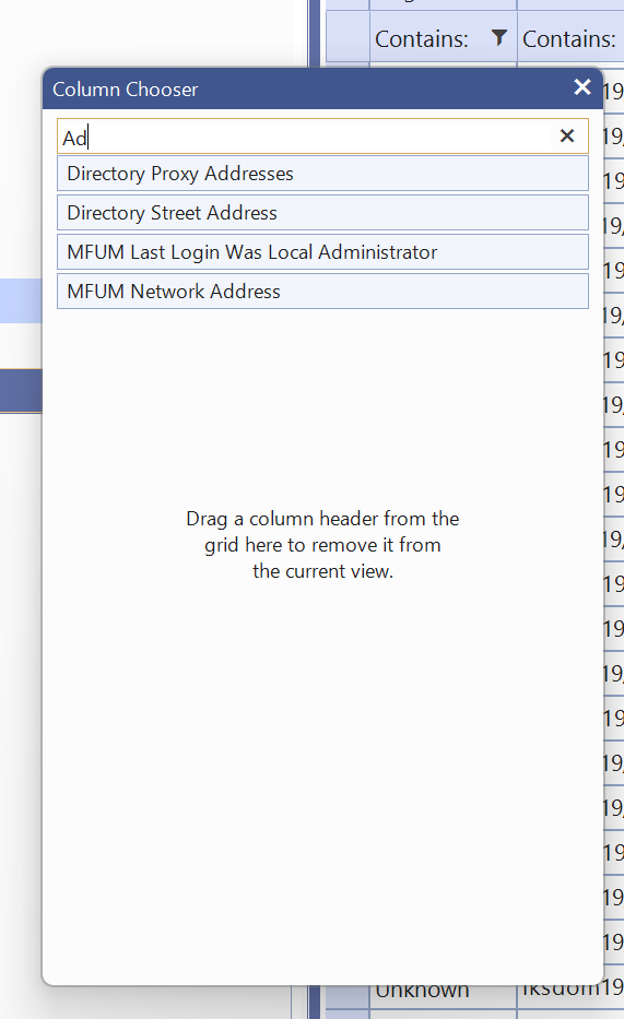
In my application, I have grids with dozens of hidden fields.
It would be beneficial if I could filter the available columns similar to what's available in the Windows Forms column chooser: