Unplanned
Last Updated:
29 Mar 2018 11:49
by Greg
ADMIN
Created by:
Nikolay
Comments:
2
Category:
Chart
Type:
Feature Request
It will be a nice addition for the chart to display harvey balls, where each ball is displayed exactly under one bar (or another data point representation).
Unplanned
Last Updated:
12 Apr 2018 08:08
by ADMIN
ADMIN
Created by:
Yana
Comments:
0
Category:
Chart
Type:
Bug Report
If you have BarSeries with CombineMode set to "Stack" with zero values, the bars are placed to the maximum of the y-axis.
As a work-around, you would need to manually adjust the Maximum value of the vertical axis.
Unplanned
Last Updated:
29 Mar 2018 11:49
by ADMIN
ADMIN
Created by:
Ves
Comments:
0
Category:
Chart
Type:
Feature Request
Allow the user to customize the origin of rotation for axis labels.
Unplanned
Last Updated:
06 Dec 2023 15:42
by ADMIN
ADMIN
Created by:
Ves
Comments:
2
Category:
Chart
Type:
Bug Report
DateTimeContinuousAxis displays incorrect labels when MajorStepUnit is Month. There are two labels for some months with 31 days.
Unplanned
Last Updated:
03 Apr 2018 11:36
by ADMIN
ADMIN
Created by:
Rosy Topchiyska
Comments:
2
Category:
Chart
Type:
Bug Report
This is visible only with longer labels, check the attached image.
Unplanned
Last Updated:
22 Mar 2018 15:15
by Jaime
ADMIN
Created by:
Stefan Nenchev
Comments:
1
Category:
Chart
Type:
Bug Report
Unplanned
Last Updated:
09 Mar 2018 12:06
by ADMIN
ADMIN
Created by:
Petar Marchev
Comments:
0
Category:
Chart
Type:
Feature Request
Presently the trackball is displayed after a hold gesture. It will be a good addition to the features of the chart if the trackball can get displayed after a single tap.
Unplanned
Last Updated:
15 Feb 2018 09:59
by ADMIN
ADMIN
Created by:
Yana
Comments:
0
Category:
Chart
Type:
Bug Report
Series labels are not displayed for horizontal BarSeries in UWP.
Unplanned
Last Updated:
20 Feb 2020 13:59
by ADMIN
ADMIN
Created by:
Yana
Comments:
4
Category:
Chart
Type:
Bug Report
If the series is added after the page constructor, the vertical axis labels are not shown.

As a workaround, create the series in the constructor and set its ItemsSource at a later stage.
Unplanned
Last Updated:
29 Mar 2018 11:49
by ADMIN
ADMIN
Created by:
Lance | Senior Manager Technical Support
Comments:
0
Category:
Chart
Type:
Feature Request
Bring the LabelRotationAngle property to Axes in Xamarin.Forms.

See LabelRotationAngle here for reference: http://docs.telerik.com/devtools/wpf/controls/radchartview/axes/axis
Unplanned
Last Updated:
13 Sep 2017 14:41
by ADMIN
ADMIN
Created by:
Stefan Nenchev
Comments:
0
Category:
Chart
Type:
Feature Request
Unplanned
Last Updated:
29 Mar 2018 11:49
by ADMIN
ADMIN
Created by:
Pavel R. Pavlov
Comments:
0
Category:
Chart
Type:
Bug Report
Bars are too thin in iOS when items are per day.
Unplanned
Last Updated:
02 Aug 2023 15:27
by Dennis
Created by:
Dennis
Comments:
0
Category:
Chart
Type:
Bug Report
On iOS is whenever the first series ItemSource has a null value, the other series are not plotted correctly in the graph. 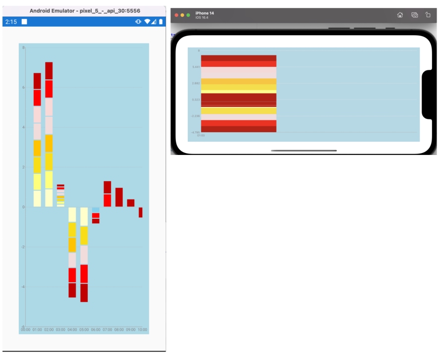
Unplanned
Last Updated:
02 Aug 2023 15:13
by Dennis
Created by:
Dennis
Comments:
0
Category:
Chart
Type:
Bug Report
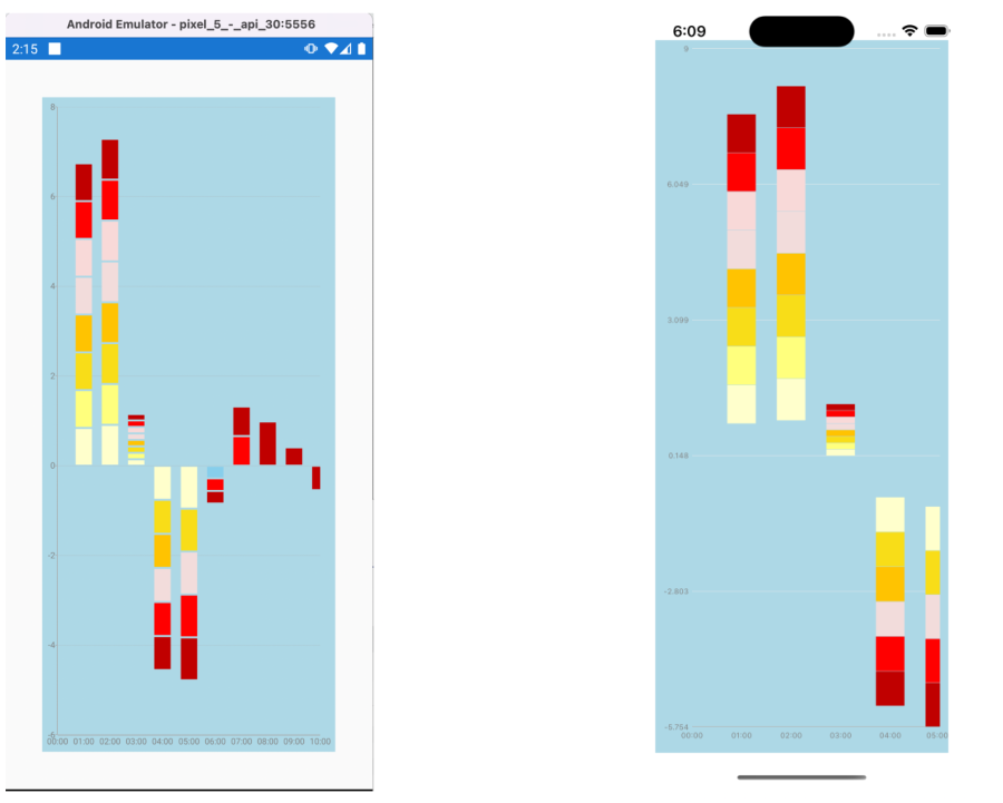
When having many stack bar series in one chart, some data points are rendered behind another data points. Check the attached image: how it looks on android and on iOS
Unplanned
Last Updated:
18 Nov 2022 17:13
by Matthew
Created by:
Matthew
Comments:
0
Category:
Chart
Type:
Feature Request
Add support for range series. The series are available in the native charts
Android - RangeBarSeries
iOS RangeBar and RangeColumn Series
UWP RangeBar, Range Series.
Please add these series to Chart for Xamarin.Forms.
Android - RangeBarSeries
iOS RangeBar and RangeColumn Series
UWP RangeBar, Range Series.
Please add these series to Chart for Xamarin.Forms.
Unplanned
Last Updated:
02 Sep 2022 08:17
by paul
Created by:
paul
Comments:
0
Category:
Chart
Type:
Bug Report
1. Change the view from BarSeries to Pie Series
=> Observe the PieChart loads as expected
2. Change the selection back to "Bar Series"
=> Observe BarSeries continues to operate as expected
3. Change the selection from "Bar Series" to "Pie Series"
=> Observe the following exception
Java.Lang.NullPointerException: 'Attempt to read from field 'double com.telerik.widget.chart.visualization.pieChart.PieUpdateContext.radius' on a null object reference'
Workaround:
Remove the ShowLabels from Pie Series.
Unplanned
Last Updated:
01 Jun 2023 07:56
by HV
Created by:
HV
Comments:
0
Category:
Chart
Type:
Bug Report
When setting LabelTextColor, it does not apply to the chart axis
verticalAxis.LabelTextColor = Android.Graphics.Color.Red;
Unplanned
Last Updated:
01 Jun 2022 08:57
by Kelsey
Created by:
Kelsey
Comments:
0
Category:
Chart
Type:
Bug Report
If you add a View Annotation with an image to the iOS Chart through a custom renderer and the Chart has zoom and pan behavior applied, the annotation displays outside the axes when the Chart is zoomed.
Unplanned
Last Updated:
16 Jan 2023 11:53
by ADMIN
Created by:
Mayank
Comments:
2
Category:
Chart
Type:
Bug Report
For Chart with ScatterLineSeries, in case the ItemsSource contains points with following sample horizontal values: 0, 2, 4, 6, 8, 6, 4, 2, 0, ZoomBehavior does not work correctly on iOS - when ZoomMode is set to "Both", the points are taken in incorrect order and the result is a zig-zag chart.
Unplanned
Last Updated:
29 Mar 2018 11:49
by ADMIN
ADMIN
Created by:
Nikolay
Comments:
0
Category:
Chart
Type:
Feature Request
Currently, depending on the platform, the first piece of the pie is drawn at 3 or 9 o'clock. It should be possible for the developer to set the starting point to be 12 o'clock.