With the current release the chart does not update its series (and axis) when the BindingContext is set on a button click.

Available in minor release 2017.3.927. It will also be available in the R3 2017 SP release.
Available in the R3 2018 SP release.
When you have a Chart with PieSeries and enable the SelectionBehavior - selecting a specific value makes it split from the pie chart and stand out. We should consider exposing another state, where the integrity of the pie chart is not broken and the selected items are just highlighted or probably have a bold border, etc.
Available in the R3 2018 SP release.
Add the ability to render points outside of the plot area when the data point value exceeds the explicitly set Min or Max values of the horizontal axis.

On Android and iOS, the line series will continue to extend off the plot area to a point that isn't rendered. Here's a screenshot, notice the line coming in from the left side of the plot area: https://www.telerik.com/clientsfiles/77e02115-6de0-4dd0-b572-5d5bc17a59b9_xamarin.jpg

On UWP, the beginning of the line series only starts on the first plot-able point. Here's a screenshot, notice the start of the line series: https://www.telerik.com/clientsfiles/d8c342e3-608b-40eb-95eb-8bd5e0dbc2e6_uwp.jpg
If you have a Chart with BarSeries and TooltipBehavior defined, the tooltip of each bar is shown only when the user taps in the area around the tip of the bar.
The expected behavior is the tooltip to be displayed when clicking anywhere on the bar.
Using the RadPieChart and PieSeries (UI for Xamarin v2019.2.802.1 from NuGet), I can currently set the LabelBinding (or LabelFormat or LabelFormatter) to adjust the strings displayed in the labels on the slices of the pie chart, but unlike other chart controls, I currently have no way to modify the styling of those labels like I can in every other chart control I've used from Telerik UI for Xamarin.
It seems to me that it would be best to have more properties on the PieSeries class, like LabelFontSize, LabelFontAttributes, LabelFontFamily, LabelTextColor, and LabelMargin (Label prefix to distinguish from LegendTitleBinding could be kept or discarded as desired on some of these names).
LabelMargin would be particularly helpful to eliminate the UWP situation wherein currently all pie slice labels overlap with the outer lighter ring of the pie chart (see image from UWP). The others just seem needed to maintain a consistent appearance of charts within an app - if all my chart labels are dark blue and a different font size and style except for the not-style-able black labels in pie charts, that makes pie charts hard to incorporate without looking bad or forcing styling elsewhere to match the pie charts' fixed values.
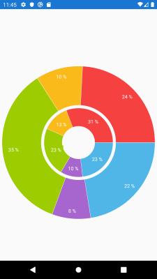
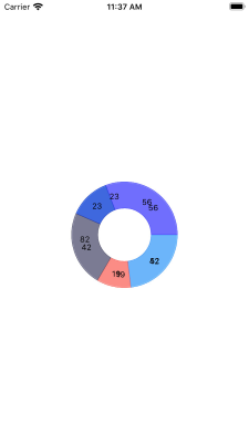
If you have the following PieChart with donut series definition:
<telerikChart:RadPieChart HeightRequest="200"
                          WidthRequest="200">
    <telerikChart:RadPieChart.Series>
        <telerikChart:DonutSeries ShowLabels="True"
                                  ValueBinding="Value"
                                  ItemsSource="{Binding Data}" />
        <telerikChart:DonutSeries ShowLabels="True"
                                  RadiusFactor="0.45"
                                  ValueBinding="Value"
                                  ItemsSource="{Binding Data1}" />
    </telerikChart:RadPieChart.Series>
</telerikChart:RadPieChart>
On android works as expected:
On iOS the series are overlapped and not visualized as expected. The radius factor is not respected
On UWP the second donut series in not visualized and the radius factor is not respected.
X-Axis labels are overlapped when new data points are constantly added.
on Android, the axis labels are replaced.
There is an inconsistency in the behavior on Android and iOS.
Workaround:
apply ChartPanAndZoomBehavior and set
PanMode to "Horizontal"
ZoomMode to "Horizontal"
And chart Zoom to "2,1"
<telerikChart:RadCartesianChart PaletteName="Light"
                                Zoom="2, 1">
    <telerikChart:RadCartesianChart.BindingContext>
        <local:ViewModel/>
    </telerikChart:RadCartesianChart.BindingContext>
    <telerikChart:RadCartesianChart.HorizontalAxis>
        <telerikChart:DateTimeContinuousAxis LabelFitMode="Rotate"
                                             MajorStepUnit="Day"
                                             PlotMode="OnTicks"
                                             LabelFormat="dd MMM"
                                             MajorStep="20"
                                             ShowLabels="True"/>
    </telerikChart:RadCartesianChart.HorizontalAxis>
    <telerikChart:RadCartesianChart.VerticalAxis>
        <telerikChart:NumericalAxis />
    </telerikChart:RadCartesianChart.VerticalAxis>
    <telerikChart:RadCartesianChart.Series>
        <telerikChart:LineSeries ValueBinding="Value"
                                 CategoryBinding="Date"
                                 DisplayName="Sales"
                                 ItemsSource="{Binding Data}"/>
    </telerikChart:RadCartesianChart.Series>
    <telerikChart:RadCartesianChart.ChartBehaviors>
        <telerikChart:ChartPanAndZoomBehavior ZoomMode="Horizontal"
                                              PanMode="Horizontal"
                                              HandleDoubleTap="True"/>
    </telerikChart:RadCartesianChart.ChartBehaviors>
</telerikChart:RadCartesianChart>
It will be a nice addition for the chart to display harvey balls, where each ball is displayed exactly under one bar (or another data point representation).
Support the ability to apply palette per point for a bar series.
Available in the R3 2017 release.
If customers set bindings to these properties and try to set range from negative to positive values (e.g. from -0.5 to 0.5) the bindings are not applied as expected.
Allow the user to customize the origin of rotation for axis labels.
After setting the MajorLinesVisibility property to GridLineVisibility.Xy only the Y lines are showing up.
This is visible only with longer labels, check the attached image.
Bring the LabelRotationAngle property to Axes in Xamarin.Forms.

See LabelRotationAngle here for reference: http://docs.telerik.com/devtools/wpf/controls/radchartview/axes/axis


