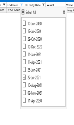
We are noticing inconsistent display issue when it comes to running this app via Citrix.
In particular the when we are using the Filter option on a grid screen, some times we get a partial display vs the Complete display. Please advise what we can do to ensure stable presentation
Correct
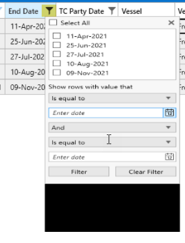
incorrect
After defining my colors in the Telerik color theme generator vs wasn't recognizing the emitted code as valid. I had to explore the Intellisense suggestions and try different variations until I arrived at the correct solution:
I'm not sure if this has to do with versioning differences or is a general case. Regardless, I figured I'd let the Telerik team know.
Best,
Nick
            // Theme Editor Output
            VisualStudio2019.Palette.AccentColor = (Color)ColorConverter.ConvertFromString("#FFF5CC84");
            VisualStudio2019.Palette.AccentMainColor = (Color)ColorConverter.ConvertFromString("#FFAAC0FF");
            VisualStudio2019.Palette.AccentDarkColor = (Color)ColorConverter.ConvertFromString("#FF5F6FA4");
            VisualStudio2019.Palette.AccentSecondaryDarkColor = (Color)ColorConverter.ConvertFromString("#FF40508D");
            VisualStudio2019.Palette.AccentMouseOverColor = (Color)ColorConverter.ConvertFromString("#FFC4D5FF");
            VisualStudio2019.Palette.AccentFocusedColor = (Color)ColorConverter.ConvertFromString("#FFD2A85E");
            VisualStudio2019.Palette.AccentForegroundColor = (Color)ColorConverter.ConvertFromString("#FF5F6FA4");
            VisualStudio2019.Palette.ValidationColor = (Color)ColorConverter.ConvertFromString("#FFFF3333");
            VisualStudio2019.Palette.BasicColor = (Color)ColorConverter.ConvertFromString("#FF94A6CA");
            VisualStudio2019.Palette.SemiBasicColor = (Color)ColorConverter.ConvertFromString("#FFC0CAE9");
            VisualStudio2019.Palette.PrimaryColor = (Color)ColorConverter.ConvertFromString("#FFF2F5FC");
            VisualStudio2019.Palette.SecondaryColor = (Color)ColorConverter.ConvertFromString("#FFFFFFFF");
            VisualStudio2019.Palette.MarkerColor = (Color)ColorConverter.ConvertFromString("#FF1E1E1E");
            VisualStudio2019.Palette.MarkerInvertedColor = (Color)ColorConverter.ConvertFromString("#FFFFFFFF");
            VisualStudio2019.Palette.IconColor = (Color)ColorConverter.ConvertFromString("#FF414141");
            VisualStudio2019.Palette.AlternativeColor = (Color)ColorConverter.ConvertFromString("#FFF7F9FE");
            VisualStudio2019.Palette.MouseOverColor = (Color)ColorConverter.ConvertFromString("#FFFFF8DF");
            VisualStudio2019.Palette.ComplementaryColor = (Color)ColorConverter.ConvertFromString("#FFD9E0F8");
            VisualStudio2019.Palette.MainColor = (Color)ColorConverter.ConvertFromString("#FFFCFCFC");
            VisualStudio2019.Palette.HeaderColor = (Color)ColorConverter.ConvertFromString("#FF40568D");
            VisualStudio2019.Palette.DockingBackgroundColor = (Color)ColorConverter.ConvertFromString("#FF5F6FA4");
            VisualStudio2019.Palette.ReadOnlyBackgroundColor = (Color)ColorConverter.ConvertFromString("#FFFCFCFC");
            VisualStudio2019.Palette.ReadOnlyBorderColor = (Color)ColorConverter.ConvertFromString("#FF94A6CA");
            VisualStudio2019.Palette.DisabledOpacity = 0.3;
            VisualStudio2019.Palette.ReadOnlyOpacity = 0.6;

            // Fixed Output
            VisualStudio2019Palette.Palette.AccentColor = (Color)ColorConverter.ConvertFromString("#FF5399EE");
            VisualStudio2019Palette.Palette.AccentMainColor = (Color)ColorConverter.ConvertFromString("#FF5399EE");
            VisualStudio2019Palette.Palette.AccentDarkColor = (Color)ColorConverter.ConvertFromString("#FF233042");
            VisualStudio2019Palette.Palette.AccentSecondaryDarkColor = (Color)ColorConverter.ConvertFromString("#FF2E6FF2");
            VisualStudio2019Palette.Palette.AccentMouseOverColor = (Color)ColorConverter.ConvertFromString("#FF5399EE");
            VisualStudio2019Palette.Palette.AccentFocusedColor = (Color)ColorConverter.ConvertFromString("#FF2E6FF2");
            //VisualStudio2019Palette.Palette.AccentForegroundColor = (Color)ColorConverter.ConvertFromString("#FFBBD3F0");
            VisualStudio2019Palette.Palette.ValidationColor = (Color)ColorConverter.ConvertFromString("#FFFF3333");
            VisualStudio2019Palette.Palette.BasicColor = (Color)ColorConverter.ConvertFromString("#FFBBD3F0");
            VisualStudio2019Palette.Palette.SemiBasicColor = (Color)ColorConverter.ConvertFromString("#FFEAEFF6");
            VisualStudio2019Palette.Palette.PrimaryColor = (Color)ColorConverter.ConvertFromString("#FFEAEFF6");
            VisualStudio2019Palette.Palette.SecondaryColor = (Color)ColorConverter.ConvertFromString("#FFFFFFFF");
            VisualStudio2019Palette.Palette.MarkerColor = (Color)ColorConverter.ConvertFromString("#FF262626");
            VisualStudio2019Palette.Palette.MarkerInvertedColor = (Color)ColorConverter.ConvertFromString("#FFFFFFFF");
            VisualStudio2019Palette.Palette.IconColor = (Color)ColorConverter.ConvertFromString("#FF414141");
            VisualStudio2019Palette.Palette.AlternativeColor = (Color)ColorConverter.ConvertFromString("#FFF7F9FE");
            VisualStudio2019Palette.Palette.MouseOverColor = (Color)ColorConverter.ConvertFromString("#FF5399EE");
            VisualStudio2019Palette.Palette.ComplementaryColor = (Color)ColorConverter.ConvertFromString("#FFBED4F0");
            VisualStudio2019Palette.Palette.MainColor = (Color)ColorConverter.ConvertFromString("#FFFCFCFC");
            VisualStudio2019Palette.Palette.HeaderColor = (Color)ColorConverter.ConvertFromString("#FF233042");
            //VisualStudio2019Palette.Palette.DockingBackgroundColor = (Color)ColorConverter.ConvertFromString("#FF233042");
            VisualStudio2019Palette.Palette.ReadOnlyBackgroundColor = (Color)ColorConverter.ConvertFromString("#FFFCFCFC");
            VisualStudio2019Palette.Palette.ReadOnlyBorderColor = (Color)ColorConverter.ConvertFromString("#FF94A6CA");
            VisualStudio2019Palette.Palette.DisabledOpacity = 0.3;
            VisualStudio2019Palette.Palette.ReadOnlyOpacity = 0.6;
I've downloaded the latest Sample Application for Terlerik UI for WPF R1 2021 SP1
When I try to select the RibbonView sample I get a MessageBox with message "Exception has been thrown by the target of an incovation" and the sample does not load. All other samples work fine.
Good afternoon,
When we add a new child element to the RadDiagram(see attach file), the diagram automatically optimizes their layout. After the chart is updated, the new element and its parent are automatically moved to the left side. How to make them stay in their places?
There is a small discussion of this problem on the forum.
Regards,
Andrei Silich
As far as I know, there are no way to set the color of the title bar. As far as I know there are no properties "color" of the title bar.
Thanks
Hi Team,
Dennis Callahan from Telerik submitting this on behalf of Don -
If your team could create a theme for UI for WPF that mimicked the look of a UWP application and responded to the Windows 10 Light and Dark setting that would be excellent. I have not found such a theme in any of the products I have looked at so if Telerik could do it I think it might be the first.
I'm trying to draw a polygon on my RadMap using the MapPolygonView control. I can only see the polygon after I finished drawing it, but while I'm drawing - I can't see the lines.
Please add the capability for the RadMap to visualize the animation of shape's lines as it is being drawn.
Hello,
We want to integrate a web browser in a flyout pane in WPF to display html 5 pages. Moreover, we want to display some html contents in tooltips too.
The provided WebBrowser by WPF framework does not work well.
Consequently, the idea is to have a "htmlplaceholder" (as you provide in silverlight) which supports HTML 5 and could be based on chromium engine.
Thanks & regards,
Testing in the RadColorEditor control:
looking the attachments,Select the two numbers on the left(the file "Select.png"),
then enter a number through the keyboard,just modified the number on the far left(the file "Input1.png").
But sometimes the two numbers that are selected are replaced,like the file "Input2.png".
Obviously the second case input experience is better!
Continuous restarts cause one of the two.
the same time:the pointer tool/Text tool/Shape tool can't select exclusive,don't draw using the selected tool.
the place preview will flash.
at the same time,when resize the right auto hide area towards the bigger,don't show the resize bar!
using GroupStyle ,and setting : ScrollViewer.CanContentScroll="False",when click the item,
within the group,the ScrollViewer auto scroll up and down,don't using VirtualizingPanel.
but the microsoft ListBox is OK!
the code like the follwoing:
<telerik:RadListBox Width="250" ItemsSource="{Binding Data.View}" SelectionMode="Single"
ItemTemplate="{StaticResource ListBoxTemplate}"
ScrollViewer.CanContentScroll="False">
<telerik:RadListBox.GroupStyle>
<GroupStyle>
<GroupStyle.ContainerStyle>
<Style TargetType="{x:Type GroupItem}">
<Setter Property="Template">
<Setter.Value>
<ControlTemplate TargetType="{x:Type GroupItem}">
<Expander IsExpanded="True"
ExpandDirection="Down">
<Expander.Header>
<StackPanel Orientation="Horizontal">
<TextBlock Text="{Binding Path=Name}"
VerticalAlignment="Center" />
<TextBlock Text="{Binding Path=ItemCount, StringFormat=Count:{0}}"
VerticalAlignment="Center"
Margin="5,0,0,0" />
</StackPanel>
</Expander.Header>
<ItemsPresenter />
</Expander>
</ControlTemplate>
</Setter.Value>
</Setter>
</Style>
</GroupStyle.ContainerStyle>
</GroupStyle>
</telerik:RadListBox.GroupStyle>
</telerik:RadListBox>
Hi there
This is a very impotent control in our company.
However, we need to implement a spell checker as you already have in RTF.
Eliezer Kaplansy PhD
CTO
Makeshet Information Systems
when use the RadTransitionControl's SlideAndZoomTransition effect for the RadTabControl, the radComboBox Multiple Selection will lost in the tabItem。
the radComboBox data is from the mvvm binding,after change the tabitem,the Multiple Selection become single selection.
the RadTabControl's style is following:
...
<ControlTemplate x:Key="TabControlTemplate" TargetType="telerik:RadTabControl">
<Grid>
<telerik:RadDockPanel LastChildFill="True">
<telerik:LayoutTransformControl x:Name="HeaderDockedElement" telerik:RadDockPanel.Dock="Top">
<Grid SnapsToDevicePixels="True">
<Border x:Name="HeaderBackground" Background="{TemplateBinding HeaderBackground}" Visibility="{TemplateBinding BackgroundVisibility}"/>
<telerik:RadDockPanel Panel.ZIndex="10">
<telerik:LayoutTransformControl x:Name="AdditionalContentTransform" Margin="0" telerik1:RadDockPanel.Dock="Right">
<ContentPresenter x:Name="AdditionalContentElement" Content="{TemplateBinding AdditionalContent}"/>
</telerik:LayoutTransformControl>
<ToggleButton x:Name="DropDownButtonElement"
Visibility="Collapsed"
telerik:RadDockPanel.Dock="Right"
Style="{TemplateBinding DropDownButtonStyle}"
ClickMode="Press"
IsChecked="{Binding IsDropDownOpen, Mode=TwoWay, RelativeSource={RelativeSource TemplatedParent}}">
<telerik:RadContextMenu.ContextMenu>
<telerikTabControl:DropDownMenu x:Name="DropDownMenuElement"
StaysOpen="False"
Placement="Bottom"
Style="{TemplateBinding DropDownStyle}"
ItemTemplate="{TemplateBinding ItemDropDownContentTemplate}"
ItemTemplateSelector="{TemplateBinding ItemDropDownContentTemplateSelector}"
DisplayMemberPath="{TemplateBinding DropDownDisplayMemberPath}"/>
</telerik:RadContextMenu.ContextMenu>
</ToggleButton>
<RepeatButton x:Name="LeftScrollButtonElement" Style="{StaticResource ScrollButtonStyle}">
<telerik:RadGlyph Glyph="{StaticResource GlyphArrowChevronLeft}"/>
</RepeatButton>
<RepeatButton x:Name="RightScrollButtonElement" Style="{StaticResource ScrollButtonStyle}" telerik:RadDockPanel.Dock="Right">
<telerik:RadGlyph Glyph="{StaticResource GlyphArrowChevronRight}"/>
</RepeatButton>
<ScrollViewer x:Name="ScrollViewerElement"
Style="{StaticResource EmptyScrollViewerStyle}"
VerticalScrollBarVisibility="Disabled"
BorderThickness="0"
IsTabStop="False"
HorizontalScrollBarVisibility="{Binding (ScrollViewer.HorizontalScrollBarVisibility), RelativeSource={RelativeSource TemplatedParent}}">
<ItemsPresenter/>
</ScrollViewer>
</telerik:RadDockPanel>
</Grid>
</telerik:LayoutTransformControl>
<Border x:Name="ContentBorder"
BorderBrush="{TemplateBinding BorderBrush}"
BorderThickness="{Binding RelativeSource={RelativeSource TemplatedParent}, Path=BorderThickness, Mode=TwoWay}"
Background="{TemplateBinding Background}"
Padding="{TemplateBinding Padding}">
<Grid>
<telerik:RadTransitionControl x:Name="ContentElement"
Visibility="{Binding RelativeSource={RelativeSource TemplatedParent}, Path=IsContentPreserved,Converter={StaticResource InvertedBooleanToVisibilityConverter}}"
Content="{TemplateBinding SelectedContent}"
ContentTemplate="{TemplateBinding SelectedContentTemplate}"
ContentTemplateSelector="{TemplateBinding SelectedContentTemplateSelector}"
Duration="00:00:00.350">
<telerik:RadTransitionControl.Transition>
<local:TransitionSetFP>
<local:TransitionSetFP.BackTransition>
<telerik:SlideAndZoomTransition SlideDirection="LeftToRight" MinZoom="1" StartSlideAt="0.01" MinAlpha="1"/>
</local:TransitionSetFP.BackTransition>
<local:TransitionSetFP.ForwardTransition>
<telerik:SlideAndZoomTransition SlideDirection="RightToLeft" MinZoom="1" StartSlideAt="0.01" MinAlpha="1"/>
</local:TransitionSetFP.ForwardTransition>
</local:TransitionSetFP>
</telerik:RadTransitionControl.Transition>
</telerik:RadTransitionControl>
<Grid x:Name="ContentElementsPanel" Visibility="{Binding RelativeSource={RelativeSource TemplatedParent}, Path=IsContentPreserved, Converter={StaticResource BooleanToVisibilityConverter}}"/>
</Grid>
</Border>
</telerik:RadDockPanel>
</Grid>
<ControlTemplate.Triggers>
<Trigger Property="DropDownDisplayMode" Value="Visible">
<Setter Property="Visibility" Value="Visible" TargetName="DropDownButtonElement"/>
</Trigger>
<MultiTrigger>
<MultiTrigger.Conditions>
<Condition Property="DropDownDisplayMode" Value="WhenNeeded"/>
<Condition SourceName="ScrollViewerElement" Property="ComputedHorizontalScrollBarVisibility" Value="Visible"/>
</MultiTrigger.Conditions>
<Setter Property="Visibility" Value="Visible" TargetName="DropDownButtonElement"/>
</MultiTrigger>
<Trigger Property="TabStripPlacement" Value="Top">
<Setter Property="BorderThickness" TargetName="ContentBorder" Value="{Binding RelativeSource={RelativeSource TemplatedParent}, Path=BorderThickness, Converter={StaticResource ThicknessToOrientedThicknessConverter}, ConverterParameter=LeftBottomRight}"/>
</Trigger>
<Trigger Property="TabStripPlacement" Value="Left">
<Setter TargetName="DropDownMenuElement" Property="HorizontalOffset" Value="0"/>
<Setter TargetName="DropDownMenuElement" Property="VerticalOffset" Value="-3"/>
<Setter Property="telerik:RadDockPanel.Dock" Value="Left" TargetName="HeaderDockedElement"/>
<Setter Property="telerik:RadDockPanel.Dock" Value="Left" TargetName="AdditionalContentTransform"/>
<Setter Property="telerik:RadDockPanel.Dock" Value="Left" TargetName="DropDownButtonElement"/>
<Setter Property="LayoutTransform" TargetName="HeaderDockedElement">
<Setter.Value>
<RotateTransform Angle="-90"/>
</Setter.Value>
</Setter>
<Setter Property="BorderThickness" TargetName="ContentBorder" Value="{Binding RelativeSource={RelativeSource TemplatedParent}, Path=BorderThickness, Converter={StaticResource ThicknessToOrientedThicknessConverter}, ConverterParameter=TopRightBottom}"/>
</Trigger>
<Trigger Property="TabStripPlacement" Value="Right">
<Setter TargetName="DropDownMenuElement" Property="HorizontalOffset" Value="0"/>
<Setter TargetName="DropDownMenuElement" Property="VerticalOffset" Value="3"/>
<Setter Property="LayoutTransform" TargetName="HeaderDockedElement">
<Setter.Value>
<RotateTransform Angle="90"/>
</Setter.Value>
</Setter>
<Setter Property="BorderThickness" TargetName="ContentBorder" Value="{Binding RelativeSource={RelativeSource TemplatedParent}, Path=BorderThickness, Converter={StaticResource ThicknessToOrientedThicknessConverter}, ConverterParameter=TopLeftBottom}"/>
</Trigger>
<Trigger Property="TabStripPlacement" Value="Bottom">
<Setter TargetName="DropDownMenuElement" Property="HorizontalOffset" Value="3"/>
<Setter Property="telerik:RadDockPanel.Dock" Value="Left" TargetName="AdditionalContentTransform"/>
<Setter Property="telerik:RadDockPanel.Dock" Value="Left" TargetName="DropDownButtonElement"/>
<Setter Property="LayoutTransform" TargetName="HeaderDockedElement">
<Setter.Value>
<RotateTransform Angle="180"/>
</Setter.Value>
</Setter>
<Setter Property="LayoutTransform" TargetName="AdditionalContentTransform">
<Setter.Value>
<RotateTransform Angle="180"/>
</Setter.Value>
</Setter>
<Setter Property="BorderThickness" TargetName="ContentBorder" Value="{Binding RelativeSource={RelativeSource TemplatedParent}, Path=BorderThickness, Converter={StaticResource ThicknessToOrientedThicknessConverter}, ConverterParameter=TopRightLeft}"/>
</Trigger>
</ControlTemplate.Triggers>
</ControlTemplate>
<Style TargetType="telerik:RadTabControl">
<Setter Property="mat:MaterialAssist.ShadowDepth" Value="Depth1"/>
<Setter Property="TextOptions.TextRenderingMode" Value="ClearType"/>
<Setter Property="BorderBrush" Value="{telerik1:FluentResource ResourceKey=BasicBrush}"/>
<Setter Property="HeaderBackground" Value="{telerik1:FluentResource ResourceKey=MainBrush}"/>
<Setter Property="BorderThickness" Value="1"/>
<Setter Property="Background" Value="{telerik1:FluentResource ResourceKey=PrimaryBackgroundBrush}"/>
<Setter Property="MinWidth" Value="5"/>
<Setter Property="MinHeight" Value="20"/>
<Setter Property="HorizontalContentAlignment" Value="Stretch"/>
<Setter Property="VerticalContentAlignment" Value="Stretch"/>
<Setter Property="IsTabStop" Value="False"/>
<Setter Property="FontFamily" Value="{telerik1:FluentResource ResourceKey=FontFamily}"/>
<Setter Property="FontSize" Value="{telerik1:FluentResource ResourceKey=FontSize}"/>
<Setter Property="Foreground" Value="{telerik1:FluentResource ResourceKey=MarkerBrush}"/>
<Setter Property="ItemsPanel">
<Setter.Value>
<ItemsPanelTemplate>
<Primitives:TabWrapPanel/>
</ItemsPanelTemplate>
</Setter.Value>
</Setter>
<Setter Property="DropDownButtonStyle" Value="{StaticResource DropDownButtonStyle}"/>
<Setter Property="DropDownStyle" Value="{StaticResource DropDownMenuStyle}"/>
<Setter Property="ScrollViewer.HorizontalScrollBarVisibility" Value="Auto"/>
<Setter Property="Template" Value="{StaticResource TabControlTemplate}"/>
</Style>
RadComboBox dropdown list leave a blank after the last item!
look the attachment.