Since Q2 2025, user defined Dark/Light/HighContrastResourcesPaths do not work - the custom resources are anot applied to the controls.
/// <summary>
/// Resource loader that provides the resource dictionaries with the brushes for the Telerik controls.
/// See https://docs.telerik.com/devtools/universal-windows-platform/common/teleriknamedbrushes.
/// </summary>
public sealed class TelerikResourceLoader : CustomXamlResourceLoader
{
/// <inheritdoc/>
protected override object GetResource(string resourceId, string objectType, string propertyName, string propertyType)
{
object result;
if (resourceId == "DarkResourcesPath")
{
result = new Uri("ms-appx:///{ProjectName}/Assets/Themes/Dark_Telerik.xaml");
}
else if (
resourceId == "LightResourcesPath" ||
resourceId == "HighContrastResourcesPath")
{
result = new Uri("ms-appx:///{ProjectName}/Assets/Themes/Light_Telerik.xaml");
}
else
{
result = null;
}
return result;
}
}
<ResourceDictionary.ThemeDictionaries>
<ResourceDictionary x:Key="Light">
<SolidColorBrush x:Key="TelerikGrid_BackgroundPointerOver" Color="Red" Opacity="0.25"/>
</ResourceDictionary>
<ResourceDictionary x:Key="Dark">
<SolidColorBrush x:Key="TelerikGrid_BackgroundPointerOver" Color="Green" Opacity="0.25"/>
</ResourceDictionary>
</ResourceDictionary.ThemeDictionaries>
Edit - indeed the Light/Dark/ResourcePaths are deleted from the generic files of telerk controls due to the following regression in WinUI App SDK 1.7.25:
https://github.com/microsoft/microsoft-ui-xaml/issues/10506
Hello,
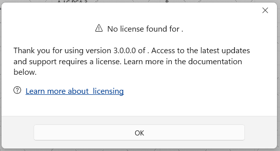
I have Telerik.WinUI.Controls v4.0.0 installed with Telerik.Licensing v1.6.5 with the extension installed and the license text file in the root folder of my project. However, I receive this message the first time a RadDataGrid is loaded on the UI on a secondary window. After closing and re-opening the window, the message doesn't show. When packaging for release, this doesn't seem to be an issue. The message is also stating the wrong version.

The click actions (like cell selection and sorting) stop working when RadDataGrid is hosted in a RadTabControl or TabView. To reproduce this, you should select the tab item with the data grid, then select another tab, and select back the tab with the data grid. This prevents the hit testing in the RadDataGrid element.
The issue occurs because the hit test service used in the RadDataGrid implementation. The hit test service relies on the IsLoaded property of RadDataGrid (inherited from RadControl). The property is set in the Loaded and Unloaded events. However, when switching tabs, the Unloaded event is invoked on deselection, but on second selection of the same tab, the Loaded event is never called again, thus IsLoaded is false.
To work this around, you can subscribe to the PreviewSelectionChanged event of RadTabControl and manually update the internal isLoaded field of the data grid.
 private void RadTabControl_PreviewSelectionChanged(object sender, Telerik.UI.Xaml.Controls.RadSelectionChangedEventArgs e)
 {
     if (e.AddedItems.Count > 0)
     {
         var gridView = ((RadTabItem)e.AddedItems[0]).Content as RadDataGrid;
         var isLoadedField = typeof(RadControl).GetField("isLoaded", System.Reflection.BindingFlags.Instance | System.Reflection.BindingFlags.NonPublic);
         isLoadedField.SetValue(gridView, true);
     }
 }
IndexOutOfRangeException occurs in some situations when updating the ItemsSource collection of RadDataGrid. In order to reproduce the issue, the ItemsSource collection should be cleared by calling its Clear method. When you add a specific number of items after that the error occurs. The number of added items depends on the viewport's height.
To work this around, instead of calling the Clear() method of the ItemsSource collection, remove the items one by one.
var collection = (ObservableCollection<MyModel>)this.dg.ItemsSource;
 while (collection.Count > 0)
 {
     collection.RemoveAt(collection.Count - 1);
 }
Unhandled COMException is thrown when the MessageGroup elements are removed from the chat's visual tree. This can happen when the group view models are removed from the MessageGroups or MessageListItems collections.
To work this around, you can get the corresponding MessageGroup container and set its DataContext to null before removing the MessageGroupViewModel from the MessageGroups or MessageListItems collections.
 var groupVisuals = chat.ChildrenOfType<MessageGroup>();
 foreach (MessageGroup group in groupVisuals)
 {
     group.DataContext = null;
 }
This should allow you to enable filtering also in the DataGridTemplateColumn.
Then all other columns being hidden before maximization are still invisible.
Workaround: Set width of the DataGrid.
This is the same feature as the "FilterRow" FilteringMode setting of RadGridView for WPF.