Completed
Last Updated:
24 Mar 2014 11:25
by ADMIN
ADMIN
Created by:
Georgi I. Georgiev
Comments:
0
Category:
Buttons
Type:
Bug Report
To reproduce: Create a form with RadButton and do some action on the Click event. Use the following Tool to click the button using the DoDefaultAction option http://msdn.microsoft.com/en-us/library/windows/desktop/dd318521(v=vs.85).aspx . You will notice that the click action will not be executed

Workaround: public class MyButton : RadButton { protected override AccessibleObject CreateAccessibilityInstance() { return new MyAccessibilityInstance(this); } } public class MyAccessibilityInstance : RadButtonAccessibleObject { public MyAccessibilityInstance(Control owner) : base(owner) { } public override void DoDefaultAction() { ((RadButton)base.Owner).PerformClick(); } }
Completed
Last Updated:
11 Feb 2014 16:10
by ADMIN
ADMIN
Created by:
Nikolay
Comments:
0
Category:
Buttons
Type:
Bug Report
ToggleStateChanging event is fired before the KeyDown event which should actually trigger the toggle
change operation. This happens when you press the Enter key.
Completed
Last Updated:
24 Jul 2012 09:29
by ADMIN
ADMIN
Created by:
Stefan
Comments:
0
Category:
Buttons
Type:
Feature Request
IMPROVE. RadCheckBox - one should be able to increase the size of the check box and the check mark
Completed
Last Updated:
05 Dec 2011 11:29
by Jesse Dyck
ADMIN
Created by:
Ivan Todorov
Comments:
1
Category:
Buttons
Type:
Bug Report
The arrow button of RadSplitButton is cut if you set a longer text and TextWrap=true.
Completed
Last Updated:
03 Sep 2012 03:19
by ADMIN
ADMIN
Created by:
Boryana
Comments:
0
Category:
Buttons
Type:
Bug Report
Setting RadDropDownButtonElement MinSize property does not make the RadDropDownButton control stretch to fit its element.

Currently, the issue can be avoided through adding the following three lines of code:
            this.radDropDownButton1.RootElement.StretchHorizontally = false;
            this.radDropDownButton1.RootElement.StretchVertically = false;
            this.radDropDownButton1.RootElement.SaveCurrentStretchModeAsDefault();
Unplanned
Last Updated:
30 Mar 2016 14:19
by ADMIN
ADMIN
Created by:
Stefan
Comments:
0
Category:
Buttons
Type:
Bug Report
To reproduce:


Add a RadButton to a form. Set an image, remove the text and set the shape of the ButtonElement to a new RoundRectShape. You will see that the image will not be painted with a shape.


Workaround:


Paint the image manually:


Image img = Image.FromFile(@"jpg.jpg");
RoundRectShape shape1 = new RoundRectShape(10);


protected override void OnLoad(EventArgs e)
{
    this.button = new RadButton();
    this.button.Parent = this;
    this.button.ButtonElement.Shape = shape1;
    this.button.Paint += button_Paint;
}


void button_Paint(object sender, PaintEventArgs e)
{
    e.Graphics.SetClip(shape1.CreatePath(new Rectangle(Point.Empty, this.button.Size)));
    e.Graphics.DrawImage(img, new Rectangle(Point.Empty, this.button.Size));
}
Unplanned
Last Updated:
17 Apr 2024 14:41
by ADMIN
ADMIN
Created by:
Dimitar
Comments:
0
Category:
Buttons
Type:
Bug Report
To reproduce:
- Add RadDropDownButton to a blank form.
- Set its anchor property to top, right and its AutoSize property to true.
- At runtime set the button text to a long string, you will notice that the button is resized to the right when it should be resized to the left.

To workaround this you can subscribe to the SizeChanged event of the button change its location depending on the new size:
Size prevSize;

public Form1()
{
    InitializeComponent();
    radDropDownButton1.AutoSize = true;

    this.Shown += Form1_Shown;
}

void Form1_Shown(object sender, EventArgs e)
{
    prevSize = radDropDownButton1.Size;

    radDropDownButton1.SizeChanged += radDropDownButton1_SizeChanged;
}

void radDropDownButton1_SizeChanged(object sender, EventArgs e)
{
    RadDropDownButton button = sender as RadDropDownButton;
    button.Location = new Point(button.Location.X - (radDropDownButton1.Size.Width - prevSize.Width), button.Location.Y);
    prevSize = button.Size;

}

private void radButton2_Click(object sender, EventArgs e)
{
    radDropDownButton1.Text = "Very long button text set";
}
Unplanned
Last Updated:
30 Mar 2016 14:20
by ADMIN
ADMIN
Created by:
George
Comments:
0
Category:
Buttons
Type:
Bug Report
To reproduce:

Add a RadTextBox and a RadButton to a form. On the Leave event of RadTextBox show a RadMessageBox. Start the application. Focus the textbox and click the button. The RadMessageBox will show, click the OK button and now you will see that the button is in its 'IsDefault' state (it is a bit more obvious with the Office2010 themes) and no other controls receive mouse input unless you click on the form.

Workaround:

Set the CausesValidation property of RadButton to false.
Completed
Last Updated:
18 Aug 2015 07:37
by ADMIN
ADMIN
Created by:
Dess | Tech Support Engineer, Principal
Comments:
0
Category:
Buttons
Type:
Bug Report
To reproduce:
1. Open the Demo application >> Button example.
2. Change the theme to TelerikMetroBlue.
3. Click with the right/middle mouse button and you will notice that the button clicked states is indicated.

Workaround: remove the MouseDown state in Visual Style Builder for the fill element as it is illustrated on the attached screenshot.
Unplanned
Last Updated:
30 Mar 2016 10:45
by ADMIN
ADMIN
Created by:
Dimitar
Comments:
0
Category:
Buttons
Type:
Bug Report
To reproduce:
- Add 3 radio buttons to a user control.
- Set the ToggleState of the second radio button to  On.
- Show the user control in a DockWindow.
- You will notice that the first toggle button is selected.

Workaround:
Set the toggle state after the window is added to the RadDock
void radDock1_DockWindowAdded(object sender, Telerik.WinControls.UI.Docking.DockWindowEventArgs e)
{
    if (e.DockWindow.Text == "UserControl11")
    {
        UserControl1 uc1 = e.DockWindow.Controls[0] as UserControl1;
        ((RadRadioButton)uc1.Controls[1]).ToggleState = Telerik.WinControls.Enumerations.ToggleState.On;
    }
}
Completed
Last Updated:
05 Feb 2018 13:51
by Dimitar
ADMIN
Created by:
Dimitar
Comments:
0
Category:
Buttons
Type:
Bug Report
To reproduce:
- Create a dpi aware application and add a checkbox to it.
- Change your DPI setting to 200% and start the application.
- The checkmark is not scaled only the text is.

Workaround:
this.radCheckBox2.ButtonElement.CheckMarkPrimitive.CheckElement.UseFixedCheckSize = false;
this.radCheckBox2.ButtonElement.CheckMarkPrimitive.CheckElement.MinSize = new Size(100, 100);
Completed
Last Updated:
28 Sep 2016 06:55
by ADMIN
ADMIN
Created by:
Hristo
Comments:
0
Category:
Buttons
Type:
Bug Report
Workaround:
 public class MyRadToggleSwith : RadToggleSwitch
{
    public override string ThemeClassName
    {
        get
        {
            return typeof(RadToggleSwitch).FullName;
         }
    }

    protected override void OnGotFocus(EventArgs e)
    {
        base.OnGotFocus(e);
        this.ToggleSwitchElement.Focus();
     }
}

or simply put focus to the element when the control receives the focus:
private void radToggleSwitch_GotFocus(object sender, EventArgs e)
{
	this.radToggleSwitch1.ToggleSwitchElement.Focus();
}
Unplanned
Last Updated:
08 Nov 2016 13:15
by ADMIN
ADMIN
Created by:
Dimitar
Comments:
0
Category:
Buttons
Type:
Bug Report
To reproduce:
- Add SplitButton to a ribbon bar and set its image.
- Disable the button.

Workaround:
this.radSplitButtonElement1.UseDefaultDisabledPaint = true;
Completed
Last Updated:
16 May 2019 08:53
by ADMIN
Release R1 2019
ADMIN
Created by:
Dess | Tech Support Engineer, Principal
Comments:
0
Category:
Buttons
Type:
Bug Report
When you customize a theme for RadSplitButton, you are not able to change the color of the action button element when it is pressed and the drop down is not opened.

Workaround:
this.radSplitButtonElement2.ActionButton.MouseDown+=ActionButton_MouseDown;
this.radSplitButtonElement2.ActionButton.MouseUp+=ActionButton_MouseUp;

private void ActionButton_MouseUp(object sender, MouseEventArgs e)
{
    this.radSplitButtonElement2.ActionButton.ButtonFillElement.ResetValue(LightVisualElement.BackColorProperty, ValueResetFlags.Local);
    this.radSplitButtonElement2.ActionButton.ButtonFillElement.ResetValue(LightVisualElement.GradientStyleProperty, ValueResetFlags.Local);
}

private void ActionButton_MouseDown(object sender, MouseEventArgs e)
{
    this.radSplitButtonElement2.ActionButton.ButtonFillElement.BackColor = Color.Red;
    this.radSplitButtonElement2.ActionButton.ButtonFillElement.GradientStyle = GradientStyles.Solid;
}
Completed
Last Updated:
15 Aug 2017 10:28
by ADMIN
ADMIN
Created by:
Dess | Tech Support Engineer, Principal
Comments:
0
Category:
Buttons
Type:
Bug Report
The same case is valid for RadToggleButton as well.

To reproduce: use the following custom RadCheckBox. You will notice that the ToggleStateChanging, ToggleStateChanged, PropertyChanged, CheckStateChanging, CheckStateChanged won't fire anymore:

public class MyCheckBoxElement : RadCheckBoxElement
{
    protected override Type ThemeEffectiveType
    {
        get
        {
            return typeof(RadCheckBoxElement);
        }
    }
}

public class MyCheckBox : RadCheckBox
{
    protected override RadButtonElement CreateButtonElement()
    {
        return new MyCheckBoxElement();
    }

    public override string ThemeClassName
    {
        get
        {
            return typeof(RadCheckBox).FullName;
        }
    }
}

Workaround:

public class MyCheckBoxElement : RadCheckBoxElement
{
    protected override void OnKeyDown(KeyEventArgs e)
    {
        if (e.KeyCode == Keys.Enter)
        {
            return;
        }

        base.OnKeyDown(e);
    }

    protected override Type ThemeEffectiveType
    {
        get
        {
            return typeof(RadCheckBoxElement);
        }
    }
}

public class MyCheckBox : RadCheckBox
{
    protected override RadButtonElement CreateButtonElement()
    {
        MyCheckBoxElement checkBox = new MyCheckBoxElement();
        checkBox.ToggleStateChanging += new StateChangingEventHandler(ButtonElement_ToggleStateChanging);
        checkBox.ToggleStateChanged += new StateChangedEventHandler(ButtonElement_ToggleStateChanged);
        checkBox.PropertyChanged += new PropertyChangedEventHandler(res_PropertyChanged);
        checkBox.CheckStateChanging += new CheckStateChangingEventHandler(res_CheckStateChanging);
        checkBox.CheckStateChanged += new EventHandler(res_CheckStateChanged);
        return checkBox;
    }

    private void res_CheckStateChanged(object sender, EventArgs e)
    {
        base.OnCheckStateChanged(e);
    }

    private void res_CheckStateChanging(object sender, CheckStateChangingEventArgs args)
    {
        base.OnCheckStateChanging(args);
    }

    private void res_PropertyChanged(object sender, PropertyChangedEventArgs e)
    {
        if (e.PropertyName == "IsChecked")
        {
            base.OnNotifyPropertyChanged("IsChecked");
        }
    }

    private void ButtonElement_ToggleStateChanged(object sender, StateChangedEventArgs args)
    {
        base.OnToggleStateChanged(args);
        base.OnNotifyPropertyChanged("Checked");
        base.OnNotifyPropertyChanged("CheckState");
        base.OnNotifyPropertyChanged("ToggleState");
    }

    private void ButtonElement_ToggleStateChanging(object sender, StateChangingEventArgs args)
    {
        base.OnToggleStateChanging(args);
    }

    public override string ThemeClassName
    {
        get
        {
            return typeof(RadCheckBox).FullName;
        }
    }
}
Unplanned
Last Updated:
19 Jun 2017 10:48
by ADMIN
ADMIN
Created by:
Dess | Tech Support Engineer, Principal
Comments:
0
Category:
Buttons
Type:
Bug Report
Please refer to the attached sample project and gif file. The text gets clipped sometimes when resizing the form. It may become even blurry. This problem is observed with the MS Form, but it is not reproducible with RadForm.

Workaround: use a RadForm

UPDATED: a second project is attached (00393359CheckBoxDisabledUPDATED.zip). The MissingCheckBoxesText.gif illustrates the incorrect behavior. In this case, the UseCompatibleTextRendering property is set to false.
Workaround for the second case: instead of setting the RadCheckBox.Enabled property to false, disabled the check primitive and make the text gray as follows:

private void radButton1_Click(object sender, EventArgs e)
{
    for (int i = 0; i < 30; i++)
    {
        RadCheckBox cb = new RadCheckBox();
        cb.Text = "RadCheckBox " + i;
        cb.Location = new Point(10, i * 30);
        cb.ButtonElement.CheckMarkPrimitive .Enabled = false;
        cb.ButtonElement.TextElement.ForeColor = Color.Gray;
        cb.ButtonElement.ShouldHandleMouseInput = false;
        cb.UseCompatibleTextRendering = false;

        this.Controls.Add(cb);
    }
}
Declined
Last Updated:
02 Jul 2026 08:26
by ADMIN
ADMIN
Created by:
Dess | Tech Support Engineer, Principal
Comments:
1
Category:
Buttons
Type:
Bug Report
Workaround:

            this.radDropDownButton1.DropDownButtonElement.DropDownMenu.PopupElement.AutoSize = false;
            this.radDropDownButton1.DropDownButtonElement.DropDownMenu.PopupElement.Size = new Size(300, 300);
Unplanned
Last Updated:
19 Dec 2017 17:08
by ADMIN
ADMIN
Created by:
Hristo
Comments:
0
Category:
Buttons
Type:
Bug Report
How to reproduce: add several menu items displaying only images to the split button and set the MaximumSize property of the drop-down menu

Workaround:
public RadForm1()
{
    InitializeComponent();

    this.radSplitButton1.DropDownButtonElement.DropDownMenu.MaximumSize = new Size(30, 0);
    RadScrollBarElement element = this.radSplitButton1.DropDownButtonElement.DropDownMenu.PopupElement.FindDescendant<RadScrollBarElement>();
    element.Visibility = Telerik.WinControls.ElementVisibility.Collapsed;
    element.RadPropertyChanging += Element_RadPropertyChanging;
}

private void Element_RadPropertyChanging(object sender, Telerik.WinControls.RadPropertyChangingEventArgs args)
{
    if (args.Property.Name == "Visibility")
    {
        args.Cancel = true;
    }
}
Completed
Last Updated:
25 Jul 2019 14:56
by ADMIN
Release R3 2019 (LIB 2019.2.729)
Created by:
IT
Comments:
0
Category:
Buttons
Type:
Bug Report
I have RadDiagram on Form and registered ShapeDoubleClicked event on it.
After double click on a shape I open another modal form (let's call it form2). The second mouse click is fired on a modal form (Form2) which in some cases, based on shape position in Form1 (precisely when the shape is in center of the screen), change the state of my ToogleSwitch which is in center of Form2.
After double click on a shape I open another modal form (let's call it form2). The second mouse click is fired on a modal form (Form2) which in some cases, based on shape position in Form1 (precisely when the shape is in center of the screen), change the state of my ToogleSwitch which is in center of Form2.
Unplanned
Last Updated:
07 Apr 2023 10:11
by ADMIN
Created by:
Mark
Comments:
5
Category:
Buttons
Type:
Feature Request
If there are boolean application Settings:
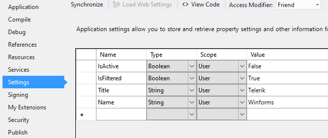
It is good to have the possibility to bind the Checked property for RadCheckBox in a similar way like the MS CheckBox offers:
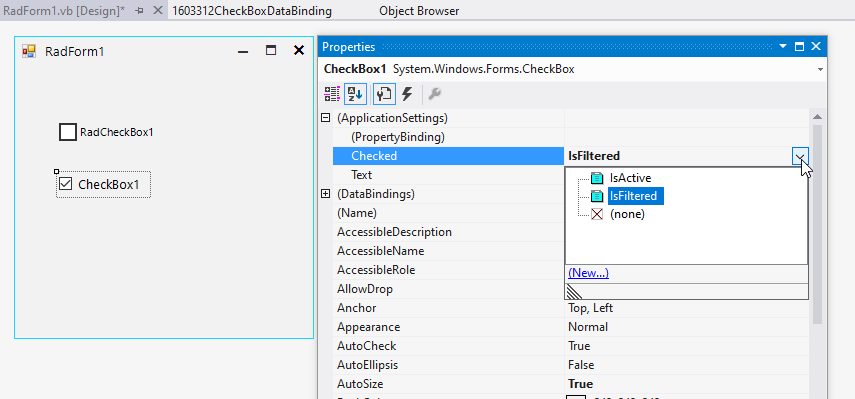
RadCheckBox offers only the Text option:
