Pending Review
Last Updated: 13 Mar 2019 23:01 by ADMIN
Milenny
Created on: 08 Mar 2019 18:37
Category: UI for UWP
Type: Bug Report
1
The "Foreground" property does not apply to the RadDatePicker icon

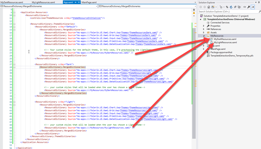
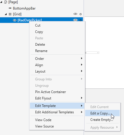
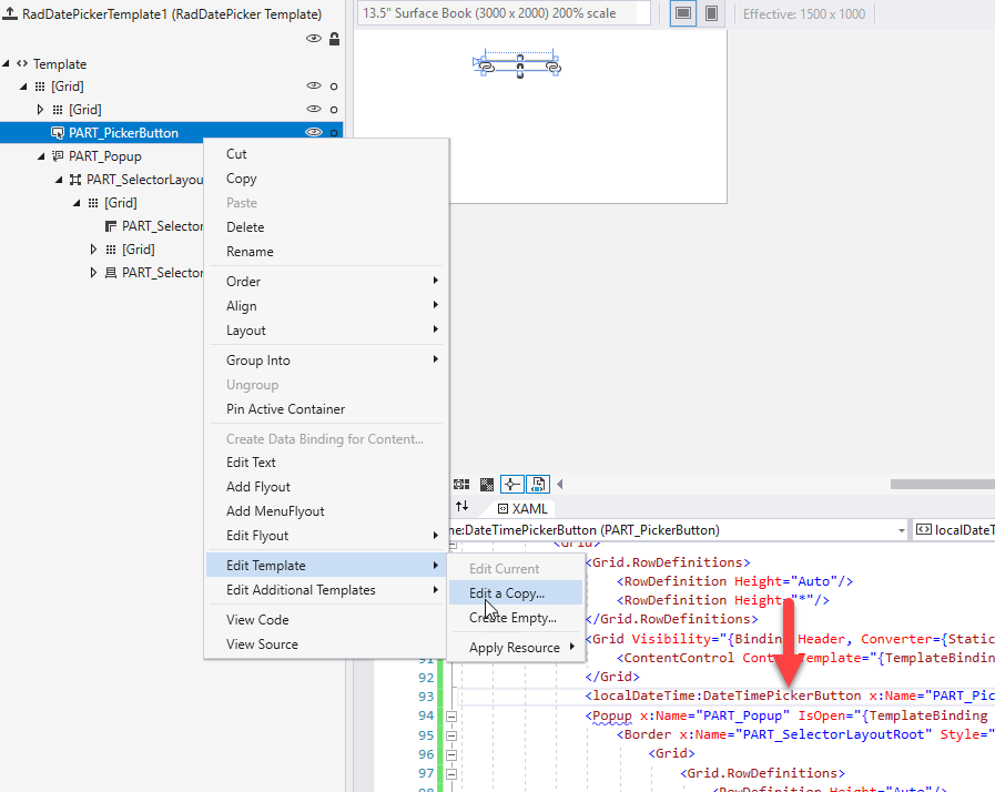
The "Foreground" property does not apply to the RadDatePicker icon .. it only applies to the text even though I followed what this page explains: https://docs.telerik.com/windows-universal/controls/raddatepicker-and-radtimepicker/styling/raddatetimepickers-explicitstyling

My XAML code is the following:

<Custom:RadDatePicker x:Name="FromDatePicker" HorizontalAlignment="Left" ValueChanged="DatePickerValueChange">
                    <Custom:RadDatePicker.Resources>
                        <Style TargetType="Custom:RadDatePicker">
                            <Setter Property="Foreground" Value="Orange"/>
                            <Setter Property="FontSize" Value="15"/>
                            <Setter Property="FontStyle" Value="Italic"/>
                            <Setter Property="Background" Value="Beige"/>
                            <Setter Property="BorderBrush" Value="Orange"/>
                        </Style>
                    </Custom:RadDatePicker.Resources>
                </Custom:RadDatePicker>

Attached image of the properties that only my RadDatePicker takes when running the application ..

Attached Files:
9 comments
ADMIN
Lance | Manager Technical Support
Posted on: 13 Mar 2019 23:01
Hello Milenny,

Sorry for the double reply. After sending that last reply, I realized that this can get messy and complicated quickly when copying out a lot of styles because you're getting the whole thing.

So to make this a lot easier to manage and much cleaner to read, I've put together a project you can use for reference.

You'll see that it uses the required MergedDictionaries approach in App.xaml, but I also decided to keep it clean by putting the custom styles (i.e. the extracted RadDatetimePicker brushes and styles) into their own ResourceDictionary files.

This way, you have a nice clean App.xaml/MainPage.xaml file and can go edit the ControlTemplates in their appropriate theme files.


The copied out styles are 100% untouched after I extracted it, so you have a fresh start.

I hope this is helpful and saves you some time.

Regards,
Lance | Technical Support Engineer, Principal
Progress Telerik
Do you want to have your say when we set our development plans? Do you want to know when a feature you care about is added or when a bug fixed? Explore the Telerik Feedback Portal and vote to affect the priority of the items
Attached Files:
ADMIN
Lance | Manager Technical Support
Posted on: 13 Mar 2019 22:46
Hello Milenny,

Sometimes VS doesn't give you the option depending on what the reference type is. This is particularly relevant when the reference is an Extension SDK reference instead of a direct assembly reference.

What you can do is create a separate test project and reference the NuGet package instead of using the commercial SDK reference. Then, Visual Studio will show the following in the Document Outline:


Then once you have that template extracted, extract the DateTimePickerButton template:


Once you''re done extracting everything, you can copy the styles over to the main project.

Keep in mind that when using resources, you typically want them in the order of dependency. The safest way to do it is in this order:

1. Colors
2. SolidColorBrushes
3. Converters
4. DataTemplates
5. ControlTemplates
6. Styles
7. StyleSelectors / TemplateSelectors

Note - Converters can be placed at the #1 spot as long as they don't use any other resources.

Using the Source Code

If Visual Studio still gives you a hard time extracting the templates, the same templates are always available in the GitHub repo. 

Look in the Input namespace's Themes folder for all the ResourceDictionaries. In addition to the theme-specific ResourceDictionaries that set the TelerikNamedBrushes, you can find the ControlTemplates inside the Generic.xaml and Resources.xaml files.

To give you a head start, here are the sections:

RadDateTimePicker section in Resources.xaml
DateTimePicker region in Generic.xaml

For your convenience, I have extracted them into MainPage.xaml , organized them and attached it here. Note that the templates were extracted from 2019.1 SP1 version (or v 1.0.1.4 on NuGet), be sure that your UI for UWP version is also on that version.

Regards,
Lance | Technical Support Engineer, Principal
Progress Telerik
Do you want to have your say when we set our development plans? Do you want to know when a feature you care about is added or when a bug fixed? Explore the Telerik Feedback Portal and vote to affect the priority of the items
Attached Files:
Milenny
Posted on: 13 Mar 2019 21:48
I have not been able to obtain the "Edit template" option, it is disabled ... both in the original control and in the new instance that you explained to me that I would add .. (see images "img-b.png" and "img-c.png ")
Attached Files:
ADMIN
Lance | Manager Technical Support
Posted on: 12 Mar 2019 18:00
Hello Milenny,

You might better off just extracting the ControlTemplate and setting your preferred styling there.

It's pretty easy to do, take the following steps:

1. With the XAML page open in VS, open the Document Outline pane
2. Expand the outline until you find the DateTimePicker
3. Right click on the RadDateTimePicker and select "Edit Template > Edit a copy"
4. Choose your desired location (I recommend using the current document, then move the style it to App.xaml later after your work is done)

At this point, you'll see the style get extracted. The Style will have a property named "Template". This is where all the parts to the control are and you can set the colors to your liking.

You'll also notice that there are some parts of the ControlTemplate that may need another extraction procedure to get at it's parts, the DateTimePickerButton control for example.

If you do not see a "Edit Template" option in the Document Outline for the sub=part, you can place a temporary instance of the control in your page content area so that you get the Edit Template option.

For example, place an instance of DateTimePickerButton next to the RadDateTimePicker in the page and repeat steps 2 and 3.


This will give you 100% control over the appearance. Just a word of caution, never remove anything with the x:Name=""PART_xxx" prefix. This means it's a required part of the ControlTemplate because the backing logic uses it.

Regards,
Lance | Technical Support Engineer, Principal
Progress Telerik
Do you want to have your say when we set our development plans? Do you want to know when a feature you care about is added or when a bug fixed? Explore the Telerik Feedback Portal and vote to affect the priority of the items
Milenny
Posted on: 12 Mar 2019 17:39

Well, seeing it well, I have only been served some of the names of brushes that I need and that I have taken from the GitHub link with the names of "updated" brushes that you have passed me ... but, for example, these 5, that also I took from there from Github, my RadDatePicker has not taken them:

TelerikDateTimePickerSelectorItemSelectedBackgroundBrush
TelerikDateTimePickerSelectorItemSelectedForegroundBrush
TelerikDateTimePickerSelectorForegroundBrush
TelerikDateTimePickerSelectorBackgroundBrush
TelerikDateTimePickerSelectorBorderBrush

among others ..

I guess there are still more brush names to update on GitHub .. How can I solve that?

Milenny
Posted on: 12 Mar 2019 16:39
wow! thank you!! I found the solution in the GitHub link where the updated names of the brushes are shown .. thanks again ..
ADMIN
Lance | Manager Technical Support
Posted on: 12 Mar 2019 16:10
Hi Milenny,

You can browse the UI for UWP source code for all the brush names you might want to use.

Here's the Dark ResourceDictionary for the Input controls (DateTimePicker is in the the Input namespace). You'll specifically want to look at the DateTimePicker brushes to see all the latest TelerikNamedBrushes.

Those will always be up to date even if the docs are lagging behind a little (which is why I opened this Feedback portal item so that the team can update the documentation with the new brush names).

I hope this information is helpful.

Regards,
Lance | Technical Support Engineer, Principal
Progress Telerik
Do you want to have your say when we set our development plans? Do you want to know when a feature you care about is added or when a bug fixed? Explore the Telerik Feedback Portal and vote to affect the priority of the items
Milenny
Posted on: 12 Mar 2019 15:30

Thanks, I have solved it by placing: "<SolidColorBrush x: Key = 'TelerikDateTimePickerArrowForegroundBrush' Color = 'White' />" (see "img-a.png")

But it happens that other properties specified for the brushes, do not take them .. for example:
- TelerikDateTimePickerItemPointerOverBackgroundBrush for the Hover State (see "img-2.png")
- TelerikDateTimePickerSelectorBackgroundBrush for the background color of the Popup Selector
- TelerikDateTimePickerSelectorItemSelectedBackgroundBrush for the boxes of the day, month and year of the Popup Selector
(see "img-3.png")
And other properties shown in the following XAML code, of which, I only take the first 4 (see "img-a.png"):

<Custom:RadDatePicker x:Name="FromDatePicker" HorizontalAlignment="Left" ValueChanged="DatePickerValueChange" BorderThickness="1">
                    <Custom:RadDatePicker.Resources>                   
                        <ResourceDictionary>
                            <SolidColorBrush x:Key="TelerikDateTimePickerArrowForegroundBrush" Color="White"/>
                            <SolidColorBrush x:Key="TelerikDateTimePickerForegroundBrush" Color="White"/>
                            <SolidColorBrush x:Key="TelerikDateTimePickerBorderBrush" Color="#FFB6B5B5"/>
                            <SolidColorBrush x:Key="TelerikDateTimePickerBackgroundBrush" Color="#FF30302E"/>
                            <SolidColorBrush x:Key="TelerikDateTimePickerItemPointerOverBackgroundBrush" Color="Pink"/>
                            <SolidColorBrush x:Key="TelerikDateTimePickerSelectorBackgroundBrush" Color="Pink"/>
                            <SolidColorBrush x:Key="TelerikDateTimePickerSelectorItemSelectedBackgroundBrush" Color="Pink"/>
                            <SolidColorBrush x:Key="TelerikDateTimePickerSelectorForegroundBrush" Color="Pink"/>
                        </ResourceDictionary>
                    </Custom:RadDatePicker.Resources>

</Custom:RadDatePicker>

Might you help me? Thank you!

Attached Files:
ADMIN
Lance | Manager Technical Support
Posted on: 11 Mar 2019 17:22
Hi Milenny,

Before I get to the reported issue, your links were pointing to the old controls docs (Windows 8.1 WinRT controls). The documentation you want to use the UI for UWP docs.  That being said, the approach is the same and results in the same behavior.

Therefore, I have converted this thread to a Feedback Portal bug report so that the team will investigate and determine if it's a product issue or just a documentation update is needed.

Solution

You can directly set the Telerik Named Brush TelerikDateTimePickerArrowForegroundBrush to change the foreground color of the down arrow glyph.

Follow these instructions here on how to set these brushes:

Telerik Named Brushes.
- DateTimePicker Telerik Named Brushes

Here's an example of setting both the button's glyph foreground to red:


<Application.Resources>
    <ResourceDictionary>
        <controls:UserThemeResources x:Key="themeResourceInitializer"/>
 
        <ResourceDictionary.ThemeDictionaries>
            <ResourceDictionary x:Key="Default">
                <ResourceDictionary.MergedDictionaries>
                    <ResourceDictionary Source="ms-appx:///Telerik.UI.Xaml.Chart.Uwp/Themes/ThemeResourcesDark.xaml"/>
                    <ResourceDictionary Source="ms-appx:///Telerik.UI.Xaml.Grid.Uwp/Themes/ThemeResourcesDark.xaml"/>
                    <ResourceDictionary Source="ms-appx:///Telerik.UI.Xaml.Input.Uwp/Themes/ThemeResourcesDark.xaml"/>
                    <ResourceDictionary Source="ms-appx:///Telerik.UI.Xaml.Primitives.Uwp/Themes/ThemeResourcesDark.xaml"/>
                    <ResourceDictionary Source="ms-appx:///Telerik.UI.Xaml.DataVisualization.Uwp/Themes/ThemeResourcesDark.xaml"/>
                </ResourceDictionary.MergedDictionaries>
 
                <SolidColorBrush x:Key="TelerikDateTimePickerArrowForegroundBrush" Color="Red"/>
            </ResourceDictionary>
 
            <ResourceDictionary x:Key="Light">
                <ResourceDictionary.MergedDictionaries>
                    <ResourceDictionary Source="ms-appx:///Telerik.UI.Xaml.Chart.Uwp/Themes/ThemeResourcesLight.xaml"/>
                    <ResourceDictionary Source="ms-appx:///Telerik.UI.Xaml.Grid.Uwp/Themes/ThemeResourcesLight.xaml"/>
                    <ResourceDictionary Source="ms-appx:///Telerik.UI.Xaml.Input.Uwp/Themes/ThemeResourcesLight.xaml"/>
                    <ResourceDictionary Source="ms-appx:///Telerik.UI.Xaml.Primitives.Uwp/Themes/ThemeResourcesLight.xaml"/>
                    <ResourceDictionary Source="ms-appx:///Telerik.UI.Xaml.DataVisualization.Uwp/Themes/ThemeResourcesLight.xaml"/>
                </ResourceDictionary.MergedDictionaries>
 
                <SolidColorBrush x:Key="TelerikDateTimePickerArrowForegroundBrush" Color="Red"/>
            </ResourceDictionary>
        </ResourceDictionary.ThemeDictionaries>
    </ResourceDictionary>
</Application.Resources>


@UI for UWP Team

The documentation still lists DateTimePickerForegroundBrush as the Key to set both the button text for button's glyph color, but it only sets the text:


Regards,
Lance | Technical Support Engineer, Principal
Progress Telerik
Do you want to have your say when we set our development plans? Do you want to know when a feature you care about is added or when a bug fixed? Explore the Telerik Feedback Portal and vote to affect the priority of the items