Pending Review
Last Updated: 04 Oct 2024 19:41 by FranckSix
Created by: FranckSix
Comments: 0
Type: Feature Request
0
With Sass there are possibility to define variable as !default and can override it before import the script

_tokens.scss

tb-custom-primary: #014d5b !default; //Is the value if not defined in final scss
tb-primary: tb-custom-primary;

-----------------------------------------------

index.scss

$tb-custom-color: #34b232; //Now I can define the final value for variable
@import '_tokens'
it would be useful to add it in ThemeBuilder UI.

Pending Review
Last Updated: 04 Oct 2024 15:46 by FranckSix
In theme builder the check-box and radio button have backgroud-image using svg to display the checkbox. But if I update $info or $primary or $kendo-checkbox-checked-text the svg is not updated.

Other way to diplay the check-box you can use clip-path, may be helpfull for this case.

An exemple working with variables
$kendo-checkbox-border-width: 3;
$kendo-checkbox-border: grey;
$kendo-checkbox-bg: lightgrey;
$kendo-checkbox-checked-bg: blue;
$border-radius: 5px;
$kendo-checkbox-md-size: 32px;

.cbstyle{
    appearance: none;
    position: relative;
    background-color: $kendo-checkbox-bg;
    border-width: $kendo-checkbox-border-width;
    border-style: solid;
    border-color: $kendo-checkbox-border;
    border-radius: $border-radius;
    height: $kendo-checkbox-md-size;
    width: $kendo-checkbox-md-size;
}

.checked::after{
  content: '';
  position: absolute;
  top: 50%;
  left: 50%;
  transform: translate(-50%, -50%);
  width: calc(#{$kendo-checkbox-md-size} * .8);
  height: calc(#{$kendo-checkbox-md-size} * .8);
  background-color: $kendo-checkbox-checked-bg;
  clip-path: polygon(20% 39%, 8% 39%, 45% 93%, 81% 13%, 70% 13%, 43% 74%); // checkbox icon
}

Pending Review
Last Updated: 27 Aug 2024 11:50 by Petar

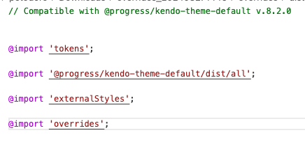
Currently, the external CSS files come before the overrides generated through ThemeBuilder. Therefore, it becomes problematic to override these ThemeBuilder overrides with external styles.

Consider allowing the user to choose the order in which the external styles are applied —whether they should come before or after the ThemeBuilder overrides.

Requested through t.1662556.

Pending Review
Last Updated: 21 Jun 2024 08:37 by Nick
Created by: Nick
Comments: 0
Type: Feature Request
1

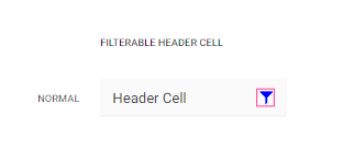
Currently, in ThemeBuilder there is a template that allows you to style the icon of a header cell that is filterable.

However, we need to be able to style the icon in a header cell that triggers the ColumnMenu (the more icon)


https://demos.telerik.com/aspnet-core/grid/column-menu 

https://www.telerik.com/kendo-react-ui/components/grid/interactivity/column-menu/ 

requested through t.1655985

Pending Review
Last Updated: 06 Sep 2023 07:21 by ADMIN
Created by: Brian
Comments: 1
Type: Feature Request
0

Hello,

There seems to be an automatic 25px margin on the <p> within the content element that we can't customize. Could you please remove this and allow this to be customized in the ThemeBuilder?

Thanks,

Brian


Pending Review
Last Updated: 20 Jun 2023 08:15 by Nick
Created by: Nick
Comments: 0
Type: Feature Request
5

Consider providing export options for fonts - for example the one requested below:

...

I would like to request the inclusion of a non-exportable option in the Font Manager. Specifically, I suggest adding an additional field that allows users to choose whether to include a particular font in the "_fonts.scss" file or not.

The purpose behind this request is to utilize these fonts within the ThemeBuilder Pro to observe the visual outcomes (including Typeface & Icon fonts). However, it I do not want to generate these fonts in the final zip since I already have fonts with the same names in my application. I solely require the font names to be present in the "_tokens.scss" file.