We are requesting the implementation of external source drag and drop functionality for the Kendo UI Native Vue Scheduler component (@progress/kendo-vue-scheduler). This feature enables users to drag items from an external list or container — such as a task panel or resource list — and drop them onto Scheduler time slots to create new events.
vue- ^3.5.34
@progress/kendo-vue scheduler - ^8.3.0
@progress/kendo-theme default - 14.0
@progress/kendo licensing- latest

The Spreadsheet component is among the last components in the Kendo UI for Vue suite that is available only as a Wrapper component.
Providing a Native version of the Spreadsheet will be a big improvement to the suite.
.png)
It's great to see MCP servers now available for Angular, React, and Blazor. Any plans to add support for Kendo UI for Vue as well?
We use Kendo UI for Vue in production, and having MCP support would really improve AI-assisted development, component discovery, and overall DX. It would also help keep feature parity across the Kendo ecosystem.
Would love to see Vue.js included.
Thanks!
Pete
Hi all!.
Are your planning to create native gantt component?
Describe the bug
By default, the Dialog component is a modal window. This means that once the Dialog appears, the page elements are the only ones the users can interact with.
Currently, if you use the keyboard navigation functionality of the Dialog, after pressing the Tab key multiple time, the focus will be on the "Open dialog" button below the modal. This should not happen.
To Reproduce
- Open this StackBlitz example
- Click on the "Open in new window" button to open the example in a separate window/tab
- In the new window, click on the "Open dialog" button
- Once the Dialog is opened, press the Tab button 8 times and press Enter
- The Dialog will be closed because, after the 8th Enter press, the focus will be again on the "Open dialog" button below the modal area.
Expected behavior
When using the keyboard navigation of the Dialog component, the focus shouldn't be transferred to the elements below the modal area. It should be kept among the elements that are displayed in the Dialog.
Greetings,
I hope this message finds you well.
I would like to request a new feature for the Kendo Vue Dropdown List component: the ability to disable selected items directly within the dropdown list configuration. This functionality is already available for Kendo React users, as outlined in your documentation:
Disabled Items in Kendo React DropdownList.
Why This Feature is Valuable for Kendo Vue Users
Consistency Across Frameworks
Many users work across multiple frameworks, including React and Vue. Consistency in feature availability ensures a seamless transition and experience for developers leveraging Kendo UI in different projects.Improved User Experience
Disabling items within the dropdown is a common requirement in dynamic forms and data-driven applications. For example, when users are selecting items from a list, disabling already-selected options prevents confusion and enhances usability by guiding them effectively.Reduced Development Overhead
While developers can currently implement this feature manually in Vue, a built-in option would significantly reduce the amount of custom code required. This aligns with the Kendo philosophy of providing robust, ready-to-use components that save time and effort.Enhanced Accessibility
A built-in disabled item option ensures proper handling of accessibility concerns, such as ARIA attributes, keyboard navigation, and screen reader compatibility. This would help developers create inclusive and accessible applications without requiring additional customizations.Competitive Edge
Offering this functionality natively in Kendo Vue would strengthen the feature parity between your React and Vue libraries, making Kendo UI even more appealing to developers evaluating dropdown components across frameworks.
Proposal
Introduce a configuration option, similar to the one in Kendo React, that allows users to disable specific items in the Vue Dropdown List component. This feature could be implemented by providing a function or property to dynamically determine which items should be disabled based on their state or other criteria.
I'm using the PanelBar component as a Navigation sidebar in my app. As this is navigation bar, I would like to be able to change the <span> element which houses the title prop, to be an <a> tag. I can see how this is possible for child items, but I cannot figure out how to do this for top level items.
Request:
Either be able to pass through a prop to change the type of element which wraps the title prop.

It will be a nice feature if the Native Grid can support a row selection through the keyboard.
Example scenario:
- Click on a checkbox in the Grid and select a row
- Hold the Shift or Ctrl key and press Arrow up or arrow down button
Targeted result: With the press of an arrow button, the row above or below gets selected
Here is a sample project that demonstrates an implementation similar to the targeted one.
Hi,
I need to fill and AcroForm PDF. I want to load the pdf and fill it from input fields in kendo vue, when I am done I need to send the pdf back to server or download/print the filled out pdf.
Hi, team.
The File Manager component is currently not available in the Kendo UI for Vue suite. Having the component available in Kendo UI for Vue will be a big improvement for the suite.
Nuxt 3 has a robust module system, which is highly beneficial for importing components easily. I have previously used modules like element-plus, headlessUI, and Vuetify. However, as we are currently transitioning to Kendo UI, we have encountered difficulties in finding a similar module. It is essential for us to be able to import Kendo UI components seamlessly and efficiently. Therefore, we have developed a module similar to the one for element-plus. During the process of writing and testing the code, everything has fallen into place. However, we have encountered an issue with importing the UI DropDownList from the module. It would be greatly appreciated if Kendo UI could provide an official Nuxt 3 module.
out test module
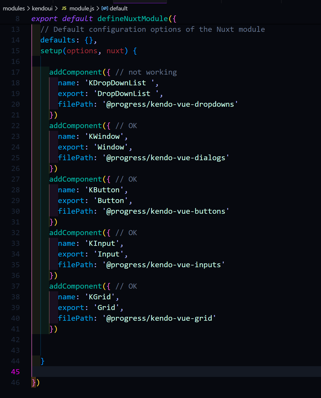
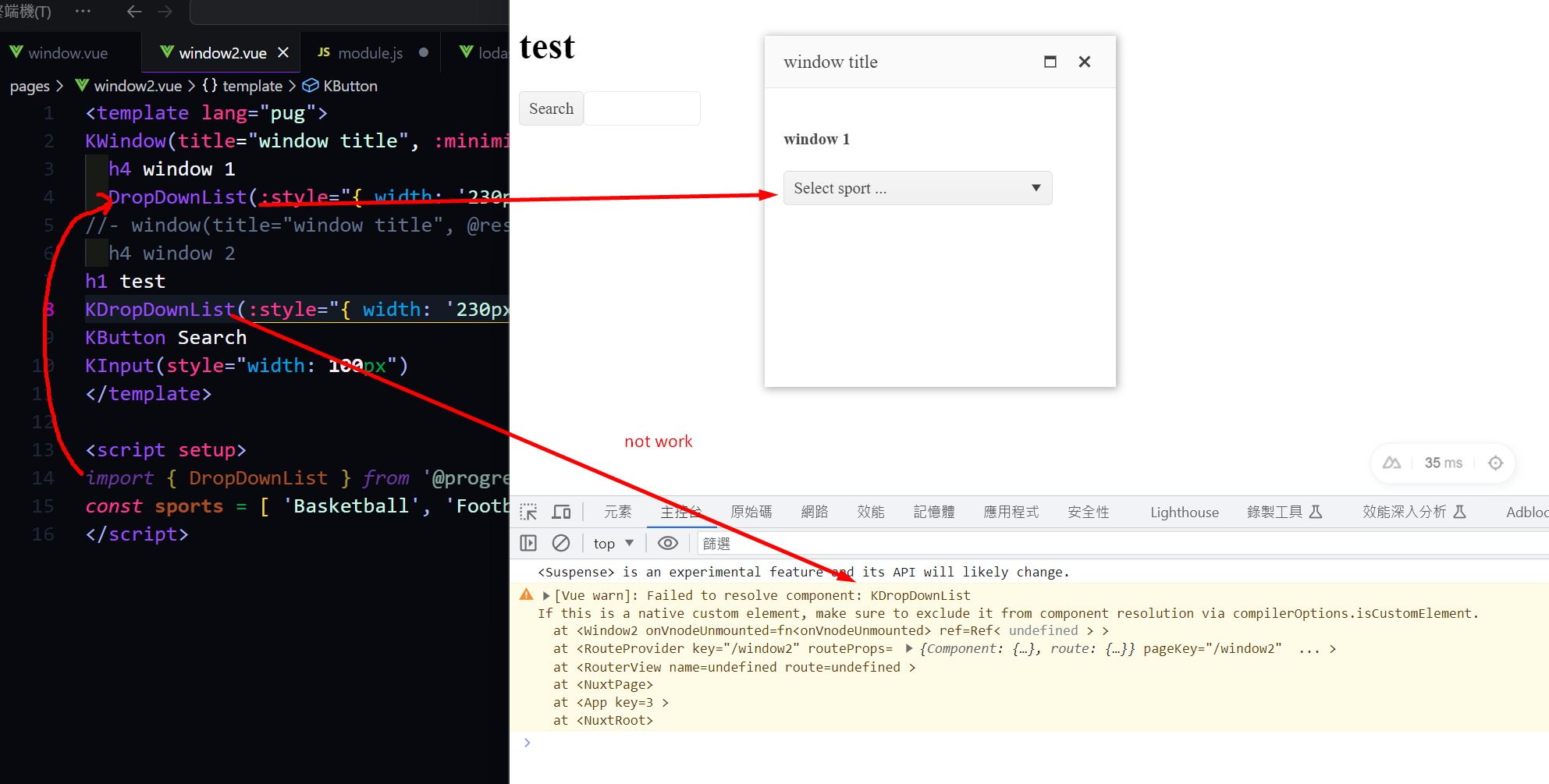
KDropDownList not work but else compoents work good.

It would be great to have a clear button in the DatePicker, as today erasing value requires 3 select-delete operations (one for the day, one for the month, and one for the year)
It would make it consistent with TextBox, ComboBox, MultiSelect & AutoComplete, which renders in a comparable way

Hello,
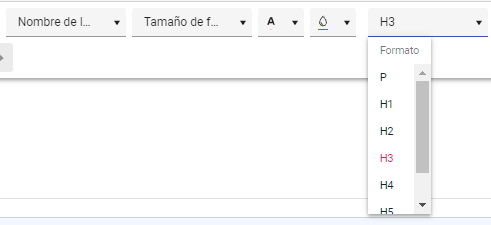
When working in Spanish or French, even if internationalization is properly configured, it is not possible to translate the items in the FormatBlock, so it is only possible to see them in English.
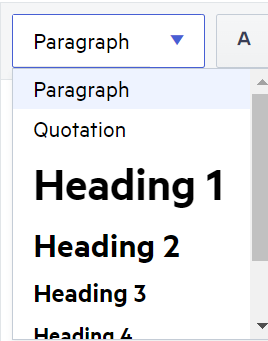
We tried to do it ourselves (https://www.telerik.com/forums/paragraph-and-heading-not-translated) but we found some issues, so please, consider including these few items in the default translations.
Thanks
Lucía

Hi,
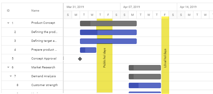
It is possible to display a vertical bar as highlighted in the image, which is in date and time range. This for time stamps not worked. Example for lunch, or not working due to bad weather.
Consider a standard chart with time periods on the x-axis, The most recent period is to the right. If you look at the chart with all periods visible and you zoom in, the chart zooms into the center of the chart. So the most recent period drops out to the right and the older periods to the left.
Request:
Use a property to stick the most recent period to the right, even if you zoom in. Currently the chart zooms into the center. The requested behaviour would be: Keep the right (or left) border and zoom in/out to the left (or right) side. So regardless of the zoom level, the most right (or left) item is allways visible.
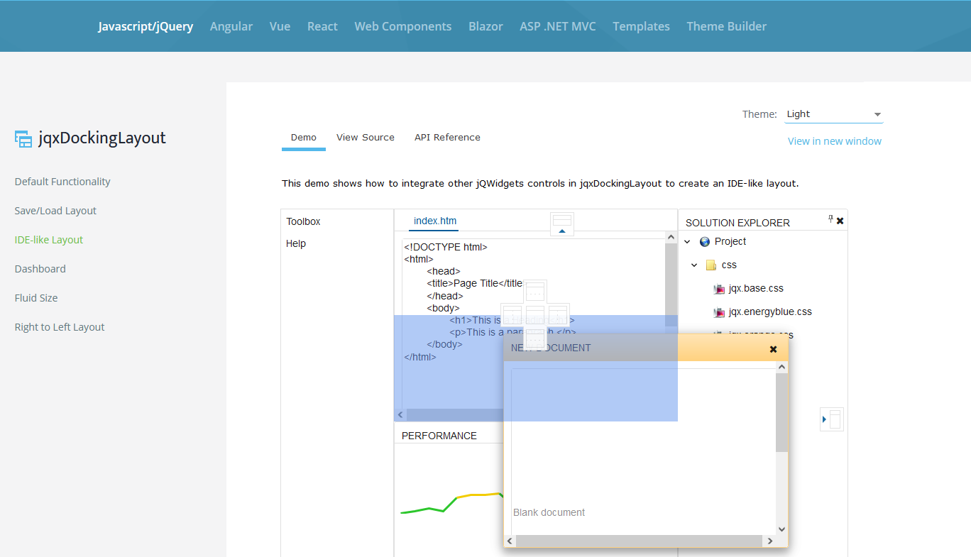
Any roadmap on creating the dock layout like this? I found the similar function for Telerik WPF component