Recently Updated
Planned
Last Updated:
11 Dec 2023 14:04
by ADMIN
Created by:
siraj
Comments:
0
Category:
Data Grid
Type:
Feature Request
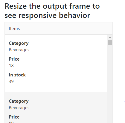
Add the ability to apply table breakpoints to the Grid for responsive behavior.
Similar to the Bootstrap tables:
https://getbootstrap.com/docs/4.4/content/tables/#breakpoint-specific
Planned
Last Updated:
14 Apr 2023 15:03
by ADMIN
Created by:
Alex
Comments:
10
Category:
Data Grid
Type:
Feature Request
Hello,
I am looking to start using the Kendo React grid control, but I need the grid to be responsive to support viewing on a phone. I noticed that your Angular grid has this functionality, but it is missing from your React grid.
I would like to have rows turn into individual cards when viewed on a phone. The closest thing I see in the react documentation involves hiding columns, which is undesirable. Is there a way to add this behavior to the React grid? If not, when will that be implemented?
Thank you,
Alex

