Currently (as visible in grid demos), touch drag scroll in mobile (responsive) mode is not working when rows selection is enabled.
There is no known workaround since the complexity of implementing custom row renderer with all the intricacies of the grid's behaviour would be a huge task.
The client's facing issue is that when using a KendoReact grid on mobile device, they can't easily scroll the grid rows data by touch drag scrolling the rows.
It is important for my users to be able to invoke the GridColumnMenuFilter directly from the grid header. ie. The jQuery version has the filter icon beside the header text (Rather than having to click a menu and then click "Filter" - which is necessary if all I want is a filter.
I know this is possible with some CSS. But it is important that there is a visual indicator that the filter is on (which the jQuery version supports but doesn't seem currently possible with the React version)
Thanks
We use data grids with virtual scrolling for inline editing a large number of records. However, when we want to add a new row to the grid it automatically resets the scroll position and doesn't even fire onPageChange event so the records you see do not correspond to the scroll position.
Check the following example (scroll to bottom, click anywhere on the table - this will add a new row - and observe the described problem):
https://stackblitz.com/edit/react-52zzvz?file=app%2Fapp.tsx%3AL78
As stated in the subject, the GridNoRecords component has an undocumented maximum width of 20em after which the GridNoRecords message is cut off. Please see the following StackBlitz for an example: https://stackblitz.com/edit/react-2z8hh63r?file=app%2Fapp.tsx
Kind regards,
David
When implementing a custom filter cell (e.g., to support DatePicker modes such as time-only, date-only, or datetime), there is currently no straightforward way to reuse the built-in filter UI elements like the operator selector and clear button.
At the moment, these controls must be recreated manually to match the behavior and styling of the default Grid filter cells. While GridCustomFilterCellProps.children does include these elements, they are bundled together with the default filter input, making it difficult to extract and reuse only the needed parts.
It would be very helpful if the default operator dropdown and clear button were exposed separately (or made easily accessible), so they can be reused in custom filter cells.
This would:
Ensure visual and behavioral consistency with built-in filter cells
Reduce duplication of logic and styling
Minimize the risk of breaking changes when internal class names or implementations are updated
A supported way to access or compose these default controls would greatly improve the developer experience when building custom filter cells.
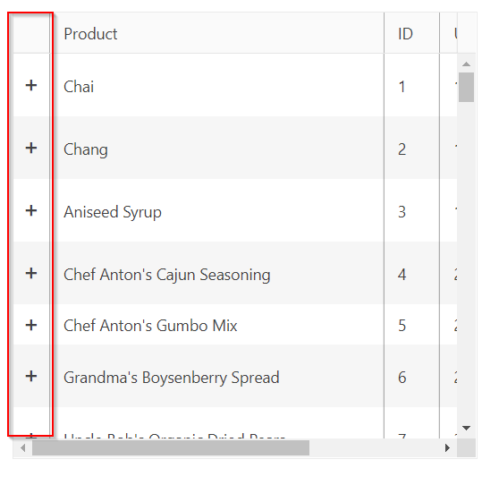
It would be great if there was the ability to lock the expand/collapse column that is rendered for master/detail grids.
Unfortunately, for KendoReact there is no such an option accessible for the "sortable" property of the data grid. We would really like to customize multi-column sorting fuctionality of our grids by the way that it is possible for Kendo UI for Angular, so we are requesting to add/make public option "multiSortKey" of the "sortable" property.
Currently, if I click the Edit button on a row and then sort by any column, the editable row is also moved according to the sorting rules.
What I’d like to request is a built-in functionality to freeze an editable row at the top of the Grid, so it remains fixed regardless of the applied sorting.
This would prevent the need to manually override the sorting mechanism just to keep the editable row pinned in place.
Similar to how you can specify a column for the selection, it'd be nice if you could specify a column for the expand / collapse column so that you can provide a header value and handle a header value click change event.
The idea being that I could mass expand or collapse master detail rows similar to how I can mass select rows.
I think this would be a great feature to have out-of-the-box, and hopefully it's something easy to add from your end. UX-wise, it's really difficult to wrap your head around a non-alphabetized list, especially when the list is used for the special purpose of filtering -- you now have to filter down the list before you can filter the grid itself, which adds more overhead for the user.
I understand that Excel is not the end-all and be-all, but Excel also sorts it by default:
Full discussion can be found here - https://www.telerik.com/forums/how-to-make-gridcolumnmenucheckboxfilter-be-alphabetical-order
Hi team,
Is it possible to have the Enter key press automatically apply the filter when the filter menu is open and active similar to submitting a form?
For example in the Column Menu if I enter some text in the filter the Filter button becomes active, if I press the Enter key nothing happens, for the filter it would be nice if it can submit the filter like for normal forms where the enter key would submit the form.
Another example would be the Checkbox Menu Filter, if I check a checkbox in the filter the current active and focused element is the checkbox and if the Enter key is pressed then it de-selects the checkbox. This behaviour is not very useful, a better implementation would be on Enter press the filter is applied.
Thanks.
Hello,
I was doing some research to see if you had a footer that would be for the entire grid instead of for each column. In this research I found an article that would place the GridToolbar as a footer by changing the order to a value of 1 on the .k-toolbar css style.
.k-toolbar {
  order: 1;
  border-top-style: inset;
  border-top-width: 1px;
}
I was wondering if you could create a feature request to add a property to the GridToolbar that would allow placing it as a footer? Or maybe a feature request that would allow for a footer for the entire grid?
I'm working on creating a footer that would allow my users to open the filter builder in a modal and then display the selected filter in text so they are aware of the current filtering of the grid. This would also be a nice feature to be included with the Grid. Included below is an example of the GridToolbar as the footer.
The GridHelper is defined in a separate file, and this is the way we can use it - https://www.telerik.com/kendo-react-ui/components/grid/getting-started/gridhelper/
However, I prefer if it is exported from the Grid package, and is maintained from there.
The new Built-in State Management does not work with remote data.
For example:
PageSize = 40.
Remotely fetch 40 items.
Click on page 2.
Remotely fetch 40 items.
The grid shows no items, since items 41-80 does not exist in the data provided.
Verified with support who suggested adding a feature request.
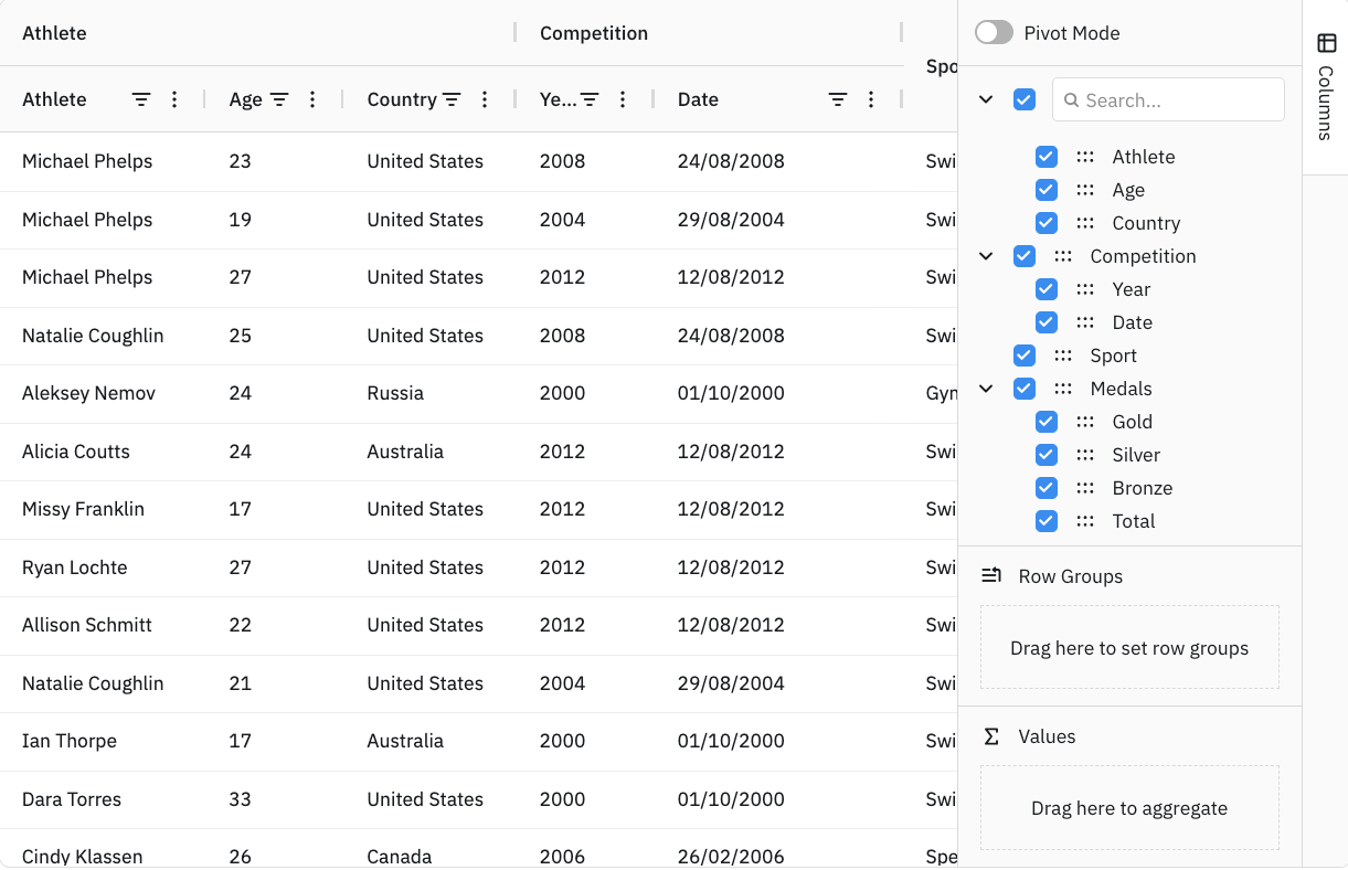
Add a Column Configurator that can be used to set the displayed columns and create multi-column headers