

The typographical kerning defined by the font is not respected when exporting components to pdf.
The text has the same aspect as if the following css property had been defined:
element {
  font-kerning: none
}
It will be nice to support font-kerning on pdf export.
While export and save PDF are extremely useful features that Kendo React UI provides.
I would like to have option to generate Password protected PDF.

Hello Kendo React Team!
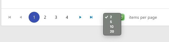
We noticed in our Review and Retro that the drop down to select how many items per page is not styled. The user on my team had a green theme to their desktop and the picker was green. Our main colors or blues so it stuck out. The jQuery grid has that drop down styled so it matches the theme used for Kendo. Would it be possible to use a custom component instead of a regular input?
Thanks!
This will be useful in cases where the end-user has to transfer large data sets into the application faster.
Material UI have such property, and adding it to KendoReact will increase its compatibility with the Material UI components.
It seems the Angular date pickers allow an actual placeholder attribute in stead of populating with the format as the React components do. The current functionality is limited in terms of the experience and requires workarounds as found in this thread.
https://www.telerik.com/forums/datepicker-without-placeholder?actionMode=replyThread
Hi
Please build a React component for Map control similar to https://demos.telerik.com/aspnet-ajax/map/examples/overview/defaultcs.aspx
I need to not restrain the window, in the element that was contained in the code.
Just like it was possible in the jQuery version (https://docs.telerik.com/kendo-ui/api/javascript/ui/window/configuration/draggable.containment),
this feature is a must.
Otherwise, I am being forced to keep my Window on the "top level" element, just so that I can have it not be constrained in the nested element...
The problem with this, is that the Window looks totally out of place, if I need more windows, I will need them all there and it's logic is not clear. The are many issues with that approach...
Please provide a temporary workaround if possible, thanks!

Hi,
We have requirement of date picker display quarters view . please see the below example
http://jsfiddle.net/4mwk0d5L/1/
Regards,
Susanta

I'd really like a KeepIt prop on https://www.telerik.com/kendo-react-ui/components/conversationalui/api/Action/ so that the action stays even when someone is typing or there is another message below it.
The use case would be a link to a Order # for example that they could go back to and click.
https://www.telerik.com/kendo-react-ui/components/conversationalui/suggested-actions/
Example of how this works with react-native-gifted-chat:
https://github.com/FaridSafi/react-native-gifted-chat#message-object

Add render prop for the SplitButton.
This will allow changing the main button and also the button that opens the DropDownList.
When adding an item (or editing an item) - it would be great to have the ability to customise the UI - for the dialog box.
This is for a component being included in a Dynamics365 view - using the PowerApps Component Framework.
Even if we had a 'double click' event - and then I could re-direct to the specific page/entity for editing.
For now - the 'default' dialog for edit doesn't work for what we need...
They can be set as with key value.
It will be very useful if we can get the new component for IPV4/IPV6 input fields. Especially networking related products, I see lot of use cases.
As in the JQuery version, it would be good to have the option of setting min screen width for grid column like below.

https://docs.telerik.com/kendo-ui/api/javascript/ui/grid/configuration/columns.minscreenwidth#columns.minScreenWidth
Currently, the only approach is to loop the data and set the desired text as a field value.

I would like to request a new Kendo React Grid column editing option so that users can navigate editable columns using the keyboard. This feature should be similar to "navigatable" option from Kendo jQuery grid example - https://demos.telerik.com/kendo-ui/grid/editing
Thanks.
The KendoReact Tooltip component only displays tooltips on hover (the showTooltip method is called on the onMouseOver and onMouseLeave events). It would be ideal if the showTooltip method was also called on the onFocus event as well, making the user experience the same for keyboard-only users.
Most other UI libraries treat hover/focus the same for consistency and accessibility.
Bootstrap requires it:
https://getbootstrap.com/docs/4.1/components/tooltips/#making-tooltips-work-for-keyboard-and-assistive-technology-users
Material UI allows you to disable focus interaction, but the default is that focus is handled the same as hover:
https://material-ui.com/api/tooltip/#props