This will allow to programmatically show and hide the Tooltip.
The SVG element does not have a title attribute but instead is using an <title> element.
It would be really useful to have the expandField Grid property being a function that dynamic (per row) return the attribute or null if the row cannot be expanded altogether.
The reason is that, not all rows are expandable in some situations but we currently cannot hide the toggle detail row (+) per row...
Set TabStrip items on multiple rows, instead of scrolling.
If there are many items, they should be shown on multiple row.
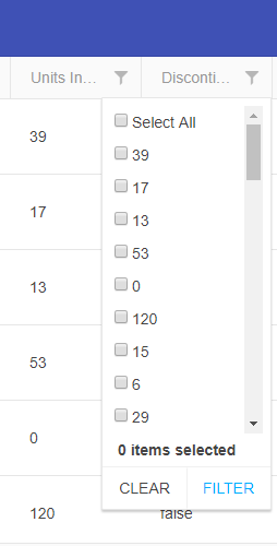
Currently the GridFilterCell OnChange returns a subset of a FilterDescriptor (A value an an Operator to run on the value), which allows a custom filter cell to create one filter rule (FilterDescriptor). However, the CompositeFilterDescriptor structure allows a lot more flexibility. `month == 'January' OR 'March' OR 'May'`. If the GridFilterCell could be passed a CompositeFilterDescriptor instead of the current subset, then a custom filter cell could be much more powerful.
In an orders grid for instance, with a status of Pending, Paid, Shipped, and Delivered a "Show/Hide Shipped" button would exclude or include the Shipped and Delivered orders when clicked. Or a list of checkboxes to choose the statuses you want to see (like the JQuery Grids support).
TL;DR: There is currently no way to re-implement multi-checkboxes or other complex filtering interfaces with the Kendo React Grid without re-implementing all of the filtering logic manually from scratch, as the Existing filter cells don't support this and a custom GridFilterCell can't be configured to return that logic in a single FilterDescriptor.
When using the DialogActionBar, its flex CSS property is flex:1 0 0. For some reason, this is not a valid value in IE11, and I need to specify the flex values explicitly:
.k-dialog-button-layout-stretched .k-button {
flex-grow: 1;
flex-shrink: 0;
flex-basis: 0px;
}
Can this be added to the original stylesheet so it works out of the box?
I am using the ComboBox component in IE11. When the control has a value, the clear button covers the select arrow at the right of the control. This occurs because IE11 does not allow nested calc() calls in the CSS width property, e.g.
.k-dropdown-wrap .k-clear-value {
right: calc(calc( 0.75rem + 17px) + 6.5px);
}
Removing the inner calc() works well enough:
.k-dropdown-wrap .k-clear-value {
right: calc(( 0.75rem + 17px) + 6.5px);
}
Unfortunately, this rule seems to originate from a CSS function call to which I do not have access. Is it possible to remove the inner calc()?
When rendering an AutoComplete, I get the following warning:
Warning: Failed prop type: Invalid prop `children` supplied to `Popup`.
in Popup (created by ListContainer)
in ListContainer (created by AutoComplete)
in span (created by AutoComplete)
in AutoComplete
I have tried this in the simple case below:
ReactDOM.render(<AutoComplete
className="form-control"
required={true}
validationMessage="Location Required." />,
document.getElementById('root'));
DropDownList and MulstiSelect do not open on click(IE 11).
They do open sometimes, but it seems random.
They do open when using the keyboard.
Dropdownbutton doesn't work in FF 66.0.2 on maxOS
1. Click on the dropdownbutton
2. Clicking outside of the dropdownbutton menu
3. The dropdownbutton does not close
Add on Add and onRemove events for the MultiSelect.
Also, the onChange event may receive additional parameters instead:
1) Action - Add or Remove
2) DataItem - It will contain the selected or the deselected item