I know there you gave me an example of how to do this with custom code - is there a reason this can't be built in? It's important and is a pain to custom implement when using custom editors for the cells
Thanks
Michael
Column locked with KendoReact Grid is not locked in the iPhone safari. It's OK in Chrome phone simulator, but not in mobile.
<Grid
                    style={{ height: '400px', width: '500px' }}
                    data={products}
                    reorderable
                >
                    <Column field="ProductID" title="ID" width="45px" locked />
                    <Column field="ProductName" title="Name" width="250px" />
                    <Column field="Category.CategoryName" title="CategoryName" />
                    <Column field="UnitPrice" title="Price" width="90px" />
                    <Column field="UnitsInStock" title="In stock" width="90px" />
                    <Column field="UnitsOnOrder" title="On order" width="90px" />
                    <Column field="Discontinued" width="120px" locked={true} />
                    <Column field="QuantityPerUnit" title="Additional details" width="250px" />
</Grid>When then CSS "rotate(90deg) translate(...)" is applied to KendoReact Chart, the coordinates of tooltip are incorrect.
In order to display KendoReact Chart on mobile phones on a horizontal screen, CSS "rotate(90deg) translate(...)" is applied to KendoReact Chart,
but the coordinates of tooltip are incorrect.
sourcecode:
let w = window.innerWidth || document.documentElement.clientWidth || document.body.clientWidth;let h = window.innerHeight || document.documentElement.clientHeight || document.body.clientHeight;
let x = (h-w)/2;
let ts = "rotate(90deg) translate("+x+"px,"+x+"px)";
const maxstyle={
transform:ts,
width:h,
height:w,
top:0,
left:0,
paddingLeft:5,
paddingRight:5,
paddingTop:5,
transformOrigin:"center center",
background:'#f5f5f9',
overflow:"hidden",
position:"fixed",
zIndex:10000
};
<div style={maxstyle}>
<img src={closeImage} onClick={this.onBack.bind(this)} className="closeImage"/>
{this.renderSingleBlock()}
</div>
In order to display KendoReact Chart on mobile phones on a horizontal screen, CSS "rotate(90deg) translate(...)" is applied to KendoReact Chart,
but the coordinates of tooltip are incorrect.
let w = window.innerWidth || document.documentElement.clientWidth || document.body.clientWidth;
let h = window.innerHeight || document.documentElement.clientHeight || document.body.clientHeight;
let x = (h-w)/2;
let ts = "rotate(90deg) translate("+x+"px,"+x+"px)";
const maxstyle={
transform:ts,
width:h,
height:w,
top:0,
left:0,
paddingLeft:5,
paddingRight:5,
paddingTop:5,
transformOrigin:"center center",
background:'#f5f5f9',
overflow:"hidden",
position:"fixed",
zIndex:10000
};
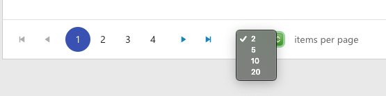
Hello Kendo React Team!
We noticed in our Review and Retro that the drop down to select how many items per page is not styled. The user on my team had a green theme to their desktop and the picker was green. Our main colors or blues so it stuck out. The jQuery grid has that drop down styled so it matches the theme used for Kendo. Would it be possible to use a custom component instead of a regular input?
Thanks!
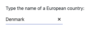
Hey there Kendo React Team!
In the drop downs there is this convenient "X" so users can quickly clear the information in the input. Would it be possible to implement this into the Date & Time Pickers as well as Generic Inputs?
Thanks!
While export and save PDF are extremely useful features that Kendo React UI provides.
I would like to have option to generate Password protected PDF.
Currently, it is required to have the same height for the items, but this can be very hard in cases when the items are dynamic with various height.
Hello again Kendo React Team,
Our team recently started using the Kendo React DateTimePicker and noticed that if the user clicks "Today" followed by "Now" the drop down does not automatically go away. The DatePicker and TimePicker both have this desired action of closing the drop down when selecting. Would it be possible to add this functionality to the DateTimePicker?
Thanks,
Mark
How to merge rows in React Data Grid?
Only ColSpan did not find RowSpan in the GridCellProp
This can be done from the file browser or using drag and drop.
Add hideAfter prop to the Notification component.
This will allow controlling when the notification will be hidden.
Grid Header shifting when filtering column.
When a column is half visible, and it is filtered, a misalignment will occur between the header and the Grid content.
Video: https://www.screencast.com/t/PhOonptY2
When setting filter type in column to `boolean` it breaks when opening the column menu with the following JS error inside `filterCommon.js`:
TypeError: Cannot read property '0' of undefined
Here's a sandbox to see. Click the column menu next to each column header. Notice `Discontinued` column will cause a JS error:
https://stackblitz.com/run/?file=app%2Fmain.jsx
The sandbox was taken from https://www.telerik.com/kendo-react-ui/components/grid/columns/column-menu/
We're using v3.1.0 but the sandbox has 3.2.0. Both versions have this bug. It seems 2.11.0 is the last working version.
The typographical kerning defined by the font is not respected when exporting components to pdf.
The text has the same aspect as if the following css property had been defined:
element {
  font-kerning: none
}
It will be nice to support font-kerning on pdf export.