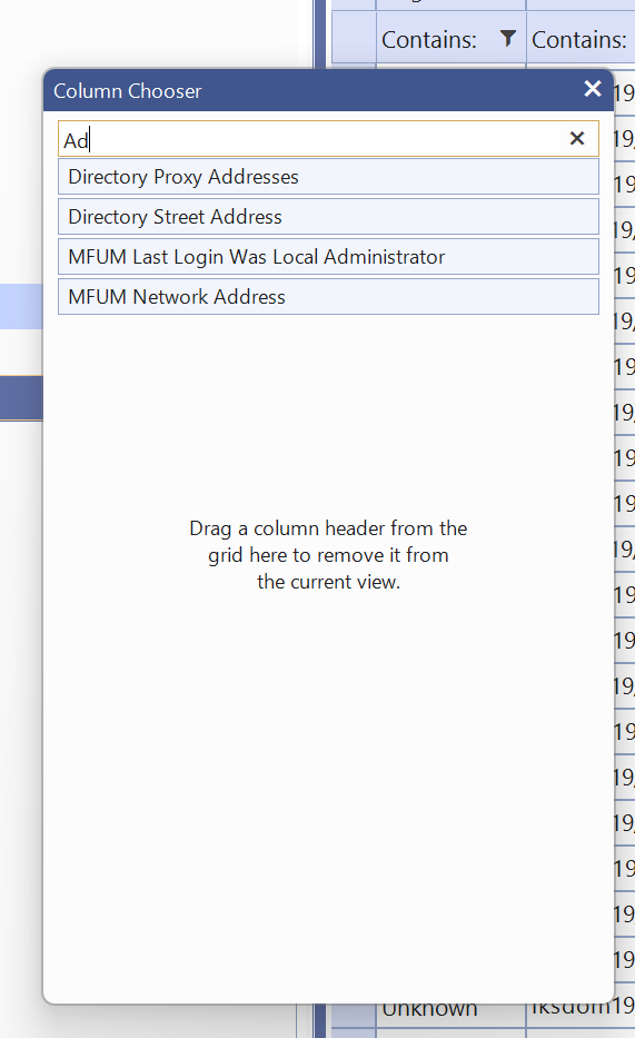
In my application, I have grids with dozens of hidden fields.
It would be beneficial if I could filter the available columns similar to what's available in the Windows Forms column chooser:
It will be really useful if we could include a new 'filtering mode' in which operators like 'and' or 'or' are allowed in the filtering input box.
For instance, using the "doesnotcontain" with 'march or july or september' will allow users to exclude multiple conditions in a single filter
Bug report
When a user edits a cell/row and presses enter, the cell is marked as dirty. However, the Save and Cancel buttons remain disabled, thus the user should focus on a different cell before being able to save changes.
Reproduction of the problem
- Dojo - https://dojo.telerik.com/JuMumnqH
- Edit a cell and press 'Enter'
Current behavior
The cell is closed and marked as dirty, the 'Save changes and 'Cancel changes' buttons remain disabled.
Expected/desired behavior
The buttons should be enabled once the cell is marked as dirty.
Workaround
cellClose: function(e){
                e.sender._toggleToolbarEditingItemsVisibility()
},
Environment
- Kendo UI version: 2025.2.520
- Browser: [all ]
Bug Report
When building with NPM, the glob is mismatched. This is currently related to the source code build.
Reproduction
- Build with version 2025.2.702 in NPM.
Current behavior
Receiving the specific error message:
[!] SyntaxError: The requested module 'glob' does not provide an export named 'default'
Environment
- Kendo UI version: 2025.2.702
- jQuery version: All supported versions
- Browser: all
Bug report
Currenlty, styles/font-icons/index.css has this line at the bottom:
/*# sourceMappingURL=index.css.map */
But the map file is not part of the distribution files, so it's causing the browser to throw an additional request for the map file.
Currenlty, the index.css.map is present in the node_modules/@progress/kendo-font-icons/dist/index.css :

But is not part of the Kendo jQuery distribution.
Expected/desired behavior
The distribution should be revised and the map file should be copied.
Environment
- Kendo UI version: 2025.3.825
- Browser: [all ]
We would like the ability to execute custom actions once a control has been fully initialized and rendered.
Use Case
On our login page, we use the Form control. After the Form control is created, we need to reposition our SSO buttons so that they appear beneath the default buttons rendered by the form. Without a reliable event, it is difficult to determine when the control is ready for safe modification.
Proposed Solution
Introduce a Created event (or similar) that is triggered once the control is fully rendered. This event would provide a hook for developers to perform additional UI adjustments or integrate custom functionality.
Reference
Syncfusion ASP.NET Core controls provide this functionality through a Created event.
Currently, the Kendo UI RangeSlider provides a single-colored track (.k-slider-track) with a separate style applied only to the selected range. However, in many modern design requirements, there is a need to split the track into multiple colored sections (e.g., 3 or more segments with different colors) to visually represent thresholds, ranges, or categories.
Example Use Cases:
Displaying low, medium, and high ranges with green, yellow, and red colors.
Visualizing different risk or performance levels directly on the slider track.
Providing a better UI experience by mapping ranges to business values.
Requested Feature:
Add native support to configure multiple color segments within the RangeSlider track (either via configuration options or styling hooks). Ideally, developers should be able to specify:
Number of segments.
Color for each segment.
Segment boundaries (percentage or value-based).
Workarounds Tried:
Custom CSS overlays and pseudo-elements can partially simulate the effect, but they are not reliable or fully aligned with the slider’s rendering behavior.
Impact:
This feature would enhance usability and visualization, making the RangeSlider more flexible for dashboards, financial apps, performance monitoring, and other business-critical UI scenarios.
Reference:
Please find an attached image illustrating the requested multicolored track (example with 3 segments: green, yellow, and red).
When I add a minimum or maximum value to the date picker, the control allows out-of-range dates to be entered until the dateInput option is set to true. At that point, any out-of-range date will be set to either "min" or "max." The change event will not be called for that change.
This would be perfect:
- The default behavior is to set the minimum or maximum value when the date input value is out of range. It would be nice if this behavior didn't depend on the dateInput option.T
- Trigger a change event when the control itself sets the minimum or maximum value.
- Add an option to change the behavior to generate an error on the control when an out-of-range value is entered.
Note: In some situations, the default behavior of setting it to "min" or "max" can also be useful... but with a change event trigger however!
Please make the speech to text button/suffix of a kendo textarea available via mvvm. Also speech to text button to come standard as a tool in the kendo editor.
Hi Team,
While I understand there are release notes and breaking changes, I would like to request you consider adding some version information to the documentation. This would help identify when certain features were introduced.
Thank you!
I created a forum post and it was suggested that I create a feature request for improved Kendo Grid keyboard accessibility when the grid contains locked columns and/or clickable elements such as buttons, links, and input boxes. I noted the following issues that I feel should be supported without having to write a bunch of workarounds or create a poor user experience for regular (mouse and keyboard) users.
This is an urgent concern because many of our clients are requiring our site to meet accessibility standards and with the heavy use of Kendo grids in their current state, it does not seem to.
I have a grid with 2 locked columns with a button in the first column and a hyperlink in the second column, the other columns just have text. I set navigatable to true. None of my fields are editable.
Here is a dojo: https://dojo.telerik.com/KUcMekCh
When the user tabs to the grid, they first get the search bar in my custom grid toolbar. Next they tab to the button (which happens to be a bootstrap dropdown menu but I don't think that is relevant). Here is where the issues start:
- They then hit tab again and sometimes are taken to the hyberlink while other times they are taken to the next row, skipping column 2's hyperlink.
- The grid does not always enter Kendo's navigation mode. When it doesn't, there is no way for the user to interact with the column header which has the sort and tooltip buttons in it.
- When they get to the bottom of the grid, the locked side will scroll vertically but the unlocked side remains in place, causing the rows to be misaligned.
- When an input cell is in the unlocked portion of the table, the user has to tab through the entire list before getting back to editing the input for a row. This isn't logical.
- I worry that if there were editable cells, which some of my grids have, the user won't be able to tab to the next editable cell and instead will be forced to navigate through every cell. I don't want to make it more difficult for a normal user in order to accommodate a keyboard only user so there needs to be a way for both to work well.
- Often the focus ends up on the unlocked table which attempts to put a blue outline around that, however, the outline isn't fully visible since that is inside of a scrollable div.
- You can click into a cell with navigatable set to true and then use the navigation but that doesn't work for a keyboard only user.
- When navigatable is not turned on, the user cannot scroll vertically if they tab to the table.
When you have a simple kendodropdown list that is set to adaptiveMode = "auto", resizing the browser throws. This can be reproduced on your demo pages.
Steps to reproduce:
- use this Dojo: https://dojo.telerik.com/LHJLQgzy which was created from your demo page
- Ensure the browser is narrow enough to be considered mobile
- run the project
- confirm dropdown is functional
- resize the browser to desktop size
- the dropdown list stops working and throws
kendo.virtuallist.js:2890 Uncaught TypeError: Cannot read properties of undefined (reading 'style')
On Kendo's grid Custom Command, there's a bug with "text" object of "command". The bug is we can't use space in the "text" object, not even %20.
This is because the "text" object is appended on class attribute of the command button.
On Kendo's grid Custom Command, there's a bug with "text" object of "command". The bug is we can't use space in the "text" object, not even %20.
This is because the "text" object is appended on class attribute of the command button.
Find Node or search mode
We are using Metro theme, and many clients say us that is a little bit difficult to distinguish parent from child items in a panelbar because they are too similar. Is possible to introduce an left padding to recreate a fake tree?
Add client-side filter method that automatically updates the filter menu options (dropdowns and values) according to the filters described in the filter expression.
How about a simple addition to zooming, whereby the zoom just automatically zooms into the current data set by filtering off the outer elements? For example, have a zoomStep property, which defines the number of elements to filter off the start and end of the data. This would allow really simple zooming without having to write filters and would allow for easy use in shared code scenarios (eg, we have a single Knockout custom binding for all our charts).