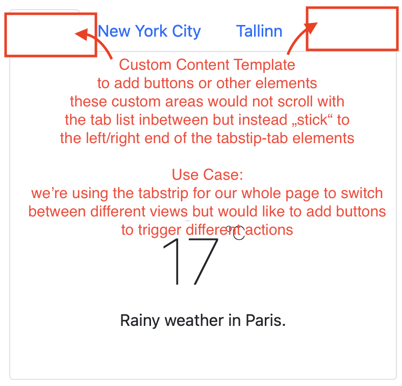
We would like to add certain quick access buttons on the same level as the kendo-tabstrip. Since the kendo-tabstrip needs to take as much space as possible for its content to be displayed fully, we currently have to use ugly workarounds like placing them absolute into free areas and creating those areas by setting margins for our tab-header.
Therefore we would like to have templates allows content to be displayed before or after the kendo-tabstrip horizontally and on the same level as the tab-header
Like the SAPUI5 object page control, it is a tabstrip with horizontal orientation of the tab headers but vertical allignment of all tab sections within the tab content container. If the user clicks on one tab header, the tab content container will be scrolled down to the tab section linked to the tab header.
A preview is given in the link below.
Yours
Stephan
Make the TabStrip component scrollable, like the counterpart (http://demos.telerik.com/kendo-ui/tabstrip/scrollable-tabs) in Kendo UI for JQuery is.
Reorder tabs with drag and drop like so: http://demos.telerik.com/kendo-ui/sortable/integration-tabstrip
It seems to be impossibly hard to make it so that when a TabStrip is in a container that the content area is able to fill the remaining space rather than fitting to the content.

I have seen that there are work arounds for what appears to be the same issue for the jQuery KendoUI library but it looks like a hack rather than a true solution.  (One shouldn't have to go to the code behind to make this happen).

A simple "fillRemainingSpace" (or similar) would be perfect and have the TabStrip handle the rest.

I expect this is pretty common scenario for anyone making application like UI websites.
I need some extra view of Tabstripe title like icon title and close button so can we add html title so good design of tabstripe title
Implement OnChange Events for tabs.
Hi Kendo UI
We had to programmatically select the correct tab. We used the selectTab method of the TabStripComponent.
We found it quite hard to detect the correct index, because we had to dynamically hide (with ngIf) a tab.
Checking on the title of the SelectEvent is possible, but this title is sometimes translated, it is not that convenient.
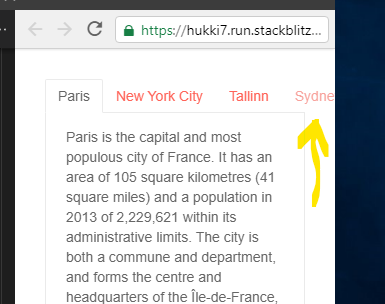
My collegue prepared a stackblitz to illustrate the problem. https://stackblitz.com/edit/angular-kendo-tabstrip-ngif?file=app/app.component.ts
Our suggestion is to add an extra (optional) id to the SelectEvent.
And that id should be the id of the tab, if the id of the tab has been set.
<kendo-tabstrip (tabSelect)="onTabSelect($event)">
        <kendo-tabstrip-tab [title]="'Paris'" [selected]="true" id="parisTab">
          <ng-template kendoTabContent>
            <p>
            Paris
            </p>
          </ng-template>
        </kendo-tabstrip-tab>
        <kendo-tabstrip-tab [title]="'New York City'" *ngIf="isNyVisible" id="nyTab">
          <ng-template kendoTabContent>
            <p>
              The City of New Yo
             </p>
            </ng-template>
          </kendo-tabstrip-tab>
          <kendo-tabstrip-tab [title]="'Antwerp'" id="antwerpTab">
          <ng-template kendoTabContent>
            <p>
              Antwerp
             </p>
            </ng-template>
          </kendo-tabstrip-tab>
       </kendo-tabstrip>
public onTabSelect(e: SelectEvent) {
console.log(e.index, e.title, e.id);
// Challenge: How to determine which tab is selected?
// e.index is not reliable if there is a ngIf on one of the Tabs
console.log('isNySelected', e.index === 1); // Wrong results if NY Tab has ngIf="false"
// Possible solution: Allow to provide an ID on the kendo-tabstrip-tab
console.log('isNySelected', e.id=== "nyTab"); // Always correct. Nice...
}Kind regards
Pieter
When the tabstrip have multiple tab within a limited width, the tabs are rendering outside the limit of the tab.
The component behavior should (perhaps by options configuration):
- Scroll to show all tabs
- Hide the non-visible tab and render a drop down to select additional tabs
- Render the tab on a second line
This can be reproduced using the StackBlitz of the tabstrip.
Thank you.
As the panel bar seems to support it it would be appreciable to have support for routes in the tabstrip component.
Vertical or Horizontal orientation of tab strips.

Default to horizontal.