I have the following data:

Price   Downloads
59      10
62      15
69      30
70      10
75      25
78      30

I want to present the data in a chart in such a way that the Price are grouped together and the Downloads have their medians.

So it would be:
< 59:   10
61-70:  (Median of 62, 69 and 70 above)
71-80:  (Median of 75 and 78 above)

X-axis would be the Price then Downloads on Y-axis.

I can create the median but I just want to be able to group the X-axis.
Currently missing values can be either interpolated (with the same dash type), zero or gap. It would be nice to provide the opportunity to configure the dash type for the missing (interpolated) values and have for example a solid line for the existing values, and dashes for the interpolated portion.
The legend in the kendo charts has limited customization available via geometry and layouts (inherited from Group <- Element) using the visual property. But this does not allow a complete range of customization equivalent to html templates such as :
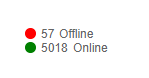
1. Table containing multiple information against each legend item. (eg : If the above legend consists of multiple items in a row could use Kendo grid in it).
2. No hyperlinks support in the text for routing to different pages on the UI or anywhere else.(eg : In the above Offline could be a hyperlink to navigate to other detailed page).
This point I think is important. Also an hyperlink (or maybe a click on an svg hide navigate to a separate legend in place).
3. Some other features supported in html such as sliders in a legend to display more info on icon click. (eg : clicking on an icon should expand the details for each legend item ).
4. Not sure if there is an svg support too. (eg: In the above I would like to place an svg icon in place of circle geometry for colored indicators).
Also it would be much convenient to allow an html template inside the legend instead of coding geometries. The above points are in support for the need for a custom html template to be either accepted as the property of the legend or to allow to construct an html code under the <kendo-chart-legend></kendo-chart-legend>
Expected: Clicking on an item in the legend is supposed to toggle it's visibility.
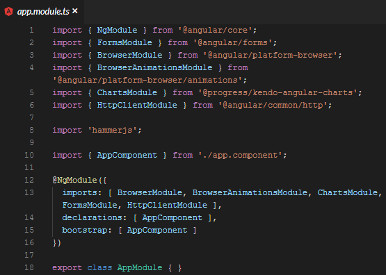
Using kendo-angular-charts 5.1.0, if you add a series input, this does not happen. A full, minimal reproduction of this issue is available At the StackBlitz link below. The top chart has no issues (hides series upon clicking) while the bottom does.
https://stackblitz.com/edit/angular-5it8qu?file=app%2Fapp.module.ts
Screenshots of above repro:
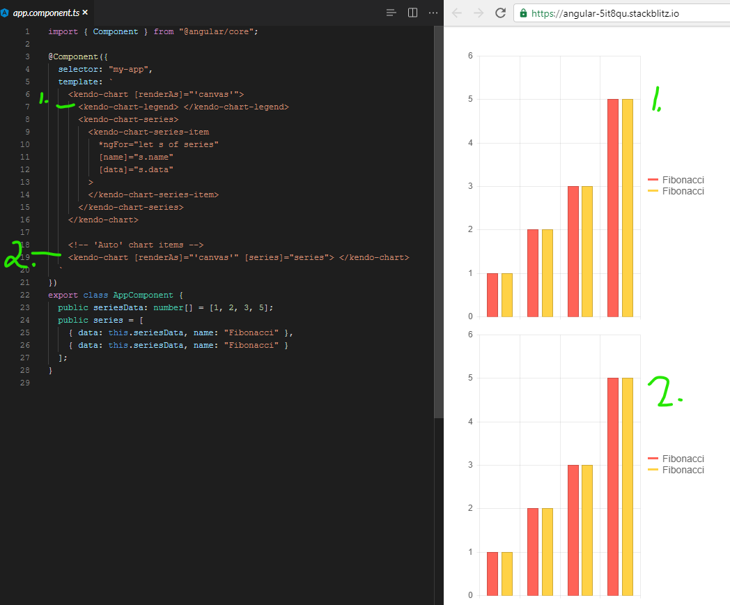
It appears that there is a line deep in the codebase that says:
const seriesComponent = this.seriesComponents.get(index);
if( !seriesComponent ){ return; }
seriesComponent.toggleVisibility();
And the seriesComponents array is empty when you use the [series] binding.
We even went so far as to bind to the legend click event and toggle the visibility myself, but it is 100% ignored.
It was something like:
public onLegendClick(event: LegendClickEvent){
  event.series.visibility = !event.series.visibility;
  event.source.refresh();
  event.source.changeDetector.markForCheck();
}
Calling refresh did redraw the chart, but it was still visible/enabled. Even though digging into it with ng.getComponent on the kendo-chart, and looking at the series, it clearly showed series[0].visible to be false.
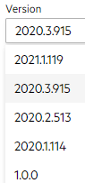
I had to make an assumption on version for this ticket since the dropdown on the bug report doesn't list 5.1.0. I wouldn't mind tips on understanding how to match up your marketing version name with your npm version. I spent 20 minutes looking around for that, but your versioning doc and release history don't seem to have anything about the actual version numbers used by package management.
Hi,
I'd it would be great if Kendo offered a way to build 2D density plot, even myabe somthing similar to a seaborn https://python-graph-gallery.com/82-marginal-plot-with-seaborn/