Sometimes with a dropdown button I would like to have Category headers or Separators to breakup the list. To accomplish a seperator it needs to be added to another existing DropDownItem. To create a category header you can style an existing DropDownItem, however it's still clickable so it becomes obvious to the user that this is a bit of a misuse of the control. Native support for Categories or Separators would be ideal, however, just having control over the click behavior and perhaps a Template property for full control over this one items rendering would make it more extensible.
Thank you,
-Andy
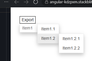
Currently the DropDownButton only allows a single level of button items inside it. I need to put nested (child) levels of items, similar to the ContextMenu.
===
TELERIK EDIT:
A possible workaround is to use a Menu component with a single root item. Make that root item look like a Button with CSS:
<TelerikMenu Data="@MenuItems"
             Class="menu-button"
             TItem="@MenuItem"
             OnClick="@OnMenuItemClick">
</TelerikMenu>

<style>
    .menu-button {
        display: inline-block;
        color: var(--kendo-color-on-base);
    }

        .menu-button > .k-item {
            background: var(--kendo-color-base);
            color: var(--kendo-color-on-base);
            border: 1px solid var(--kendo-color-border);
            border-radius: var(--kendo-border-radius-md);
        }

            .menu-button > .k-item:hover {
                background: var(--kendo-color-base-hover);
            }

            .menu-button > .k-item.k-menu-item:active {
                color: var(--kendo-color-on-base);
                background: var(--kendo-color-base-active);
            }

            .menu-button > .k-item.k-menu-item:focus {
                box-shadow: 0 0 0 2px rgba(0,0,0,.08);
            }

            /* optional: hide the expand arrow */
            .menu-button > .k-item .k-menu-expand-arrow {
                /*display: none;*/
            }

            .menu-button > .k-item > .k-menu-link {
                padding: var(--kendo-spacing-1) var(--kendo-spacing-2);
            }
</style>

@code {
    private void OnMenuItemClick(MenuItem clickedItem)
    {
        Console.WriteLine($"The user clicked on {clickedItem.Text}");
    }

    private List<MenuItem> MenuItems { get; set; } = new List<MenuItem>()
    {
        new MenuItem()
        {
            Id = 1,
            Text = "Menu as DropDownButton"
        },
        new MenuItem()
        {
            Id = 2,
            ParentId = 1,
            Text = "Level 1 Child 1"
        },
        new MenuItem()
        {
            Id = 3,
            ParentId = 1,
            Text = "Level 1 Child 2"
        },
        new MenuItem()
        {
            Id = 4,
            ParentId = 3,
            Text = "Level 2 Child 1"
        },
        new MenuItem()
        {
            Id = 5,
            ParentId = 3,
            Text = "Level 2 Child 2"
        },
        new MenuItem()
        {
            Id = 6,
            ParentId = 5,
            Text = "Level 3 Child 1"
        },
        new MenuItem()
        {
            Id = 7,
            ParentId = 1,
            Text = "Level 1 Child 3"
        }
    };

    public class MenuItem
    {
        public int Id { get; set; }
        public int? ParentId { get; set; }
        public string Text { get; set; } = string.Empty;
    }
}
When using the OnClick event on a DropDownButtonItem, the MouseEventArgs parameter is always null. However, if the OnClick event is used on the main TelerikDropDownButton component, the MouseEventArgs works correctly.
REPL reproduction - https://blazorrepl.telerik.com/mfYdbbPQ37jhZlMq47
By default, the dropdown popup is automatically positioned 100% from the top and along the left side of its parent (the input). I want to customize this behavior, for example, aligned to the right side of its parent.
For the time being, a possible custom approach is to use a TextBox or Button component as an anchor and a configured Popup component. For example, refer to this REPL link.
- I want to track when the popup element of the DropDownButton is opened and closed.
- I also want to have an Open method via the component reference
===
ADMIN EDIT
===
For the time being, a possible option is to use the DropDownList component that exposes such events. Customize it so it can look and behave similarly to the DropDownButton.
Example implementation: https://blazorrepl.telerik.com/mekbkTPE21kwyMBU05.