

---
ADMIN EDIT
Attached to this post are a reproducible and a workaround - setting the state in OnAfterRenderAsync with a small delay, so the initial grid render happens, then it can re-render and take the filters into account.
---
When I switch the culture of my App from English to Swedish, the Virtual scrolling feature of the Grid breaks.
===========
ADMIN EDIT
===========
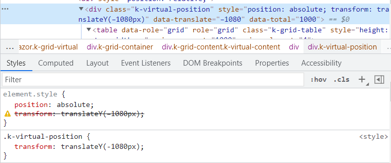
The issue stems from invalid transform style applied to the k-virtual-position div element in Swedish culture. Due to integer to string conversion that takes culture into consideration when setting the style and/or data-translate attribute, when this number is < 0, the negative sign is longer dash for Swedish culture. This longer dash is not parsable by JS and CSS which is why the translateY transform is invalid.
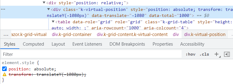
As a workaround for the time being, you can try adding transform style for the k-virtual-position div, so you can override the default one and the correct dash will be applied:
<style>
    .k-virtual-position {
        transform: translateY(-1080px);
    }
</style>
Grid virtual scrolling will freeze in the following scenario:
- Open https://demos.telerik.com/blazor-ui/grid/virtual-scrolling
- Scroll to the lower part of the Grid
- Filter any column, so that the number of items becomes less than the current scroll position
- The Grid will show "no records to display" and row placeholders, even if there are items to display
Please support Display(Order = ...) with autogenerated Grid columns.
Such functionality will also be useful for controlling the order of manually declared columns when using a custom component for reusable columns. For example: https://blazorrepl.telerik.com/cGOtbwOX21f6zQcy35 - the "Name" column is rendered last and currently one cannot control its order.
public class DateModel
{
  [Display(Order = 2)]
  public string Id { get; set; }
  [Display(Order = 1)]
  public string Text { get; set; }
}
Here is the scenario:
- UI for Blazor version 2.30
- Grid with InCell editing
- EditorTemplate with a DropDownList inside
In version 2.30 there is no longer need for an explicit blur handler for the in-cell editor template. The editor template closes automatically when the user selects a value from the DropDownList. However, the new value is ignored.
REPL test page: https://blazorrepl.telerik.com/mFbcmQvs16Lf1jwv18

I have created a custom model where I added an ExpandoObject and a couple properties to it. The Grid seems to render the data successfully but the data operations are not possible - the nested properties are treated as invalid. Please add support for nested ExpandoObject properties in custom models.
---
ADMIN EDIT
---
For the time being, there is a workaround that you may try. Use the ExpandoObject directly, do not nest it in the custom model - bind the Grid Data to a collection of ExpandoObject and populate its properties in the OnInitialized.
@using System.Dynamic

<TelerikGrid Data="@Data"
             Pageable="true" Sortable="true" Groupable="true"
             FilterMode="Telerik.Blazor.GridFilterMode.FilterRow"
             EditMode="@GridEditMode.Incell"
             Resizable="true" Reorderable="true">
        <GridColumns>
            <GridColumn Field="Id" FieldType="typeof(string)" Width="120px" />
            <GridColumn Field="DetailData.PropertyInt" Title="Column A" FieldType="@typeof(int)"  />
            <GridColumn Field="DetailData.ProptertyString" Title="Column B" FieldType="@typeof(string)"/>
            <GridColumn Field="DetailData.PropertyDate" Title="Column C" FieldType="@typeof(DateTime)"/>
        </GridColumns>
</TelerikGrid>


@code {
    public ExpandoObject[] Data { get; set; } = Array.Empty<ExpandoObject>();

    protected override async Task OnInitializedAsync()
    {
        Data = new ExpandoObject[]
            {
            GetPopulatedExpando(1),
            GetPopulatedExpando(2),
            GetPopulatedExpando(3),
            GetPopulatedExpando(4),
            GetPopulatedExpando(5),
            };
    }

    private ExpandoObject GetPopulatedExpando(int id)
    {
        dynamic expando = new ExpandoObject();
        expando.Id = id;
        dynamic nested = new ExpandoObject();
        nested.PropertyInt = id;
        nested.ProptertyString = "ID " + id;
        nested.PropertyDate = new DateTime(2022, 4, id);
        expando.DetailData = nested;

        return expando;
    }
}
I am adding validation messages for the popup form fields and I do not want to display the ValidationSummary in addition to them. Please add option to remove it.
---
ADMIN EDIT
---
Built-in field validation messages will be exposed in future version of the product. Thus, you can add inline or tooltip validation messages to the Popup edit form without an EditorTemplate.
For the time being, you can remove the ValidationSummary with some CSS. Here is an example of hiding the ValidationSummary and adding inline ValidationMessage for the ProductName field: https://blazorrepl.telerik.com/cckycgPf37NZfy9J11

When the Grid is grouped and aggregate functions are enabled, paging performance degrades significantly because grouping and aggregate calculations are executed on every page change. This results in noticeable delays and UI stutter, especially in WebAssembly applications and larger datasets.
This enhancement optimizes page navigation for grouped Grid scenarios with aggregates by avoiding repeated processing when the underlying data has not changed, resulting in substantially faster paging performance while preserving existing functionality and first-load behavior.
Currently, the validation of the grid can be disabled altogether via the GridValidationSettings.Enabled option. However, we cannot control the validation of the grid per column.
Also, we cannot control when the validation is triggered. The simple inputs expose the ValidateOn option, but it cannot be set to the default editors of the grid without the need for an explicit declaration of a custom editor.
Feature Request
Currently, when a grid is rendered with 500 rows in a WASM application and expand/collapse action is initiated, it takes a few seconds to finish grouping and rendering.
Steps to reproduce
1. Create a grid in WASM app.
2. Add 500 rows.
3. Do not enable paging.
4. Group by any field and initiate expand/collapse.
5. All rows are re-rendered which leads to a few seconds delay.
Similar to the WPF grid I would like the option to require the user hold shift to sort by multiple columns, otherwise the grid would sort by only a single column.
https://docs.telerik.com/devtools/wpf/controls/radgridview/sorting/multiple-column-sorting
Currently, the Grid doesn't display its built-in loading animation on initial data (page) load.
The OnRead handler is now completely decoupled with the Data parameter, so the limitation can be removed at least for OnRead scenarios.

Hello there,
I am looking for the ability to display hierarchical data in the grid control similar to that available in the asp.net core grid: https://demos.telerik.com/aspnet-core/grid/hierarchy
Thanks!
Currently the blazor grid must be a specific, static height. If one is not provided, the grid uses a default of 500px.
Kendo grid implementations in other UI frameworks allow for more flexibility in the height of the grid. It would be great if the blazor implementation could support this as well.
Two specific scenarios that are valueable:
1) Grid height adjusts to accomodate all of the items in the grid
For other kendo grid implementations, this is typically the case when "Scrollable" is set to false. If there is a plan to allow toggling scrolling for the blazor grid, then I think that this would come along with that.
2) Ability to set grid height to 100%
With other kendo implementations this is normally done via CSS, and is useful for when you want a "full screen" grid. This is normally combined with "Scrollable=true" and often combined with Pagination="true" as well. Currently it's not possible to do this - since the height is defined on the k-grid element, it cannot be overridden with CSS.