Problem:
Grid exports columns as 0 width unless Grid column widths are specified in px. This is a terrible experience for users, and specifying grid width in px is terrible when you have users that can be using phones or 4k screens. Managing Grid for different screen sizes is already hard enough!
Solution 1: (Good)
The grid should export a default (64px) width for columns that aren't specified in px. Inexperienced Excel users are lost when columns are collapsed, but can easily resize columns as needed when each one is visible!
Solution 2: (Better)
Calculate a width - like [(rem value)*10]px. Even if it isn't perfect it will go a long way to creating something visually pleasing on initial open in Excel.
Hello,
After just a sort operation, in the event handler of OnStateChanged event, the FilterDescriptors of GridStateEventArgs.GridState is not empty.
Steps to reproduce :
1) Implement Grid with OnStateChanged and OnRead :
<TelerikGrid
             OnStateChanged="@((GridStateEventArgs<IGetAgences_Agences_Items> args) => OnStateChangedHandler(args))"
             OnRead=@ReadItems
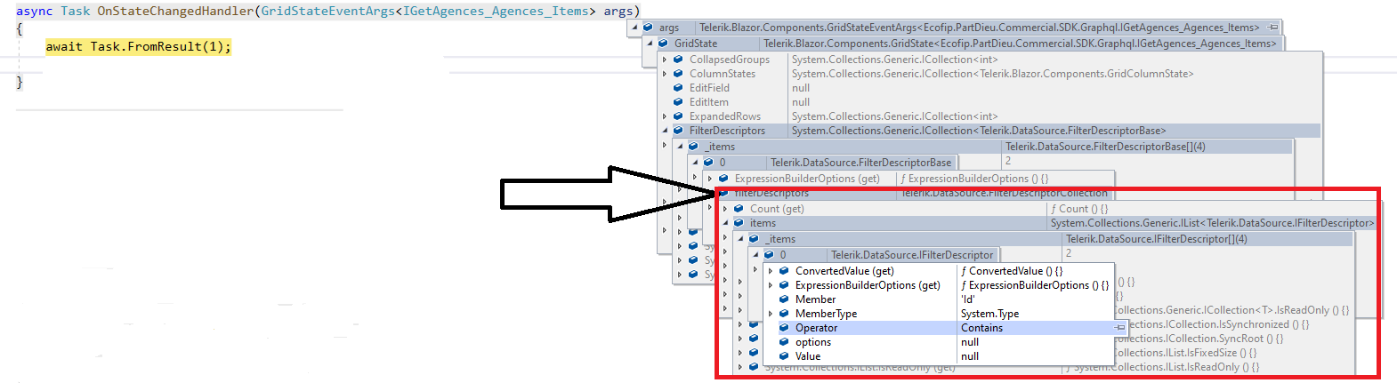
    async Task OnStateChangedHandler(GridStateEventArgs<IGetAgences_Agences_Items> args)
    {
        var filters = args.GridState.FilterDescriptors; // filters are not empty after just a sort opration

    }

    async Task ReadItems(GridReadEventArgs args)
    {

        this.LoadData()

        await InvokeAsync(StateHasChanged);
    }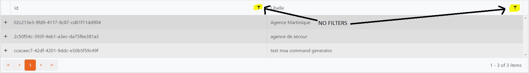
2) Sort a column
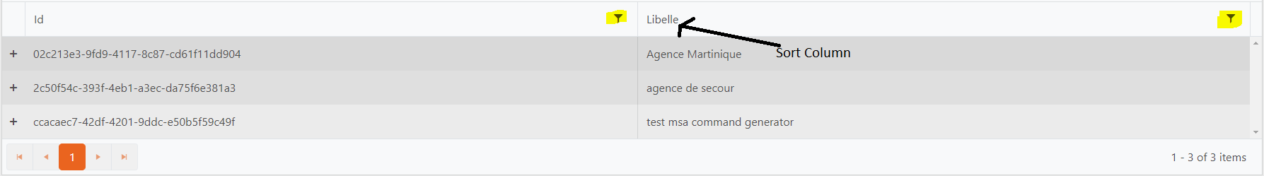
3) The OnStateChanged event is fire
4) In the OnStateChangedHandler, the filters are not empty :
Expected behaviors :
If no filters added, the filters of the GridState must be empty
Thank's
Thomas
Typo:
<span>Produts for sale: @productsCount </span>
Should be Products
Reordering rows with RowDraggable is great but tricky.
Droping while the red line marker is on the upper line of a row works.
Droping while the red line marker is on the bottom line of a row brings the item to the position over the dopped line.
Thus, it is impossible to bring a line to the last position of a table (although one can bring the last row over it's predecessor as a workaround)
It is impractical to set the grid columns to fixed width. I'll explain with example:
I have grid with 4 columns. The grid should have width 100%.
- Column 1: short text, 10-15 characters. I need this one to auto width to content.
- Column 2: checkbox, also auto-width to header title.
- Column 3: free text that may wrap on multiple lines. I need this column to use all available horizontal space so it will push the 4th column to the very right.
- Column 4: button. auto-width to either header title or button width, whichever is wider.
The auto-width feature is already requested: Autofit column widths on data load (telerik.com) but I don't see a feature request to handle the Column 3 scenario.
I'd like to be able to enable the Column Chooser menu on just the Command Column and then keep all the other column menus as-is (I have a combination of various custom filter controls on them, so I don't watch to switch to the Column Menu)
GridCheckBoxColumn: The check disappears when focus is on a editable cell.
<TelerikGrid Class=k-gridData="@adherenceAgents"
EditMode="@GridEditMode.Incell"
Height="150px"
SelectionMode="@GridSelectionMode.Single">
<GridColumns>
<GridCheckboxColumn SelectAll="false" Title="Select" Width="70px" />
<GridColumn Field="@(nameof(AdherenceAgent.Scheduled))" Editable="false" Title="Scheduled" />
<GridColumn Field="@(nameof(AdherenceAgent.EmployeeId))" Editable="false" Title="Employee ID" />
<GridColumn Field="@(nameof(AdherenceAgent.Name))" Editable="false" Title="Name" />
<GridColumn Field="@(nameof(AdherenceAgent.AchievedAdherences))" Title="Points" />
<GridColumn Field="@(nameof(AdherenceAgent.PossibleAdherences))" Title="Possible" />
<GridColumn>
<HeaderTemplate>Adherence<br/>Score</HeaderTemplate>
</GridColumn>
</GridColumns>
</TelerikGrid>
Example Repo: https://github.com/benhysell/BlazorGridPagingIssue
Steps To Reproduce
- Run application and navigate to https://localhost:5001/workAround
- See the GridCheckboxColumn has ellipses added to the header
- Stop application, change package reference for Telerik.UI.for.Blazor from version 2.28.0 to version 2.27.0
- Clean/Rebuild/run application and navigate back to https://localhost:5001/workAround
- Notice how the header does not have ellipses added for the GridCheckboxColumn
I would prefer if you can use the FilterMenuTemplate in such a way that you can fetch also "filter criteria" from other fields/columns.
An example:
- grid has 3 coluns > Name, City, Population
- filter mode is set to filter menu and my filter menu should display at the first column.
- after the filter dialog is opened my expactation is that it includes also entries from other fields
In summary, my team would welcome the opportunity of central approach for filtering with multiple fields.
Regards,
Özmen
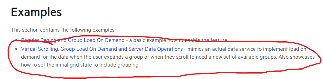
Documentation states that Grid supports Virtualization with Grouping if it is done by loading the Groups on-demand.
See:
On page: Blazor Grid - Load Group Data On Demand | Telerik UI for Blazor
From this, it appears that Virtual Scrolling, Group Load on Demand, and pagination of the results should function as expected. I'm specifically focusing on the section where it says "load on demand for the data when the user expands a group or when they scroll to need a new set of available groups".
The behavior I am seeing in my Telerik Repl is not matching up with that.
See: https://blazorrepl.telerik.com/QFbmurvT41eZq6Ld34
In the repl, I have added some Console.WriteLines to see when OnRead is actually called, as well as to log out some other information about the OnRead Request. It can be seen that no pagination information is included in the request (PageSize = 0, Skip = 0) while the PageSize is set on the actual Grid component (PageSize = 20).
As a result, all groups are loaded initially, which will be problematic if my server-side data set is being grouped on a value that will result in thousands/millions of groups.
It is possible that I missed something in the documentation that would enable the expected behavior (the Grid actually giving me PageSize and Skip so pagination will actually work), but it is also equally possible that this was never intended behavior, and I have been misled by the documentation page.
When a filter descriptor is created and the value is of type DateTime? (nullable DateTime) the serialized value is incorrect.
    DataSourceRequest request1 = new()
    {
         Filters = new[] {new FilterDescriptor("Test", FilterOperator.IsEqualTo, DateTime.Now.Date) {MemberType = typeof(DateTime)}},
         Sorts = new List<SortDescriptor>()
    };

    DataSourceRequest request2 = new()
    {
         Filters = new[] { new FilterDescriptor("Test", FilterOperator.IsEqualTo, DateTime.Now.Date) { MemberType = typeof(DateTime?) } },
         Sorts = new List<SortDescriptor>()
    };

    string query1 = request1.ToODataString(); // outputs $count=true&$filter=(Test%20eq%202022-05-12T00:00:00.0000000Z)&$skip=0
    string query2 = request2.ToODataString(); // outputs $count=true&$filter=(Test%20eq%202022-05-12%2000:00:00)&$skip=0
As you can see in the provided example : https://blazorrepl.telerik.com/QcaiPbkL56qf6XQ747
I have the following situation. I'm using a custom editor template with two-way binding for the column : OrderToEdit.ShipCity. If I change the value of this column in a row and press Enter, Tab or mouse focus out very quickly (immediately after value change), UpdateHandler is triggered before the valueChanged event of the context and as a result changes are not shown. If there is a delay ( i.e 1 second ) all works fine. This is not happening when i'm using the builtin editor GridEditorType.TextBox. Could you provide me a solution ?
There is another problem. if a click inside a cell edit mode is triggered. But if i click in a button in the toolbar or in column menu the cell remains open is not closed. I think this should not happen.
Hi,
We ran into an issue with manual binding and selected items with Grid component. I used the 'WebApiFromServerApp' sample in 'grid\datasourcerequest-on-server' folder from Telerik's samples on GitHub.
To recreate the issue, modify 'GridWithService.razor' file in 'WebApiFromServerApp' project. I attached modified project.
To test the behavior:
- Select records with Id 2 and 3 from grid.
- Navigate to another page and return back to the first one.
- Despite selected items exist in the grid's 'SelectedItems', but they are not being shown. This is the first issue.
- The second issue is you can still select them again! In that case they would be duplicated as selected items.
Thank you.
Description
When the state is loaded and there is a value in the search box, the X (clear button) is missing.
Reproduction (if bug)
- Create a Grid, set a SearchBox in the toolbar.
- Set value in the SearchBox.
- Save state.
- Refresh the page and apply the state.
- The value is present in the searchbox but the X icon is missing.
Expected (if bug)
The X icon should be visible.
Browser (if bug)
All
Project type (if bug)
All
Last working version of Telerik UI for Blazor (if regression)
3.5.0
Description
The left offset style value is not correctly formatted. It is culture-specific, however, the CSS rules should be formatted with culture invariant decimal separator - dot.
Reproduction (if bug)
1. Create a grid with locked columns.
2. Set the culture to one that has a comma as the decimal separator.
3. Resize the frozen columns, the left value is formatted with a comma instead of a dot.
Expected (if bug)
The value should be formatted with a dot.
Browser (if bug)
All
Project type (if bug)
All
Hello,
I seem to have stubled upon a strange bug in TelerikGrid. We have wrapped a TelerikGrid and the Columns are also wrapped to allow special actions.
The bug is present in "raw-telerik-code" as well.
We have an edge case where we have a TelerikGrid and some of its columns should be Locked (Stickied/Frozen) as a default behaviour.
But depending on user interaction we want to change the state. We cannot use a property for each column that we want to be Locked/Unlocked as it should be handled by the GridState.
When the Column is using default behaviour (not Templated), it works as intended. But as soon as you use a <Template> for the Column, the Locked state cannot be changed from the default/supplied value.
TLDR: Programmatically changing the Locked state of a column where the cell is templated will not change the locked state.
I have prepared two REPL examples. One for 3.7.0 as it is what we currently are using, and one for 4.0.1 as to prove that it still exists in the current itteration.
3.7.0
https://blazorrepl.telerik.com/cHEHurlI06olUsJ410
4.0.1
https://blazorrepl.telerik.com/cdYRuBvo07aB6BGY39
With best regards