

Currently, if I set a zoom level to the body/html different than 1 the DropDownList's popup is not positioned correctly.
Please provide support for proper rendering on different zoom/scale levels.
===
ADMIN EDIT
===
The request applies to all components that incorporate popup elements - for example, ComboBox, MultiSelect, DatePicker, TimePicker and more.
When using the DropDownList component with less than seven items, there is extra whitespace:
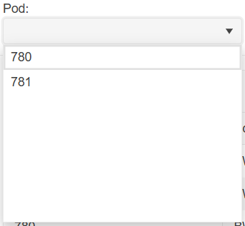
In terms of user experience, this extra whitespace is clutter as it takes up visual space yet serves no viable purpose to the user. Clutter gives an unfinished appearance and should be removed if possible.
You can remove the extra whitespace by specifying Height and MaxHeight in the DropDownListSettings render fragment:
<TelerikDropDownList Data="@_dropDownData" @bind-Value="@_selectedPod">
    <DropDownListSettings>
        <DropDownListPopupSettings Height="auto" MaxHeight="200px"/>
    </DropDownListSettings>
</TelerikDropDownList>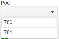
However, having to specify DropDownListSettings for every DropDownList component that has fewer than seven items is laborious and verbose. I would like there to be no extra whitespace in DropDownList components by default without having to specify DropDownListSettings.

The OnClose event fires multiple times when the handler uses the DialogFactory.
The behavior occurs with all select components (AutoComplete, ComboBox, DropDownList, MultiColumnComboBox, MultiSelect)
Possible workarounds include:
- Use a boolean flag to prevent the OnClose handler from executing the second time, for example, if the second execution occurs less than 1-2 seconds after the first one.
- Use OnChange instead of OnClose.
- Use a <TelerikDialog> component instead of ConfirmAsync.
Here is a test page that reproduces the issue:
<div style="display: flex; gap: 2em;">
    <div>
        <TelerikButtonGroup SelectionMode="@ButtonGroupSelectionMode.Single">
            <ButtonGroupToggleButton @bind-Selected="@UseOnChange">Use OnChange</ButtonGroupToggleButton>
            <ButtonGroupToggleButton @bind-Selected="@UseOnClose">Use OnClose</ButtonGroupToggleButton>
        </TelerikButtonGroup>

        <TelerikDropDownList Data="@Data"
                             @bind-Value="@Value"
                             ValueField="@nameof(SampleModel.Text)"
                             OnChange="@OnDropDownListChange"
                             OnClose="@OnDropDownListClose"
                             Width="160px" />

    </div>
    <div>
        <TelerikButton OnClick="@( () => CloseLog = string.Empty )">Clear Event Log</TelerikButton>
        <p>
            <pre>@CloseLog</pre>
        </p>
    </div>
</div>

@code {
    private List<SampleModel> Data { get; set; } = new();

    private string Value { get; set; } = string.Empty;
    private List<string> Values { get; set; } = new();

    private string CloseLog { get; set; } = string.Empty;

    private bool UseOnClose { get; set; } = true;
    private bool UseOnChange { get; set; }

    [CascadingParameter]
    public DialogFactory? TelerikDialogs { get; set; }

    private async Task OnDropDownListChange(object currentValue)
    {
        CloseLog += $"OnChange {DateTime.Now.ToString("HH:mm:ss.fff")} \n";

        if (UseOnChange)
        {
            await TelerikDialogs!.AlertAsync("OnChange");
        }
    }

    private async Task OnDropDownListClose(DropDownListCloseEventArgs args)
    {
        CloseLog += $"OnClose {DateTime.Now.ToString("HH:mm:ss.fff")} \n";

        if (UseOnClose)
        {
            await TelerikDialogs!.AlertAsync("OnClose");
        }
    }

    public class SampleModel
    {
        public int Id { get; set; }
        public string Text { get; set; } = string.Empty;
    }
}

Hi,
We are using the DropDownList component as an inline editor in the grid, for managing a product hierarchy. Previously we were using the DropDownList with grouping enabled, without virtualization, but due to volume of data we now need to use virtualization.
This does not work with grouping at the moment.
At the bottom of this page it is mentioned that 'Virtual scrolling with grouping will be supported in a future version.'.
Any timeline on this feature?
KR,
Lennert
Please add group header template for the select components. There are two goals:
- Customize the group items' appearance.
- Implement custom behaviors, for example - batch select or unselect of all items in the group by clicking on the group header.
Hello,
would it be possible to add "OnFocus" event to DropDownList as there is already "OnBlur" event?
Thanks