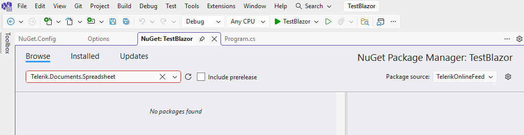
With an active Blazor trial, the Telerik Document Processing NuGet packages are not found in the Visual Studio Package Manager and in the Terminal as well:

Description
When the dropdown is open, the button's aria-controls attribute references a value that matches the popup's data-id, not its actual id. Since aria-controls must point to an element's id, the attribute is invalid and no element in the DOM matches the reference, breaking the accessible relationship between the button and its popup.
Button renders:
aria-controls="50dc5df2-b83e-41bd-8c34-98470aba77c6"
Popup element has:
data-id="50dc5df2-b83e-41bd-8c34-98470aba77c6"
id="8630d4e4-2f22-4eaf-b96c-7cae113b70ed"
Steps to Reproduce
- Add a TelerikDropDownButton using the standard Telerik example (source below).
- Open the dropdown and inspect the HTML or run a Lighthouse audit.
<TelerikDropDownButton Icon="@SvgIcon.Share" OnClick="@(()=>OnItemClick("Primary"))">
    <DropDownButtonContent>Share</DropDownButtonContent>
    <DropDownButtonItems>
        <DropDownButtonItem Icon="@SvgIcon.Facebook" OnClick="@(()=>OnItemClick("Facebook"))">Facebook</DropDownButtonItem>
        <DropDownButtonItem Icon="@SvgIcon.Twitter" OnClick="@(()=>OnItemClick("Twitter"))">Twitter</DropDownButtonItem>
        <DropDownButtonItem Icon="@SvgIcon.Linkedin" OnClick="@(()=>OnItemClick("Linkedin"))">Linkedin</DropDownButtonItem>
        <DropDownButtonItem Icon="@SvgIcon.Reddit" OnClick="@(()=>OnItemClick("Reddit"))">Reddit</DropDownButtonItem>
    </DropDownButtonItems>
</TelerikDropDownButton>
The following exception occurs:
Microsoft.JSInterop.JSDisconnectedException: JavaScript interop calls cannot be issued at this time. This is because the circuit has disconnected and is being disposed.
............
at Telerik.Blazor.Components.Common.Loader.ComponentLoaderContainer.DisposeAsync()
When the user closes the browser and the web page contains any of the below components:
- DockManager
- FileManager
- Grid
- ListView
- PdfViewer
- PivotGrid
- Scheduler
- SpreadSheet
- TreeList
Most organizations follow a 12-month cycle or update their ACR whenever there's a significant product version change, whichever comes first, to remain in good standing.
Please update the latest Telerik for Blazor Accessibility Conformance Report for the current version of Telerik for Blazor. We need these reports for the US States that use our software and Telerik for Blazor. Without current, valid VPATs, we will have to discontinue use of Telerik for Blazor.
DevExpress for Blazor has a current VPAT here for example (latest report Dec, 2025): https://www.devexpress.com/products/net/accessibility/ACR-DevExpress-Blazor-25.2.pdf
Image Collection Viewer / Selector Component
A flexible and accessible image viewer / selector for Blazor applications, similar to what popular eCommerce websites use to show products.
Features
- Accessibility: Uses ARIA roles and labels for screen reader support and keyboard navigation.
- Configurable Layout: Supports custom
HeightandWidthparameters to fit various UI needs. - Aspect Ratio Control:
ConstrainImageHeightandConstrainImageWidthparameters allow precise control over aspect ratio, whether to maintain aspect ratio and/or constrain height and width. - ImageInfo Model: Accepts a collection of
ImageInfoobjects, each with a required image source and optional alt text for accessibility. - Alt Text Support: Ensures all images have descriptive alt text for improved accessibility.
- Scrollbar Handling: Automatically displays a vertical scrollbar if the image list exceeds the constrained height, ensuring all images remain accessible.
- Visual Feedback: Selected and focused images are visually highlighted for clear user interaction.
Sample Code
ImageCollectionViewer.razor
@inject ITelerikStringLocalizer Loc

<LanguageTrackProvider OnInitializeEvent="provider => provider.RegisterComponent(this)" />

@if (Images.Any() && _selectedImage != null)
{
    <div class="d-flex @Class" style="height: @Height; width: @Width;">
        <ul aria-label="@Loc["ImageThumbnails"]" role="radiogroup" class="image-collection-button-container">
            @foreach (var image in Images)
            {
                <li>
                    <button @onclick="() => OnImageSelect(image)"
                            class="@($"image-collection-button{(image.Src == _selectedImage.Src ? " selected" : "")}")"
                            role="radio" aria-checked="@(image.Src == _selectedImage.Src ? "true" : "false")">
                        <img src="@image.Src" alt="@image.Alt" />
                    </button>
                </li>

            }
        </ul>
        <div class="image-collection-image-container">
            <MagnifiableImage Image="@(new ImageInfo(_selectedImage.Src, _selectedImage.Alt))" Class="image-collection-image" MagnifyScale="@MagnifyScale"
                              Height="@(ConstrainImageHeight ? "calc(100% - 2px)" : "auto")" Width="@(ConstrainImageWidth ? "100%" : "auto")" />
        </div>
    </div>
}
else
{
    <TelerikSkeleton ShapeType="@SkeletonShapeType.Rectangle" Height="@Height" Width="@Width" Class="@Class"/>
}

<style>
    .image-collection-button-container {
        flex: 0 0 auto;
        width: 10%;
        height: 100%;
        min-width: 90px;
        max-width: 110px;
        overflow-y: auto;
        padding: 2px;
        margin: 0;
        scrollbar-color: rgba(1, 1, 1, 0.25) rgba(0, 0, 0, 0);
        scrollbar-gutter: stable;
        list-style: none;
    }

    .image-collection-button {
        padding: 0;
        margin-bottom: 1rem;
        border: 1px solid var(--kendo-color-border, rgba(0, 0, 0, 0.08));
        border-radius: 0.5rem;
        width: auto;
        aspect-ratio: 1 / 1;
        display: block;
    }
    .image-collection-button:hover {
        filter: brightness(90%);
    }
    .image-collection-button:focus {
        outline: none;
        box-shadow: 0 0 0 2px color-mix(in srgb, var(--kendo-color-on-app-surface, #424242) 50%, transparent);
    }
    .image-collection-button.selected {
        box-shadow: 0 0 0 2px var(--kendo-color-primary, #1274AC);
    }
    .image-collection-button img {
        width: 100%;
        height: 100%;
        min-width: 70px;
        min-height: 70px;
        max-width: 90px;
        max-height: 90px;
        object-fit: cover;
        border-radius: 0.5rem;
        display: block;
    }

    .image-collection-image-container {
        flex: 0 0 auto;
        width: 90%;
        padding: 2px;
    }

    .image-collection-image {
        border: 1px solid var(--kendo-color-border, rgba(0, 0, 0, 0.08));
    }
</style>
ImageCollectionViewer.razor.cs
using Microsoft.AspNetCore.Components;
using Telerik.Blazor.Components;
namespace RazorLibrary.Components.Images;
/// <summary>
/// <para>
/// Displays a collection of selectable image thumbnails provided by <see cref="Images"/> and a main image display area.
/// If <see cref="Images"/> is empty, displays a <see cref="TelerikSkeleton"/> placeholder instead. Supports
/// accessibility, configurable height via <see cref="Height"/>, width via <see cref="Width"/>, aspect ratio control
/// via <see cref="ConstrainImageHeight"/> and <see cref="ConstrainImageWidth"/>, and alt text for images.
/// </para>
/// <para>
/// Usage:
/// <code>
/// @using RazorLibrary.Components.Images
///
///
/// <ImageCollection Images="myImages" Height="300px" Width="100%" />
///
///
/// @code {
/// private List<ImageInfo> myImages = new()
/// {
/// new ImageInfo("img1.jpg", "First image"),
/// new ImageInfo("img2.jpg", "Second image")
/// };
/// }
/// </code>
/// </para>
/// </summary>
public partial class ImageCollection
{
/// <summary>
/// The collection of images to display in the image collection.
/// </summary>
[Parameter] public IEnumerable<ImageInfo> Images { get; set; } = [];
/// <summary>
/// The overall height of the image collection component (e.g., "200px", "100%", or "auto"). Default is "auto".
/// </summary>
[Parameter] public string Height { get; set; } = "auto";
/// <summary>
/// The overall width of the image collection component (e.g., "200px", "100%", or "auto"). Default is "auto".
/// </summary>
[Parameter] public string Width { get; set; } = "auto";
/// <summary>
/// If true, sets the main image display height to 100%, which constrains it to the value specified by <c>Height</c>.
/// If false, height is auto. Maintains aspect ratio unless both <c>FixImageHeight</c> and <c>FixImageWidth</c> are true.
/// Default is false.
/// </summary>
[Parameter] public bool ConstrainImageHeight { get; set; } = false;
/// <summary>
/// If true, sets the main image display width to 100%, which constrains it to the value specified by <c>Width</c>.
/// If false, width is auto. Maintains aspect ratio unless both <c>FixImageHeight</c> and <c>FixImageWidth</c> are true.
/// Default is true.
/// </summary>
[Parameter] public bool ConstrainImageWidth { get; set; } = true;
/// <summary>
/// The magnification scale for the magnifier. Default is 3 (3x magnification).
/// </summary>
[Parameter]
public double MagnifyScale { get; set; } = 3;
/// <summary>
/// Applies additional CSS classes to the ImageCollection's root element for custom styling and visual modifications.
/// </summary>
[Parameter] public string Class { get; set; } = string.Empty;
private ImageInfo? _selectedImage;
/// <inheritdoc />
protected override void OnInitialized()
{
_selectedImage = Images.FirstOrDefault();
}
private void OnImageSelect(ImageInfo imageInfo)
{
_selectedImage = imageInfo;
}
}ImageInfo.cs
namespace RazorLibrary.Components.Images;

/// <summary>
/// Information about an image, including the source URL and alt text.
/// </summary>
/// <param name="Src">The image source URL. Required.</param>
/// <param name="Alt">The image alt text. Optional.</param>
public record ImageInfo(string Src, string? Alt = null);
Note
The sample code uses the MagnifiableImage component, which is another feature request. The MagnifiableImage component can be replaced with a img element.
After upgrading to 12.0.0, the Content does not change when clicking tabs. I always see the Content of the first tab.
My project targets .net8.
Using the TelerikTabSrip, If the first tab is not visible when rendered, the tab content for all tabs doesnt render.
Replicated here https://blazorrepl.telerik.com/cpEWGOPk22VW8be254
If you change the code to make the first tab visible, all is well.
You can make other tabs invisible, and all is well.
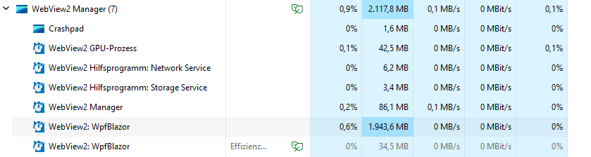
In our application we use some large datasets and present them in a TelerikGrid. We use WPF + Blazor Hybrid and noticed, that in some cases the memory usage of the Web View process grows up to some gigabytes.
Here a screenshot of the task manager with a lot of RAM usage for the web view.
Here a screenshot of the detached DOM elements after a two navigations. The container divs are not garbage collected.
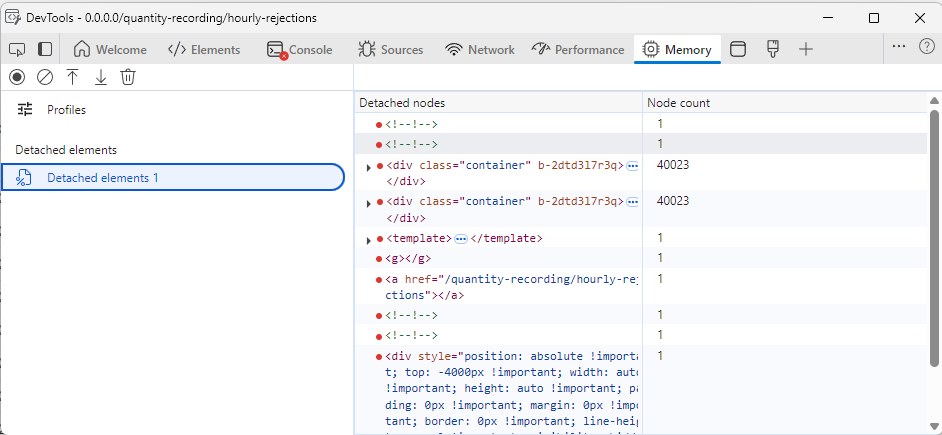
I tracked down the issue to come from the TelerikGrid, because when I remove it from the pages, everything runs fine. I also removed all GridColumns and the issue is still present. In the developer tools I noticed that one of the parent div elements remains in memory every time I navigate back and forth.
I also created a blank Blazor WebAssembly Standalone application and added a simple instance of the grid. Here, the issue is also present. I attach the one blazor page that causes the issue.
I've tested all major versions from 5.1 upwards, every version is affected.
I've noticed this warning is now shown since version 9.0.0. I checked the release notes and don't see any notes reflecting this change. I also checked the documentation and don't see any information about the OnUpdate event. Can we please update the documentation to document the changes? I would like to understand the behavior of OnUpdate so I can move away from ValueChanged.
"warning CS0618: 'TelerikFilter.ValueChanged' is obsolete: 'Use OnUpdate instead.'"
Hello:
I am using column menu in a gantt component. In version 8.1.1 the selection of columns to display was working correctly, but when upgrading to version 9.0.0 I get an error using the same implementation. The error received is:
blazor.web.js:1 crit: Microsoft.AspNetCore.Components.WebAssembly.Rendering.WebAssemblyRenderer[100]
      Unhandled exception rendering component: Object reference not set to an instance of an object.
System.NullReferenceException: Object reference not set to an instance of an object.
   at Telerik.Blazor.Components.Common.ColumnMenu.ColumnMenu`1.<OnColumnChooserColumnVisibilityChange>d__188[[BlazorRepl.UserComponents.__Main.FlatModel, BlazorRepl.UserComponents, Version=0.0.0.0, Culture=neutral, PublicKeyToken=null]].MoveNext()
   at Telerik.Blazor.Components.Common.ColumnMenu.ColumnMenuChooser.OnApplyClick()
   at Microsoft.AspNetCore.Components.ComponentBase.CallStateHasChangedOnAsyncCompletion(Task task)
   at Microsoft.AspNetCore.Components.RenderTree.Renderer.GetErrorHandledTask(Task taskToHandle, ComponentState owningComponentState)
You can replicate the error from online examples just by adding or removing visible columns.
https://www.telerik.com/blazor-ui/documentation/components/gantt/gantt-tree/columns/menu

I need to use this functionality with Telerik® UI for Blazor version 9.0.0.
When is it planned to solve this error? Is there a workaround I can apply?
Regards.
I would like to have possibility to put sorting and filtering icons in second row or at least second line in TelerikGrid header. To follow our project design I need to have 1 header row with header titles, and second row with sorting and filtering. Or at least one table header row with sorting and filtering icons in 2 line. Is this somehow possible to achieve?
Hi,
Are you planning to add a loader to the grid in the feature?
E.g as an isLoading attribute or exepnd the build-in one?
With method OnRead to fetch data, when grid is not yet loaded with data, it displays no records available.
Also when chenging data, loading is not starting, but there is an unsmooth transition after some time.
Thanks in advance for your time, Kacper
I have a scenario in which we have user definable columns for a grid, including hundreds if not thousands that need to be ported from the old version of our product. This means these column keys would be strings that may contain spaces or even special characters - and as such cannot be a valid C# property name (which means using an ExpandoObject approach will not work)
It would be really beneficial if the TelerikGrid component could be given Data of an IEnumerable<Dictionary<string, object>> where the Field property of GridColumn (or a new property) would line up with a key in that dictionary rather than a field name for the component to then use reflection with.
A customer with multiple modules of our product installed may very well have columns with similar names, i.e "Some Key", "SomeKey", "Some_Key", "Some & Key" - so simply replacing spaces or special characters may not always still give unique keys.
We are using Telerik UI for Blazor (V6.2.0) grid. The first 3 columns (Delivery No, Spot Check, Spotcheck Status) of the grid are frozen/locked. While horizontal scrolling the header text gets overlapped. We have used custom CSS to change the header color.
<TelerikGrid @ref="@GridRef" Data="@dashboardData"
Reorderable="true"
SortMode="@SortMode.Single"
Pageable="true"
FilterMode="GridFilterMode.FilterRow"
PageSize="10"
EnableLoaderContainer="true"
Sortable="true" Context="inboundContext" OnRowRender="@OnRowRenderHandler" Width="1800px" Height="500px">
@foreach (var header in tableHeader)
{
@if (@header.id == "SpotCheck")
{
<GridColumn Field="@(nameof(@header.id))" Width="150px" Title="@header.headerName" Visible="@header.isVisible" Locked="true" Reorderable="false" Filterable="false">
<Template>
@{
var item = (Delivery)context;
var isVisible = (item.DeliveryType.Equals("IN") && !string.IsNullOrEmpty(item.EUDRRefAndVerificationId));
}
<div class="spot-check-btn">
<TelerikButton Class="custom-btn custom-btn-secondary" OnClick="()=>reDirectTo(item.Id)" Visible="isVisible">Spot Check</TelerikButton>
</div>
</Template>
</GridColumn>
}
else if (@header.id == "status")
{
<GridColumn Field="@(nameof(@header.id))" Title="@header.headerName" Visible="@header.isVisible" Width="150px">
<Template>
@{
var item = (Delivery)context;
<span class="status-data @item.Status.ToLower()">
<span class="dot"></span>@item.Status
</span>
}
</Template>
</GridColumn>
}
else if (@header.id == "SpotcheckStatus")
{
<GridColumn Field="@header.id" Title="@header.headerName" Width="150px"
OnCellRender="@((e) => OnCellRenderHandlerSpotcheckStatus(e))"
Visible="@header.isVisible" Locked="true" Reorderable="false">
</GridColumn>
}
else
{
<GridColumn Field="@header.id" Title="@header.headerName" Width="150px"
OnCellRender="@((x) => OnCellRenderHandler(x, @header.id))"
Visible="@header.isVisible" Locked="@header.Locked">
</GridColumn>
}
}
</GridColumns>
<NoDataTemplate>
<p><strong style="color: var(--kendo-color-primary);">No Data Available.</strong></p>
</NoDataTemplate>
</TelerikGrid>
Creating a new WebApp project template through the extension fails to build. This is caused by incorrect icon type in the MainLayout.razor file.
To make sure the app is correctly built, the Icon type should be FontIcon.
<TelerikButton Icon="@FontIcon.Menu"
               FillMode="@ThemeConstants.Button.FillMode.Clear"
               OnClick="@( () => DrawerExpanded = !DrawerExpanded )" />
It appears there are some issues with encoding special characters in the DataSourceExtensions.ToODataString extension method.
See snippet below.
var ds = new DataSourceRequest()
{
	Filters = [new FilterDescriptor("FieldName", FilterOperator.IsEqualTo, "Route #")],
	Sorts = []
};
{
Console.WriteLine(ds.ToODataString());
$count=true&$filter=(FieldName%20eq%20%27Route%20#%27)&$skip=0
This results in a malformed url as the last part of of the query is interpreted as a fragment due to this character not being encoded.
After reading your documentation, it appears that the Pager Position enum only allows for the grid pager to be at the top OR the bottom of the grid.
It would be most excellent to allow it to be BOTH. For very large grids, it would be convenient for the user to see the grid at the very top, but if they do happen to need to scroll to the very bottom of the grid, seeing the pager component there would also be convenient for the user.
This is in regard to this page:
https://www.telerik.com/blazor-ui/documentation/components/grid/paging
Please add a .Both option to the PagerPosition enum that allows both Top and Bottom at the same time.
Thanks! :)